3 claves para el Rebranding de tu marca

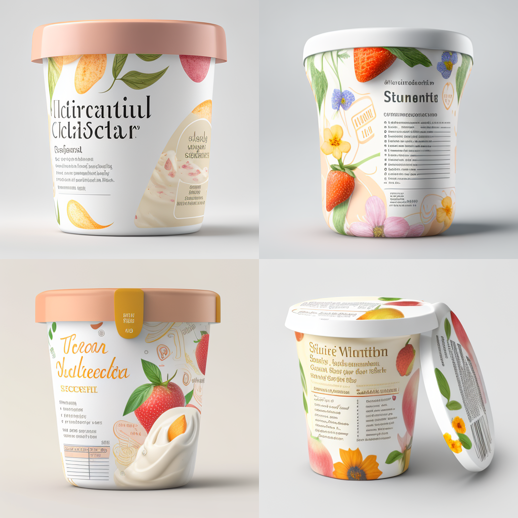
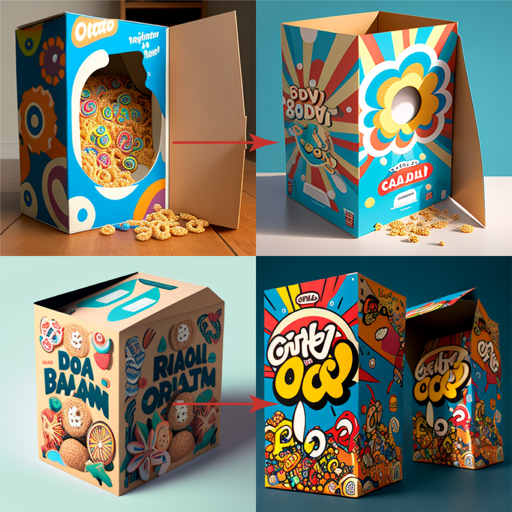
Midjourney image

La organización de la información es fundamental en cualquier proyecto, especialmente en un rebranding de packaging. Una buena gestión de la información asegurará un proceso eficiente, sin errores y con un resultado de calidad. La creación de documentos de apoyo fundamentales para tener éxito en un rebranding son:

  • Procedimiento/s de diseño
  • Template/s
  • Documento/s de calidad

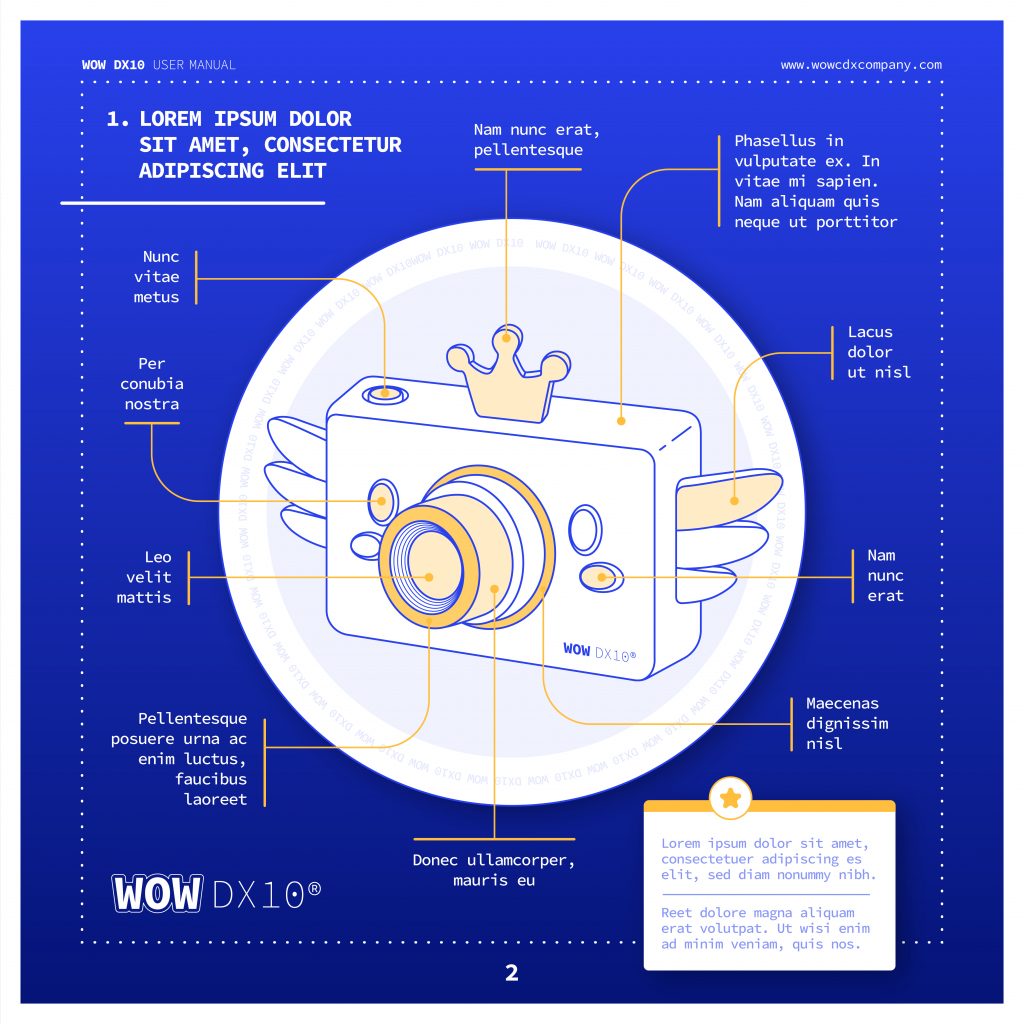
Un template es una herramienta que permite a los diseñadores tener recursos claros y precisos sobre las especificaciones de diseño para una categoría de producto. Este documento deberá incluir detalles como el tamaño, la posición de los elementos y los colores corporativos. Debemos crear tantos templates como tipo de producto vaya afectar al rebranding, si habláramos de la industria farmacéutica serían uno de envase, otro de prospecto y otro para los aluminios por ejemplo.

Un procedimiento detallado es otro documento importante que debe ser creado en la fase inicial del proyecto. Este documento explicará cómo se deben realizar las tareas y los pasos necesarios para lograr un resultado final exitoso. Además, el procedimiento también ayudará a evitar errores y a asegurar que todas las tareas se realicen de manera consistente. De nuevo el orden de dicho documento nos facilitará su uso, no debe ser una descripción del proceso, sino una síntesis de la información fundamental ordenada en capítulos para resolver el “puzzle” o diseño. De nuevo debe hacer tantos procedimientos como tipología de productos.

El documento de calidad es un registro de todas las especificaciones y requisitos necesarios para garantizar un resultado de alta calidad. Este documento debe incluir todos los detalles fundamentales para la aprobación del diseño y será más eficiente en la medida de que seamos capaces de condensar la información en capítulos para centrarnos en una zona o sección del diseño. Un ejemplo reducido de un algunos detalles a considerar en un envase de un medicamento podrían ser:

  • Tipo de archivo (Ai, PDF?)
  • Colores (Pantone +, máximo número de colores)
  • Márgenes
  • Detalles corporativos y logos
  • Braille
  • Revisión de Textos
  • Códigos (EAN, laetus, datamatrix, ….)

Todos estos documentos de apoyo deben generarse en una primera fase, donde se diseñan una muestra de los productos a modificar. Estos modelos servirán de base para el resto de los productos, y garantizarán una continuidad, consistencia u homogeneización en el diseño.

En resumen, la creación de documentos de apoyo es fundamental en un proyecto de rebranding de packaging. Estos documentos asegurarán un proceso eficiente, sin errores y con un resultado de calidad por lo que se debe invertir el tiempo y atención necesaria en su creación además de las pertinentes pruebas de uso para detectar repeticiones innecesarias así como detalles omitidos.

AMS Twona NeXT 200mg digital pills

Image with Midjourney

Twona NeXT – Artwork Management System

Directions for use: Full implementation of Twona NeXT Artwork Management System is recommended for all stakeholders in your organization.

Dosage

For optimal results, it is recommended that you fully implement Twona NeXT as your Artwork Management System. This means integrating Twona NeXT into all your processes, training all stakeholders in its use, and utilizing its features to streamline and optimize your artwork management processes.

Risks of not using Twona NeXT

Continuing to work in the traditional way can result in sub-optimal processes, prolonged time-to-market, excessive working hours, messy file folders, untraceable processes, non-compliant systems, and a lack of preparedness for external audits. These risks can lead to decreased efficiency, reduced productivity, and increased risk for your organization.

Warnings

Failing to implement a digital Artwork Management System such as Twona NeXT can result in a lack of visibility and control over your artwork management processes, leading to decreased efficiency and increased risk. By fully integrating Twona NeXT into your organization, you can streamline and optimize your processes, improve collaboration, and ensure compliance.

It is important to carefully follow the recommended dosage and to fully integrate Twona NeXT into your organization for optimal results. If you have any questions or concerns about the use of Twona NeXT, please consult with your Artwork Management System specialist.

Puntos clave para tu Guía de Estilo en la industria farmacéutica

Photo by Aron Visuals on Unsplash

El packaging es un aspecto fundamental en el sector farmacéutico, ya que es el elemento de comunicación más directo y visual con el consumidor. Por eso, es importante tener una guía de estilo bien definida para el diseño de los envases de los productos farmacéuticos.

La importancia de tener una guía de estilo específica para un país concreto

La guía de estilo debe ser creada por diseñadores que conozcan el sector y sus normativas, para garantizar que el packaging cumpla con todos las regulaciones en materia de seguridad y salud respecto a un país concreto. Es cierto que muchas veces la guía de estilo es un documento que aplica a nivel europeo y esto puede ser un problema por varias razones. Comparto algunos ejemplos de incoherencias que he encontrado en los 20 años que llevo diseñando packaging farmacéutico, en particular productos genéricos:

  • Documento en inglés con normas difíciles de aplicar cuando tu texto en lugar de “pills” se debe implementar: comprimidos recubiertos con película EFG.
  • Disposición de elementos en contra de la normativa del país, por ejemplo posición del código nacional en una posición que la normativa prohibe explícitamente.
  • Normas de diseño no posibles por normativa cómo diferentes atributos en la fuente del nombre cuando se exige que el nombre debe ser una unidad respecto a tamaño de fuente y formato.
  • Disposición de logos y aspectos visuales corporativos en detrimento de información respecto a contenido u otros elementos más importantes.
  • Disposición de elementos visuales solamente posibles en otros paises o ignorando pautas obligatorias respecto a la normativa vigente.

Si te has enfrentado a una guía de estilo generalmente bastante amplia, creada por marketing o una agencia con experiencia en otros sectores, te habrás encontrado con la frustración que supone intentar seguir una guía que no cumple normativa o que no da alternativas. Una solución es un anexo a dicha guía de diseño con las particularidades de un país en concreto.

El orden es fundamental

Photo by Clayton Robbins on Unsplash

Una buena guía de estilo es una herramienta valiosa que ayuda a los diseñadores y departamento de calidad a crear y revisar respectivamente los materiales para que sean coherentes, eficaces y cumplan con las regulaciones y requisitos necesarios. Además, una guía de estilo bien organizada asegura que el proceso de diseño y revisión sea más eficiente y que los errores sean mínimos.

La organización por tipo de producto es fundamental en la guía de estilo, ya que cada envase requiere un tratamiento específico en cuanto a su diseño y presentación. Una buena guía de estilo debe tener secciones dedicadas a envases blister, envases verticales, aluminios, viales, entre otros. Por ejemplo, un envase tipo blister requiere una tipografía clara y legible, mientras que un envase para viales necesita un diseño más compacto y que aproveche al máximo el espacio disponible.

Es fundamental que la guía esté estructurada de manera clara y sencilla, de modo que sea fácil de seguir y consultar. De esta manera, los diseñadores y departamentos de revisión cómo marketing o calidad pueden acceder a la información relevante de manera ágil y eficiente. Esto evitará errores y re-diseños innecesarios, y permitirá acelerar el proceso.

Actualización con el mercado

Otro detalle a tener en cuenta es la falta de actualización a lo largo del tiempo dado que un documento tan extenso y que supedita tantos detalles no se actualiza anualmente obviamente, pero si debe tener en cuanta los cambios de normativa y ser suficientemente orgánico para poder generar un anexo útil. Un ejemplo relativamente cercano puede ser la serialización. ¿Hace cuánto fue ese proyecto? ¿Se ha actualizado tu guide line al respecto?. Es cierto que dicho proyecto no va afecta a todos los diseños, pero si la etiqueta que debes incluir en tu envase esta sobre un texto no duplicado sabes que tu diseño será rechazado.

Resumiendo, si quieres que el trabajo de tus diseñadores así como departamentos de revisión de materiales implicados sean eficientes tu guía de estilo debe cumplir los siguientes cuatro puntos:

  • Creada desde y para la industria farmacéutica.
  • Ajustarse a la normativa del país de aplicación o un anexo en su defecto.
  • Estar ordenada en secciones o capítulos por tipo de producto.
  • Ser un documento orgánico que sea actualizado con los cambios de dicha industria.

The Tale of Doomed Design Team

Once upon a time, there was a team of designers who were in charge of creating the packaging materials for a pharmaceutical company. The process was complicated, since there were many stakeholders: The Clan of the CMOs, the Tribe of the Printheads, The Marketing Lords and Orcs of Qualitiland. They followed the same old routine when it came to creating the artworks: they’d first create the design, then implement the text and finally submit it back to the King of Regulatory for proofreading to make sure everything was perfect.

Created with Midjourney

However, things weren’t always perfect. There was no forever happy ending. The designers often (this is an understatement, for this happened every single day of their miserable lives) found themselves having to redo their work. Not because they’d made mistakes creating the artworks….but because the text contained overlooked ghostly mistakes. They called it: The Doomed Text of Eternal Damnation. They’d always get the artwork back, after someone had spent time checking the text after they’d implemented it on the design, and sometimes they’d even have to start from scratch because the mistakes were so big. It was a huge waste of time and resources, and it was holding up the entire process. They felt desperate.

One day, the great Process Improvement King, saw the tears of the Design team and decided enough was enough. He told them they needed to make a change, so they started thinking about how they could improve their workflow. They realized that if they asked the King of Regulatory to checked the text before they even submitted it to the design team, they could avoid a lot of these mistakes and save a lot of time. So, they decided to move the text proofing from the end of the workflow to the beginning. They decided to stand for themselves, mouse and keyboard in hand, and fight for their freedom.

After a long and gruesome battle, they won. Shortly after, the results were amazing. By checking the text before it was implemented on the design, the team reduced the number of iterations needed to get the design approved. They also reduced the total time spent by the design team, which meant they could get the packaging to market faster and had more capacity to handle more jobs. They felt superpowered.

It was a simple change, but it made a huge difference. No more tears, no more late Friday submissions, no more pain. The team was so happy they’d found a solution to their problem, and they couldn’t believe they hadn’t thought of it sooner. From then on, the Regulatory Kind checked the text before submitting it to the design team, and they never had any more problems with their artworks.

A forever happy ending after all.

The end.

Oh god….another feedback round.

Image created with Midjourney

Design approvals from multiple stakeholders (regulatory, marketing, client, printer, CMO) can be a challenging and time-consuming task for artwork managers and design teams. It’s like trying to herd cats – it’s impossible, but you still have to try! In today’s heavy workloads, it’s important to streamline the design approval process and save time, reduce delays and ensure projects are completed on time and with as few rounds as possible. What are the 2 key challenges of getting approval rounds right?

Challenge 1: Managing Multiple (often too many) Feedback Loops

When working with multiple stakeholders, there’s always the risk of conflicting opinions, which can result in endless rounds of revisions and delay the project. Quality might ask to add one end of sentence dot, Regulatory wants to skip it to launch the product, Marketing is changing the color of the flap….again, while the printer realised they attached the wrong dieline. OMG moment. To overcome this, it’s important to establish clear lines of communication and a structured review process. This includes setting up regular check-ins, clear expectations and deadlines, and establishing a centralized system for feedback and revisions.

Challenge 2: Balancing Speed and Quality

Another key challenge in managing design approvals is balancing speed and quality. In order to ensure that projects are completed on time, it’s often necessary to move quickly through the design approval process. However, this can result in missed details, oversights, or incorrect approvals. On the other hand, taking too much time to review and approve can be costly or simply unacceptable. To balance speed and quality, it’s important to set realistic deadlines, involve the right people at the right time, and establish a clear and consistent review process.

Bonus Quiz: Serial or Parallel Approvals?

One key component of a proper approval process is the establishment of approval model. This is in many oranizations overlooked and underrated. Let me explain.

The Serial Approval Process

Image with Midjourney

When multiple stakeholders are required to provide feedback and approval, it is common practice to request such approval one stakeholder at a time. The argument that we typically hear is that this allows the design team to fix errors early on before the “important” stakeholders take a look. Every time we face this, it hurts. Intermediate and uncompleted feedback rounds only cause MORE WORK, not less. They also increase the risk of introducing unwanted mistakes.

The Parallel Approval Process

An alternative approach is to request feedback and approval to all stakeholders at the same time, and wait for all responses before issuing a new version. This comes with its own challenges is hardly suited for a traditional email/paper based model.

Golden Tip: Implement an Automated Approval Workflow

To improve and simplify the design approval process, it’s recommended to implement an automated approval workflow. Automated workflows can help streamline the review and approval process, reducing the time it takes to complete designs and minimizing the risk of missed details or oversights. With an automated system, all feedback and revisions are stored in one central location, allowing teams to track the status of each design in real-time. This suits the Parallel Approval Process really neatly and helps to keep the process organized, reduces the risk of conflicting feedback, and ensures everyone is on the same page. It’s like having a GPS for your design approvals – you’ll always know where you’re going and how to get there!

Managing approvals can be a complex and time-consuming process. But, with the right approach, it can be a straightforward and efficient process. By establishing clear lines of communication, balancing speed and quality, and implementing an automated approval workflow, organizations can streamline the design approval process, save time and ensure projects are completed on time and with a few iterations as possible. And, most importantly, they can have a little more peace of mind and a little less stress.

Diseño de packaging en medicamentos genéricos

Midjourney image

El packaging es un aspecto crucial en el diseño de productos, ya que es la primera impresión que un cliente tiene de un producto. Por esta razón, es fundamental tener un enfoque estratégico y un proceso bien estructurado para el diseño de packaging, que permita lograr un resultado profesional y atractivo para los consumidores.

En el caso de la industria farmacéutica y en particular en los productos genéricos el marketing es muy sutil porque esta regulado por la Agencia del Medicamento y el diseño se limita a ciertos colores corporativos así como logos y la fuente, nada más.

En cualquier caso hay detalles como el reconocimiento de marca que pueden generar una fidelización del consumidor final. En el mercado de los fármacos genéricos, dado que el resultado médico es el mismo, la diferencia esta en la distribución y la experiencia del usuario que puede variar cuando estudiamos el packaging y el contenido del mismo:

  • Un color terapéutico reconocible
  • La posibilidad de dividir la dosis en dos o más partes
  • El color del comprimido
  • Nombre y contenido claro en todas las caras
  • Legibilidad e instrucciones respecto a su conservación

Puntos clave para homogeneizar tus materiales

1.- Un procedimiento bien estructurado donde enumeramos los diferentes pasos a seguir. El procedimiento debe estar dividido en secciones que se centren en las diferentes partes que conforme el diseño, por ejemplo secciones de cada una de las caras o secciones de un prospecto.

El uso de procedimientos es esencial en el diseño de packaging, ya que permite a los diseñadores tener una guía clara y estructurada para lograr un resultado óptimo, ayudan a identificar y solucionar problemas antes de que se produzcan, lo que reduce el tiempo y los costes de producción.

2.- El uso de “templates” o plantillas siempre de uso común para todos los diseñadores. Los templates son una serie de directrices y estándares que se aplican a todos los diseños. Las plantillas incluyen aspectos como la ubicación de los elementos, el uso de colores, iconos, locos y tipografías, entre otros.

Ni que decir tiene que debemos tener una template para cada categoría de producto, por ejemplo, envases, aluminios, etiquetas, etc. Son recursos necesarios para la gran mayoría de productos englobados en un grupo, las excepciones no deben incluirse en dicho documento.

Midjourney image

Hay varias razones por las que tener templates es importante para el diseño de packaging:

  1. Garantiza la homogeneidad de los diseños: Las plantillas aseguran que todos los diseños sean coherentes y mantengan un estilo uniforme, lo que es esencial para crear una identidad de marca fuerte y reconocida.
  2. Evita errores: Ayudan a prevenir errores comunes en el diseño, como la elección de un tipo de letra demasiado pequeño o la ubicación incorrecta de los elementos en la etiqueta.
  3. Aumenta la eficiencia: Al tener disponibles elementos que siempre implementamos en cada uno de los diseños.

En resumen, es posible hacer un diseño sin los recursos expuestos en éste artículo, pero si tu organización tiene un amplio portafolio con grandes volúmenes y se busca la homogeneización de los productos, un procedimiento bien estructurado y el uso de templates, no solo acelerará el proceso exponencialmente sino que además reduciremos, sin eliminar completamente por desgracia, la posibilidad de desviaciones que supongan una retirada del mercado dañando nuestra imagen de marca y resultados.

¿Puedes asumir el riesgo de tener una desviación o no cumplir tu calendario de lanzamientos?

Packaging Reduction: Non Food items

Electrical goods often come with warranties and usage instructions in multiple languages. You know what I’m talking about, the multiple booklets of instructions in 10 different languages or the warranty document to complete and return by post! (remember postage stamps anyone?!), that often fall straight into the recycling bin.

But, there are valid and important reasons for having these. One, being the safety of the consumer and their new product, or information on how to put your new piece of furniture together; but also, one SKU with as many languages included as possible, means a reduction in the overall number of SKUs in production. The more languages you can include, the more countries you can sell that same product in.

So, how do you go about making these important and (sometimes) required pieces of information available while considering packaging reduction and carbon footprint for example? How to squeeze 10 languages on less paper? Do we really need to print out 5 different warranty cards?

  1. A picture is worth 1000 words: Pictures are a universal language and can help convey information without the need for words. This is particularly useful for showing how to use a product or for highlighting specific parts of the product. For example, IKEA provides assembly instructions for their furniture with clear and concise illustrations and no words.
  2. Words: Words are necessary for more detailed instructions and for legal information such as warranties and safety warnings. They also allow for specific language nuances and cultural references that may not be conveyed through pictures alone. Samsung provides detailed instructions in multiple languages for their products, including safety warnings, to ensure that customers fully understand the products they purchase.
  3. Pictures: Using pictures can make the information easier to understand and remember, especially for customers who are not fluent in the language in which the instructions are written. It also saves space, making it easier to include multiple languages in the single document. Apple Inc. uses pictures and diagrams to explain the functions of their products in multiple languages, making the same information accessible to a wide range of customers.
  4. Environmental Impact: Printing documents in multiple languages can have a significant environmental impact, particularly if they are rarely read and often thrown away. Consider providing instructions and warranties in electronic format (online) where possible, to reduce waste. This aligns with companies’ efforts to reduce their carbon footprint and meet overall packaging reduction targets. For instance, Tesla provides electronic versions of their warranties and usage instructions, reducing the amount of paper waste generated by their products.

In conclusion, handling multiple languages in FMCG warranties and usage instructions requires careful consideration of the most effective way to convey information. A combination of pictures and words can be an effective solution, while also reducing the environmental impact of printing (less paper required) or by providing electronic versions where possible. This supports companies’ efforts to reduce their carbon footprint and meet overall packaging reduction targets.

What are you doing to reduce the amount of packaging and unread booklets in your product?

The nightmare of technical specs

Image created with Midjourney

Working in the pharmaceutical industry, the creation of packaging designs can be a challenging and complex process, especially when dealing with multiple Contract Manufacturing Organizations (CMOs) and Printing companies. There are many factors that can impact the design, including regulatory requirements, branding, marketing, and of course, technical considerations. One of the biggest challenges that packaging designers face when working with multiple printing stakeholders (weather it is a CMO or a printer directly) is the varying technical requirements. Different companies have different machinery and different Standard Operating Procedures (SOPs) (sometimes they don’t even have SOPs).

Oh man…this is hard.

The first challenge related to working with multiple printers is the differences in print and packing capabilities. Each printer may have different printing processes and equipment that they use. For example, one printer may use a rotogravure printing process while another may use flexographic printing. This can result in differences in color accuracy, registration, and overall quality of the final print. Additionally, some printers may not be able to accommodate certain design elements, such as holographic foils or raised printing, which can impact the design and the overall look of the packaging. Additionally, and more specifically for the packaging industry, the printed materials are going to be the input of a packing machine which is going to fold, fill, glue and whatnot in an automated machine. This process is critical since failure can have a high cost impact. Most “reasonable” printing companies and CMOs provide technical specifications to their design agencies (or their clients) so the design materials can be created to specs.

The second challenge is the complex technical documentation that designers must understand in order to create compliant designs. Technical documentation often includes specifications on dielines, varnish free areas, margins, folding lines, visual marks used for automated packing and many more. Understanding these guidelines and ensuring that the design meets them can be a time-consuming and confusing process, particularly for designers who are not familiar with the specific requirements of each printer and considering some of these technical specification documents can be 40 page long. If you are dealing with 10 suppliers, times 40 is a 400 page documentation. That is not easy to manage. This can result in mistakes and miscommunications between the design team and the printer, which can ultimately impact the time to market.

What can we do to fix this?

There are ways to improve the process when technical specification documentation is complex and there are many different suppliers:

  1. Write and maintain proper design manuals specifically for each printer/CMO. This will help ensure that the design team has all of the information they need to create designs that are compatible with each printer’s technical requirements. This can also help avoid misunderstandings and miscommunications between the design team and the printer. Additionally, it will be required should you have to face a customer audit.
  2. Perform training of the design team on all technical requirements. This will help ensure that the design team is aware of the specific requirements of each printer and can create designs that are compatible with those requirements. Furthermore, it will help designers find and interpret information faster and accurately.
  3. Allow a direct line of communication with the printer instead of via the client. A direct line of communication can help avoid misunderstandings and miscommunications that may occur when the design team is communicating through the client. Let the technical people speak to technical people directly, otherwise you will face the broken phone syndrome.

The creation of packaging designs can be challenging, especially when working with multiple CMOs and printers. The varying technical requirements of each printer and the long and complex technical documentation can be a pain in the arse to deal with and a high risk factor. But don’t despair, by following these three tips – writing and maintaining proper design manuals, performing training on technical requirements, and allowing a direct line of communication with the printer – designers can improve the process and ensure that the final product meets all of the necessary requirements.

Two Factor or not two factor … that is the question

Image created with Midjourney

Did you know that there are almost 1,000 attempts to hack account passwords every single second?

That is 1,000 now

… and 1,000 now,

… and 1,000 now.

In today’s world where cyber threats are on the rise, companies must prioritize the protection of their data and systems. Implementing a Two-Factor Authentication model is a sensible way to make sure that your tools, data and information are secure.

So, what is Two-Factor Authentication?

Two-Factor Authentication (2FA) is a security process that requires users to provide two forms of identification to access their accounts. You can see it as an extra layer of security that makes it harder for hackers to gain access to sensitive information such as username and passwords, as well as critical company data.

Why should you use a 2FA process?

Here are a few reasons why it may be important for your company to consider this option:

  1. Enhanced security

    2FA adds an extra level of security to the login process. With it, in order to access an account, a hacker would need to have both the password and the second factor (a one-time code sent by email, phone, or generated by an authentication app). This makes it much harder for a hacker to gain unauthorized access.
  2. Prevents account takeovers

    Account takeovers occur when a hacker gains access to a user’s account and can cause significant damage to the company’s systems, data, and/or its reputation and brand image. With 2FA, even if a hacker obtains a user’s password, they will not be able to access the account without the second factor.
  3. Meets industry standards/ requirements

    This may be one of the reasons why many companies are implementing a 2FA protocol. For industries with very strict requirements (or even regulations) regarding data security, companies may be required to use 2FA to be in compliance.

    By using 2FA, companies can demonstrate their commitment to data security and avoid potential fines and penalties for non-compliance.
  4. Easy to implement

    2FA can be easily implemented for most systems and tools, and many already have built-in 2FA options. In many cases, users simply need to enable 2FA in their account settings, and they’re good to go!
  5. Improves user trust

    By using 2FA, companies can show their customers, users, and partners that they are committed to protecting their sensitive information. This can build trust and improve customer satisfaction, as users will feel more confident that their information is secure.

Are you in charge of making these decisions, or at least, of bringing the discussion around it in your organization? A word of warning for you then: It is possible that some users would be a bit against the implementation of 2FA, as it requires an extra step. Imagine that because some users decide that taking 2 extra seconds to verify a code on their email is too long, and this protocol is not implemented, and this user’s computer gets hacked and access to your data is obtained. Was it worth it? I bet it would not be. As the saying goes… it is always better to be safe, than sorry.

Mistakes on medical leaflets

The packaging of pharmaceutical products is a crucial aspect of the industry. It serves not only as a protective barrier for the product, but also as a means of communication between the releaser and the consumer. The releaser, a pharmaceutical laboratory, must ensure the existence of an appropriate pharmacovigilance system that allows him to assume his responsibilities and obligations in relation to the pharmaceutical specialties he markets and ensure the adoption of appropriate measures when necessary.

Risks and consequences

One of the most important components of pharmaceutical packaging is the leaflet, also known as the patient information leaflet (PIL), which provides information about the product, including its intended use, side effects, and usage instructions.

To check the content of a leaflet thoroughly is critical, as even a small typo, missing text, or added text can have significant consequences for the patient and the releaser.

Why?

Midjourney image

It is important to avoid errors in the leaflet because they can result in medication errors. For example, if a typo results in the incorrect dosage instructions being printed on the leaflet, the patient may take too much or too little of the medication, which can have serious consequences for their health. Similarly, if important information about side effects is missing or incorrect, the patient may not be fully aware of the risks associated with taking the medication. Believe me, there are side effects which patient and relatives should be fully aware from small possible irritations to a tendency to gambling, side effect that is only revealed after clinical trials for obvious reasons.

Deviation in the leaflet can also result in recalls and legal issues for the releaser. A recall is a costly and time-consuming process, as it requires to retrieve all the affected products from the market and replace them with new, corrected versions. In some cases, the recall may result in significant financial losses, as well as a damaged reputation and loss of trust from consumers.

As a designer and knowing the sensitivity of this situation, the corresponding procedure, quality documents and relevant tools are essential. Just thinking about the lack of an appropriate software 15 years ago makes me dizzy.

How to avoid mistakes

Midjourney image

In order to avoid errors in the leaflet, it is important to have a robust quality control process in place. This may involve multiple rounds of review and testing by different employees within the company, we call it four eyes principle. The process should also include a thorough review of the final product before it is released to the market, in order to catch any last-minute changes or mistakes.

In conclusion, checking the content of a leaflet in the packaging of pharmaceutical products is a crucial step in ensuring patient safety and avoiding costly recalls and damage to brand image. By having a robust quality control process in place, releasers can avoid errors and ensure that the information provided in the leaflet is accurate and up-to-date. Patients can also play a role reporting any discrepancies to their healthcare provider. By working together, the industry and consumers can ensure that the information provided in the leaflet is accurate and that patients receive the best possible care.