Transparency in packaging

If you are following packaging trends this year, one that stood out to me was the use of transparent packaging. With all the information that normally comes together on a product packaging, I feel that using a transparent one can be a big challenge for brands. However, I can see how using it also has a few advantages, which may outgrow the difficulties when it comes to sales and brand adherence.

Why would you should consider using transparent packaging, you ask? I bring you a few ideas on why this may be important for your product:
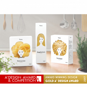
design award pasta https://competition.adesignaward.com/design.php?ID=52197
  • Having a clear packaging allows customers to “peek” into the product before purchasing, so they are able to better identify product ingredients, colors, texture, format… which can help verify that it meets their expectations and guide their buying decision. What you see is then what you get, there is no room for interpretation.
  • A transparent packaging transforms the product itself in a visual element of the packaging design. For the beauty and cosmetics markets, where the product is often visually appealing, creating an idea of luxury, having transparent packaging can help drive more attention on to the shelves. But other industries have jumped to this wagon lately and food brands have for instance. also been more creative in how they were showing their product inside the packaging, making it stand out in a fun way. See example of Pasta Nikita.
  • Transparency can create a sense of honesty and openness between the brand and the customer, building up trust in the brand. It gives an idea to the buyer that there is nothing to hide and that your brand believes so much in their product they are showing it to you “naked” from other elements that will distract you from the product itself.
  • If you are looking at making your product look and feel premium or high-end, transparent packaging is a way to go, as it often gives products a sleek and modern appearance. This can communicate quality and sophistication, which can translate into your ideal customer base and your product price tag.

As mentioned, brands will still need to make sure that they fit all required information into their (transparent) packaging. Here are some ideas on how to make this work:

  1. Use labels in a strategic way, place them where they don’t obstruct the view of the product such as the side or bottom of your packaging, or use smaller labels (using expansible ones).
  2. Print onto the packaging: using screen printing or an inkjet printer that can print directly onto plastic or other materials you can include the information directly into the packaging with color contrast.
  3. What about clear stickers or holograms? These can be attached over the packaging to provide the necessary regulatory details without obstructing the view of the product. This approach can be effective for adding required information, such as product expiration dates or manufacturing details that may be necessary to add at the end point of the printing process, and do not need to have a beautiful design, but be practical.
  4. Use QR Codes to bring customers to less relevant information. Using QR Codes is one of the Smart packaging initiatives that many companies have started using. With limited space, and lots to tell, technology can be your friend and a simple click can bring you to a wealth of information about the product. Think of adding details about the ingredients, giving ideas on recipes to combine with the product, or including information on a contest. Rather than cramping your package with all this, you can easily refer to it on a QR code and direct people to your website.
  5. Use packaging inserts: if online seems a little bit too fancy or your target audience is not that tech savvy, there is always the option for old fashioned paper inserts. Usage instructions, warnings, ingredients, an upcoming event, or a contest… all can be advertised through an insert included inside of the packaging or attached to the outer side of the packaging, as long as it does not obstruct the actual product view.
  6. Use textured packaging: with embossing or debossing on your packaging you will be able to add a texture to it, making it a product customers will want to touch and hold. It is unusual, and it brings an extra sense into the product experience, touch.

There are probably more ideas on how to make a transparent packaging work and still make sure you follow the regulations and include all mandatory information, without losing quality and attractiveness on your product. If you are using something else than the suggestions above, will you let me know? I am really interested in learning more on how to make a product stand out without cluttering the packaging and making your brand show transparency and trustworthiness through it. You can also share examples of transparent packaging that are working out for you/other brands you admire, or that simply made you laugh.

If you are interested in the topic and want to read more about “How seeing products on, or through, the packaging influences consumer perceptions and purchase behavior” take a look at the Oxford published paper here. Enjoy!

5 best practices for artwork coordinators to ensure packaging consistency

Image generated with MidJourney

Having a consistent brand experience is one important element for your product success in the market. Achieving this is not always easy, specially when companies have a multitude of products in different categories, or products that are targeted at different customer groups, when they use many different designers/agencies, and specially, when deadlines are tight. As an artwork coordinator, you have to bridge those gaps and make sure that your brand stands out, and is recognizable throughout all your different product lines, without incoherences and mistakes.

These 5 best practices can help you get there!

1. Define brand guidelines

We have talked about brand guidelines before. A complete brand book will contain the rules and directions on how to use design elements like typography, colors, imagery and logos, as well as define the brand tone of voice and messaging, so that the brand values and image are easily recognizable by the product users. Artwork coordinators need to have a deep knowledge of the guidelines, how to implement them, and when exceptions can be made. It is your job to make sure that the brand guidelines are complete, and cover all possible packaging scenarios, so that when new products are introduced, their packaging design is easily replicated with its specific differences and nuances.

2. Use consistent templates

Once you have your brand guidelines in place, you should make sure to develop templates that make your work easier when creating new artworks; that way, you can be sure that all your product line will have a similar look and feel. The templates can have locked out elements like the placement of logos, product name, or key visual elements, so that you can be sure that those align perfectly.

Not sure how you feel about it, but I hate when I purchase a bag of chick-pea crisps and a bag of lentil crisps from the same company, and the packaging is “slightly off”, with small detail things like: a logo is bigger in one bag than in the other, or moved to the side, or the key selling point of the product appears on a particular font or color, and these do not match. Clients notice these small things, and they are annoyed by them. At least, clients like me :D!

3. Work closely with designers

If you are not acting as a designer as well (which let’s be honest, happens quite often to artwork coordinators), you will certainly be working with them very closely, to create the packaging artworks.

It is of absolute importance that the guidelines are understood by the design team, so you should make it a priority to teach them about the guidelines, not just show them where the brandbook document is stored (*yes, I know you have done this before, it is ok, that is why I am here to let you know that you need to stop doing that and provide proper training on your brand guidelines).

Additionally, you also should make sure that they have all in their possession all key brand elements: logos in the right size and formats, fonts that they will need to use, color codes for RGB/CMYK, image bank/library access, design tool licenses… so that the quality of what they produce can be up to standards.

4. Conduct regular reviews

Once the packaging design is completed and in use, it is not crazy to plan periodical reviews. One clear scenario for this is when you are working with different designers/studios, or when you recently changed providers, so that you can compare their adherence to the guidelines and verify that brand consistency remains intact. It is also possible that over time, your guidelines evolve as your brand does, and this is also a moment when reviewing your packaging design would be needed, so that any changes implemented in the guidelines can also be put in place in your packaging moving forward.

These changes can also be driven by new regulations that require new icons/information on your packaging, and without a proper review, some of your artworks could be deviating from the way you want them to be created, just due to lack of communication about the changes, country-specific regulations, or others. It is your job as an artwork coordinator to have this under control, and ensure that the packaging effectively communicates the product’s value proposition at any given time.

5. Ensure consistent production

In the end, what the client will see is what they can get their hands on, so the final product on the shelves. For multiple reasons, the production of different products of your portfolio may not take place in the same printer, or production facility , which means that the printing or quality standards may vary. Because products end up sitting next to each other on the shelves, it is possible that two variations of a product / different line of a product, end up showing small (hopefully) differences in the final sold product.
Consistency of the final product with the approved artwork is key to a positive brand image. This is why it is often important to be able to compare the final product (e.g from a photo of a box, wrapping, bottle, can…) with the final approved artwork. This is something that you can for instance do with Twona X-RAY, a complete Artwork and Graphic Design Comparison Platform that helps you effortlessly review your text, graphics, and final packaging.

Compare your final product with your artwork files

Packaging consistency is therefore a matter of aligning multiple stakeholders and making sure they all adhere to the brand standard, templates and guidelines defined by your company. It involves activities such as information sharing, training, and reviews (multiple rounds) that often fall on the task list of an artwork coordinator, while juggling other many tasks and deadlines. The job of the artwork coordinator is a complex one, as we explained before!

Following these 5 best practices, we are sure that you will achieve more consistency in your packaging design and new product launch. Do you have any other tips to share with fellow artwork coordinators?