How user friendly is your packaging?

Consumers value convenience when deciding what products to use. Or more importantly,
“Consumers might not always be aware of the importance of convenience in their behavior until it is absent. “

Importance of Convenience in Consumer Behavior (analyticssteps.com)

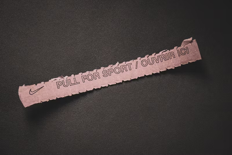
I don’t know about you, but I recently left a beautiful and perfect size lunch-box on the shelf because I struggled to open it when I tried to see the inside. And I hate it when opening a product outer packaging becomes a fight between me and the cardboard or plastic around it, but love the easiness of a little pull-me tab to tear the top so my purchase magically appears.

What are some elements that make product packaging user-friendly for me?

Easy-to-Open Designs

As mentioned, being able to open the packaging without it becoming a fight or having to read thru confusing instrutions, makes the whole world when you first are presented with a product. That creates a positive first impression and contributes to overall customer satisfaction.

Unboxing videos would not be so popular would you be seeing someone tear down cardboard and dangling with scissors to break into the purchased goods. Packaging that guarantees a quick access, an organized product structure, and is not too fragile to damage by mistake is crucial for customer retention and brand loyalty.

This is not always simple, specially when it comes to fragile goods that could damage during transportation, as even if the immediate product packaging may be friendly, the outer package could be a total nightmare. Therefore, manufacturers must consider the strength and integrity of the packaging to prevent accidental opening during transportation and storage while ensuring that end-users can open it effortlessly, which proves to be difficult to achieve sometimes.

Image: Thujey Ngetup , Unsplash

Some elements that you may consider to make your packaging easy to open are:

  • Tear strips and perforations
  • Pull tabs or finger lifts
  • Textured or embossed easy-grip features
  • Easy-to-peel seals, such as peel-off stickers or tape
  • Push-button releases

Resealable packaging

Packaging that cannot be resealed often means that consumers need to use other materials to reseal your product, or need to use a different container for it once opened, which defeats all your branding efforts.

Some products require to be re-sealed after each use, to preserve freshness or to prevent spills like personal care items, pet supplies, and household cleaners. Following in the convenience clause, your clients would appreciate being able to reseal the package without having to transfer the contents into additional containers.

Incorporate resealable closures, such as zippers, snaps, adhesive or magnetic strips; This allows users to open and close the packaging multiple times without compromising its integrity!

But this is easier said than done, as effective resealable packaging requires careful material selection and design considerations to maintain the integrity of the seal and prevent leakage, which also goes hand in hand with regulations about product safety or that increase the risk of tampering.

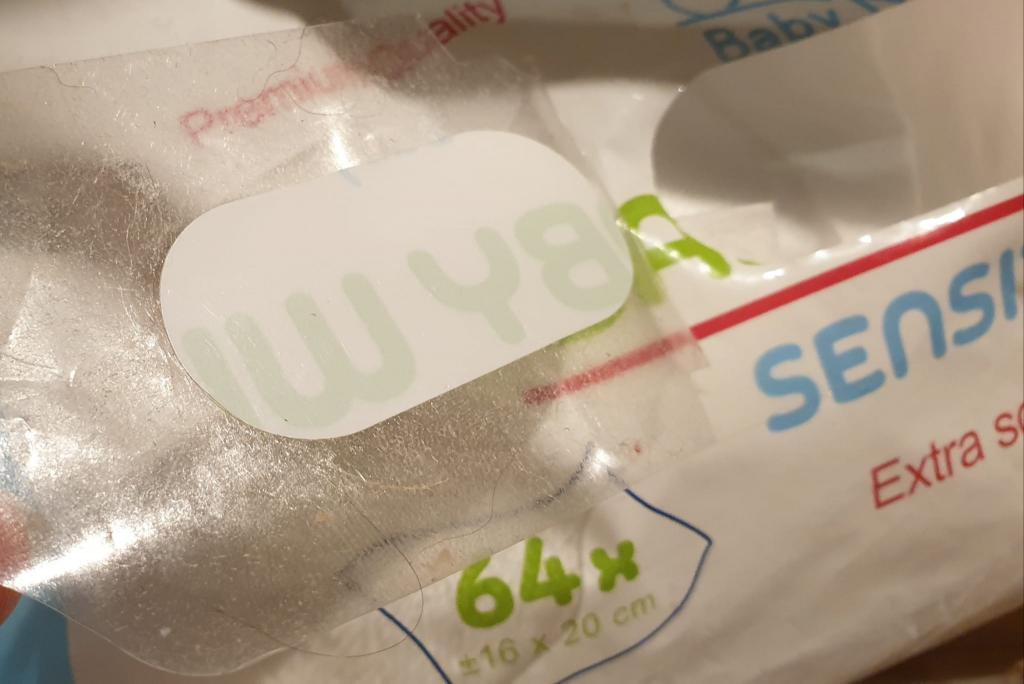
dirty re-seal adhesive

Additionally, manufacturers must conduct rigorous testing to ensure the resealing mechanism functions as intended throughout the product’s lifespan – this is not always the case when the re-seal gets in contact with “the elements” around it.

This often means that good resealing options come with a cost, and this is why they are not used YET on so many of the daily need products, but we start to see these in luxury or non-essential products. The trend is there, and as long as research continues and there is investigation into new ways of resealing products, and maybe some regulations come in to place, we will see these spread to essential products in due time.

Ergonomics

Ergonomics play a crucial role in user-friendly packaging, especially for products that consumers handle regularly or for extended periods. For example, in personal care products or household tools, ergonomic packaging reduces strain on users’ hands and provides a comfortable grip, enhancing the overall user experience. This is why ergonomic packaging will not only enhances the user experience but also demonstrates a brand’s commitment to customer satisfaction and well-being, making it a reason for staying loyal to a brand or product.

Manufacturers must carefully assess the target audience’s needs and preferences when designing ergonomic packaging. Conducting user testing and incorporating feedback during the design process can lead to packaging that aligns with consumers’ physical requirements and enhances usability.

Some ideas of ergonomic packaging that you can incorporate into your packaging

  • Soft-touch surfaces or materials, that enhance the tactile experience, and making the product comfortable to handle.
  • Curved edges and corners that make the packaging safer to handle.
  • Grip indentations that help handle the packaging securely and comfortably
  • Packaging that can be opened, closed, or dispensed with just one hand
  • Include handles into your packaging for easier handling and weight distribution

What are some innovations that you are carrying into your packaging design to make sure that it ticks all the boxes for convenience for your target group? How are you incorporating feedback from them into your design efforts? And finally, how are you making sure that the packaging meets all the regulations and brand requirements when it comes to these user-friendly elements?

Zuriñe García
Marketing

Transparency in packaging

If you are following packaging trends this year, one that stood out to me was the use of transparent packaging. With all the information that normally comes together on a product packaging, I feel that using a transparent one can be a big challenge for brands. However, I can see how using it also has a few advantages, which may outgrow the difficulties when it comes to sales and brand adherence.

Why would you should consider using transparent packaging, you ask? I bring you a few ideas on why this may be important for your product:

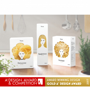
design award pasta https://competition.adesignaward.com/design.php?ID=52197
  • Having a clear packaging allows customers to “peek” into the product before purchasing, so they are able to better identify product ingredients, colors, texture, format… which can help verify that it meets their expectations and guide their buying decision. What you see is then what you get, there is no room for interpretation.
  • A transparent packaging transforms the product itself in a visual element of the packaging design. For the beauty and cosmetics markets, where the product is often visually appealing, creating an idea of luxury, having transparent packaging can help drive more attention on to the shelves. But other industries have jumped to this wagon lately and food brands have for instance. also been more creative in how they were showing their product inside the packaging, making it stand out in a fun way. See example of Pasta Nikita.
  • Transparency can create a sense of honesty and openness between the brand and the customer, building up trust in the brand. It gives an idea to the buyer that there is nothing to hide and that your brand believes so much in their product they are showing it to you “naked” from other elements that will distract you from the product itself.
  • If you are looking at making your product look and feel premium or high-end, transparent packaging is a way to go, as it often gives products a sleek and modern appearance. This can communicate quality and sophistication, which can translate into your ideal customer base and your product price tag.

As mentioned, brands will still need to make sure that they fit all required information into their (transparent) packaging. Here are some ideas on how to make this work:

  1. Use labels in a strategic way, place them where they don’t obstruct the view of the product such as the side or bottom of your packaging, or use smaller labels (using expansible ones).
  2. Print onto the packaging: using screen printing or an inkjet printer that can print directly onto plastic or other materials you can include the information directly into the packaging with color contrast.
  3. What about clear stickers or holograms? These can be attached over the packaging to provide the necessary regulatory details without obstructing the view of the product. This approach can be effective for adding required information, such as product expiration dates or manufacturing details that may be necessary to add at the end point of the printing process, and do not need to have a beautiful design, but be practical.
  4. Use QR Codes to bring customers to less relevant information. Using QR Codes is one of the Smart packaging initiatives that many companies have started using. With limited space, and lots to tell, technology can be your friend and a simple click can bring you to a wealth of information about the product. Think of adding details about the ingredients, giving ideas on recipes to combine with the product, or including information on a contest. Rather than cramping your package with all this, you can easily refer to it on a QR code and direct people to your website.
  5. Use packaging inserts: if online seems a little bit too fancy or your target audience is not that tech savvy, there is always the option for old fashioned paper inserts. Usage instructions, warnings, ingredients, an upcoming event, or a contest… all can be advertised through an insert included inside of the packaging or attached to the outer side of the packaging, as long as it does not obstruct the actual product view.
  6. Use textured packaging: with embossing or debossing on your packaging you will be able to add a texture to it, making it a product customers will want to touch and hold. It is unusual, and it brings an extra sense into the product experience, touch.

There are probably more ideas on how to make a transparent packaging work and still make sure you follow the regulations and include all mandatory information, without losing quality and attractiveness on your product. If you are using something else than the suggestions above, will you let me know? I am really interested in learning more on how to make a product stand out without cluttering the packaging and making your brand show transparency and trustworthiness through it. You can also share examples of transparent packaging that are working out for you/other brands you admire, or that simply made you laugh.

If you are interested in the topic and want to read more about “How seeing products on, or through, the packaging influences consumer perceptions and purchase behavior” take a look at the Oxford published paper here. Enjoy!

Striking the Right Balance: Key Aspects of Designing SOPs for Pharmaceutical Packaging

Midjourney

Designing packaging materials for pharmaceutical brands can be a meticulous and complex process. As a designer working for a studio that works exclusively with pharma, my work primarily involves implementing a strict set of rules on various packaging materials that will be commercialized across different markets. To keep everything in check, in my team we write SOPs tailored to each customer. In this article, I’ll discuss the key aspects we consider when writing those SOPs and comment on the balance between effectiveness and completeness.

Clarity and Simplicity

The first aspect to consider when writing a design SOP is clarity and simplicity. The document should be easy to understand and follow for all team members, regardless of their expertise or experience. If a Junior designer cannot follow the document, then it does not fulfils its purpose. This can be achieved by using clear language, avoiding jargon, and providing visual examples when necessary. An image might be worth a thousand words. An effective SOP should prioritize essential information and avoid excessive detail to ensure that it remains concise and focused. If complex details are needed, you can always reference a more complex or complete document such as complete brand design guideline.

Compliance with Brand Guidelines and Regulatory Requirements

Pharmaceutical packaging must adhere to both the company’s brand guidelines and the regulatory requirements of the target market. It also needs to comply with all technical specifications from the manufacturing entity. A design SOP should provide clear instructions on how to maintain consistency with the company’s visual identity and fulfill the necessary legal obligations. This includes guidelines on colors, fonts, logos, and layout, as well as any specific labeling requirements mandated by law. And these change per country! Templates are in this case VERY useful.

Adaptability for Different Formats and Materials

We deal with packaging in various formats and materials, such as boxes, bottles, and blister packs. An effective design SOP should account for these variations and provide guidance on how to adapt designs accordingly. If you ever faced implementing a tini tiny label, then you know what it’s like. This may involve including modular design elements that can be easily rearranged or resized to fit different formats. Again, templates are your friend.

Revision and Update Process

Finally, a design SOP should include a clear process for revising and updating the document. This is crucial to ensure that the SOP remains relevant and up-to-date with any changes in brand guidelines, regulatory requirements, or industry best practices. This is particularly critical if your studio is ISO compliant. It is as important to make the right changes as to track who made those changes and why.

Striking the Right Balance

An effective and useful design SOP should provide enough information and guidance to ensure that all team members can create consistent, compliant, and technically correct packaging materials. However, it’s essential to strike the right balance between providing necessary details and overwhelming the reader with excessive information. An over-complete SOP may lead to confusion, inconsistencies, and a slower design process. By focusing on the key aspects outlined above, you can create an SOP that is both comprehensive and efficient, ensuring that your pharmaceutical packaging designs meet the highest standards.

If you are unsure as to what is the right level of detail, use an Agile process. Write a draft, let your team use it, get feedback and refine the document iteratively.

Your Studio Partner

Do you feel stuck with your current design process? Reach out to our studio and let us give you a hand. We can help you implement artworks or improve your studio processes.

Your Studio Partner

What in the world is AMS?

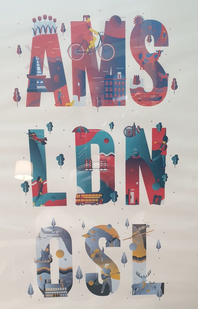
Airport codes in illustration by SailHo Studio

AMS is not only the Airport code for the city Twona is based in, but also used as an abbreviation for an Artwork Management System. This is a software solution designed to streamline the creation, approval, and distribution of creative assets such as packaging elements, leaflets, labels, and other marketing materials.

The goal of an AMS is to simplify and automate the often complex and time-consuming process of artwork creation and management, thereby reducing errors, saving time, and improving overall efficiency.

It also means that all data related to your artwork is stored in one place; no more versions saved on local drives claiming to be the most recent and sent around stakeholders in error, conversations and discussions in one repository ensuring transparency for all stakeholders involved and don’t forget traceability of who did what when. 

There are many benefits to introducing an AMS into a company that produces any type of packaging, labels or marketing leaflets. Here are a few of the most important:

  1. Centralised storage and organisation: An AMS provides a centralised location for storing and organising all creative assets. This makes it easier for teams to find the assets they need, and also reduces the risk of assets becoming lost or misfiled.
  2. Improved collaboration: An AMS makes it easier for teams to collaborate on the creation and approval of creative assets. With an AMS, teams can easily share feedback and revisions, reducing the need for multiple rounds of revision and improving the speed at which projects can be completed.
  3. Better control and visibility: An AMS provides a centralised location for tracking and monitoring the progress of artwork projects. This makes it easier for managers to see which projects are on track, which are running behind schedule, and which need additional attention.
  4. Enhanced brand consistency: An AMS helps to ensure that all creative assets are consistent with a company’s brand guidelines. This helps to maintain a consistent look and feel across all marketing materials, improving brand recognition and credibility.
  5. Increased efficiency: An AMS automates many of the manual processes involved in the creation and management of creative assets. This saves time, reduces errors, and improves overall efficiency.
  6. Compliance and regulatory support: Some AMS can help companies comply with regulations and standards by automatically checking that all creative assets meet the required guidelines. This helps to avoid costly mistakes and ensures that all materials are compliant with industry regulations.
  7. Streamlined approval processes: An AMS can help to streamline the approval process for creative assets by automating many of the manual steps involved. This reduces the time required for approval and makes it easier for teams to keep track of the status of each project.

If you are thinking that your company would benefit from an AMS, there is no harm in reaching out and talking to a few. We here at Twona would be more than happy to help you make the decision to invest in an AMS or not. We are also honest and will let you know if Twona is or isn’t right for your needs. So, get in touch today and let’s start the conversation.

Streamlining Proofreading: Tips and Tools for Artwork Specialists and Designers

Proofreading is a critical step in the packaging and labeling process, ensuring that the final output is accurate, compliant, and visually appealing. With the complexity of modern packaging and the need for precision, specially in the pharma and food industries, streamlining the proofreading process is essential. Below you can find some tips and tools to help improve your proofreading process, with a focus on the benefits of using Twona X-RAY as a powerful proofing solution (which also has a free version).

3 Golden Tips for Streamlining Proofreading

  1. Develop a systematic approach: Establish a consistent proofreading process that includes a checklist of items to review, such as text content, layout, color, and other visual elements. Write an SOP for your specific artwork types. Identify the technical specs of your designs (outlined, open, images, number of columns) and define the right approach for your artworks to ensure a smooth proofreading experience.
  2. Collaborate effectively: Work closely with your team to ensure everyone is on the same page and has a clear understanding of those SOPs and has had proper training.
  3. Leverage technology: Do not check artwork changes “by eye”. Use a (preferably web based) tool to check your artworks and compare PDF to PDF, PDF to Word, PDF to Photo and more.

Twona X-RAY: A Powerful Proofing Solution for Artwork Specialists and Designers

Twona X-RAY is a modern SaaS proofing solution designed for highly regulated verticals (like pharma, food, retail and printing) to help artwork specialists, designers, regulatory affair specialists and quality assurance managers streamline their proofreading process. The software offers several key advantages that make it an ideal choice for packaging and labeling in highly regulated markets:

SaaS Web-Based System

As a SaaS web-based system, Twona X-RAY allows users to access the platform from anywhere with an internet connection, making it a convenient and flexible solution for remote teams and professionals on the go (yes, it also works on your phone and tablet). The cloud-based system also ensures that updates and improvements are automatically applied, keeping your proofing tools at the forefront of industry standards.

Computer Vision Technology

Twona X-RAY leverages advanced computer vision technology to align photos and master files, ensuring that all visual elements are accurately compared during the proofreading process. This innovative feature not only reduces manual work but also minimizes the risk of errors or discrepancies. It has been design with a few key use cases in mind:

  • Print proof checking: take a picture with your phone of that freshly printed proof and compare it on the spot with your master file before you give the go ahead with thousands of prints. The computer vision algorithm will perform a deep analysis to transform your photo and match it against your master design file.
  • Keyline alignment: automatically align an empty keyline with a completed design to check that the right keyline has been used.
  • Automatic alignment: when your provider rotates, changes or scales your design to match the printing machine, X-RAY will automatically align your files so you can easily compare them.

Text Comparison and Visual Graphic Comparison

The software offers robust text comparison and visual graphic comparison capabilities, allowing users to quickly and easily identify any differences between the original design and the final output. This ensures that all text and graphic elements are reviewed thoroughly, resulting in a higher level of accuracy and compliance. X-RAY can also extract text using OCR to allow you to check even the most difficult jobs.

Validated and Full Traceability

Twona X-RAY is a validated solution, ensuring that it meets the stringent requirements of the pharmaceutical, food, and retail industries. The software also provides full traceability, maintaining a complete record of all proofreading activities, including changes made, user information, and timestamps. This level of transparency and accountability is invaluable for organizations seeking to maintain compliance with industry regulations.

Ready to try it yourself?

Improving Collaboration between Designers, Artwork Coordinators, and Regulatory Affairs Professionals

Midjourney

In the complex world of product packaging and labeling (Pharma and Food mostly), effective collaboration between designers, artwork coordinators, and regulatory affairs professionals is crucial for ensuring compliance, efficiency, and overall success. With ever-changing regulations, tight budgets and timelines and a large set of very different stakeholders, having a streamlined process that connects everyone is essential. Below you will find some key aspects of how to optimize collaboration centered around the benefits of using an Artwork Management System (AMS) like Twona NeXT.

Establish Clear Communication Channels

One of the main challenges every organisation faces when there is a large number of SKUs and stakeholders involved is maintaining clear and effective communication. To address this, you must establish a clear communication channel for each project, where all stakeholders can share updates, feedback, and relevant information. While tools like Slack or Microsoft Teams can help facilitate these conversations, they are hardly suitable for highly regulated environments due the lack of traceability. Additionally, they tend to be disconnected from the projects themselves, serving only as a platform for discussion. Ensuring a Single Source of Truth is key wile Slack or Teams can be used as secondary channels by means of an integration. This means, for instance, a notification can be sent from your system to Slack when a project reaches a certain milestone.

Define Roles and Responsibilities

It is essential to outline the roles and responsibilities of each team member involved in the packaging workflow. Clearly defining who is responsible for what tasks or step ensures accountability and helps prevent confusion and potential bottlenecks. Create a detailed SOP that outlines each step in the workflow, add your work instructions to facilitate adoption and prevent errors and arrange training for every stakeholder involved in the process.

Implement a Centralized Artwork Management System

Using a centralized AMS like Twonas can significantly improve collaboration between designers, artwork coordinators, and RA. Twonas offers a unique set of features that are tailored to meet the needs of the Pharmaceutical, Food, and Retail Industry, making it a perfect choice for managing your artwork projects.

Some of the unique selling points of Twonas include:

  • Automated Workflows: Twonas streamlines the entire process by automating tasks, reminders, and approvals. This helps to eliminate manual processes and reduce the risk of errors or delays.
  • Real-Time Collaboration: Twonas allows team members to collaborate on projects in real-time, ensuring everyone is always on the same page. This feature is particularly useful for reducing the number of feedback rounds.
  • Version Control: Twonas offers a robust version control system that tracks changes and maintains a complete history of all artwork files. This feature helps to prevent confusion and ensures that everyone is working on the latest version of the project.
  • Integration with Third-Party Tools: Twonas integrates with key applications making it easy to connect your existing workflow and systems.

Continuous Improvement

Finally, always be open to learning and improvement. Regularly review your processes, gather feedback from your team (both internal and external), and identify areas for improvement. Implementing a culture of continuous improvement will help ensure that your team is always working efficiently and effectively.

Want to know more? Then drop us a line and we will be happy to discuss your process needs.

Claves del éxito al afrontar el diseño del packaging de un nuevo cliente

En el mundo del diseño, la creación de plantillas de diseño o templates a partir de ahora, es esencial para el éxito de cualquier proyecto. Un template es un documento o archivo que se utiliza como base para la creación de nuevos diseños o materiales. Pueden ser simples, como una página en blanco con un borde, o pueden ser más complejas, con una estructura detallada que incluye una variedad de elementos y características.

Call-E image

Necesito encontrar todo o casi todo lo que necesito en un mismo lugar, si no pierdo demasiado tiempo en buscar recursos y no en el propio diseño.

Cualquier diseñador

La importancia de crear templates adecuadas para futuros proyectos radica en la eficiencia que proporciona al proceso de diseño. Un template bien diseñado asegura que los diseños sean coherentes y que se mantengan dentro de la marca o la identidad visual de la empresa. Además, permiten que los diseñadores trabajen de manera más rápida y eficiente, reduciendo el tiempo de creación de un diseño y, por lo tanto, maximizar nuestros recursos.

Al crear los templates, es fundamental asegurarse de que su contenido sea apropiado para el proyecto en cuestión. Si no está diseñada específicamente para el proyecto puede generar problemas de coherencia, o peor aún, puede llevar a errores costosos. Por ejemplo, si una empresa tiene un template para un folleto que se utiliza para anunciar un producto específico, pero luego se utiliza para anunciar un producto diferente, el resultado puede ser una confusión entre los clientes potenciales y una pérdida de credibilidad de la marca.

Los documentos de apoyo son la base para un proceso de trabajo eficiente, se debe tener en cuenta que el template no solo debe ser funcional, sino que también debe ser fácil de usar. Los diseñadores que trabajan en el proyecto deben poder entender y utilizarlo de manera efectiva para que puedan trabajar con rapidez y eficiencia. Por lo tanto, es importante que sea claro, intuitivo y fácil de navegar.

Un ejemplo real para producir el packaging de un nuevo cliente por ejemplo en el sector farmacéutico sería de la siguiente manera:

  • 1. Proyecto piloto: es importante que haya un proceso inicial de aprendizaje donde trabajamos con una muestra que debe abarcar gran parte de los tipos de productos y siempre es importante que contenga ejemplos difíciles. No nos interesa aprender implementaciones sencillos para sufrir inevitablemente cuando lleguen productos complejos obviando que no podemos cubrir todas las opciones.
  • 2. Documentación de apoyo: una vez hayamos trabajando y aprendido los productos en la fase inicial es hora de generar los documentos de apoyo necesarios como templates, procedimientos y los checklists pertinentes. Siguiendo con el ejemplo debería haber tantas triadas (procedimiento, template y checklist) como categorías de productos: Envases, prospectos, aluminios, etiquetas, sobres, etc.
  • 3. Formación, uso y mejora constante: es necesario apuntar que dichos documentos deben ser de uso común y dado que son documentos vivos deben estar en continua revisión partiendo de su uso continuo mejorando y simplificando dichos archivos periódicamente. Es muy común que el contenido inicial de dichos documentos sea más extensiva que concentrada por motivos de seguridad y calidad.
Dall-E image

Resumiendo, el diseño del packaging tiene muchos detalles que hay que conjugar alineando también agentes externos con detalles técnicos de los fabricantes y excepciones que no encontrarás en ningún documento. La clave esta en tener una fase inicial que nos ayude (piloto), para nutrirnos de archivos de apoyo que nos faciliten el proceso (templates, procedimiento, checklists) para acelerar el diseño del 90% de los productos y así tener tiempo para las excepciones y seguir creciendo.

Streamlining Label Design Projects: Leveraging Google Sheets and Twona Integration for Efficient Artwork Coordination

With Midjourney

In today’s fast-paced retail environment, companies specializing in providing products to retailers require efficient solutions to manage the high volume of label design projects. When selling a product, these organizations need to create or adapt and existing label and sometimes even customise it for their clients to include their details and design components. For Artwork Coordinators, streamlining the project management process while maintaining accuracy and efficiency is crucial. A remarkable solution that we have found works well with our customers is the integration of Google Sheets and Twona, our artwork management system, using an API via Zapier – a connector system.

This innovative integration has proven to be a game-changer for many organizations, as it allows them to create 50 or more label design projects in one go. The process is simple: Artwork Coordinators fill in the required details in a Google Sheet, which can be fully customised, and the API connection with Twona automatically creates projects for each entry. This setup provides the best of both worlds – the familiarity and speed of a spreadsheet, combined with the robust tracking capabilities of a project Artwork Management System. Furthermore, the sheet can then be kept updated as the project proceeds, giving teams a great deal of visibility.

The benefits this integration brings to the workflow include:

  1. Familiarity and ease of use: Google Sheets is widely recognized for its user-friendly interface and seamless collaboration capabilities. Teams can effortlessly input project details and requirements into the spreadsheet without any additional training.
  2. Speed and efficiency: By merely filling in a Google Sheet document, companies can create 50 or more projects in one go. This bulk creation feature significantly reduces the time spent on setting up individual projects, leaving more time to focus on other aspects of the work.
  3. Accurate tracking: Twona’s Artwork Management System enables organizations to monitor the progress of each project, from design to completion. With the integration in place, manual data entry and miscommunication among team members are eliminated. Real-time status updates help manage deadlines and ensure project deliverables are met.
  4. Time and cost savings: The integration of Google Sheets and Twona eliminates the need for manual data entry, significantly reducing the time spent on project setup. Consequently, this translates into cost savings, as resources can be allocated more efficiently.
  5. Error prevention: The API connection between Google Sheets and Twona ensures that data is transferred accurately, reducing the risk of errors. This not only saves time but also helps maintain a high level of quality across all projects.

The integration between Google Sheets and Twona via an API through Zapier has been instrumental in optimizing label design projects for some of our clients who manage very large volume of designs with short timelines. By leveraging the familiarity and speed of a spreadsheet along with the tracking capabilities of a project Artwork Management System, organizations can streamline their workflows, save time, and prevent errors. If your organization is looking for ways to improve artwork coordination processes, consider integrating a popular spreadsheet tool with a reliable Artwork Management System – it might just be the game-changer you need.

Improving your Artworks Workflow

With Midjourney

As an artwork coordinator working for a pharmaceutical company, I oversee the packaging design process from start to finish. It’s a complex process that involves multiple stakeholders and departments: regulatory, supply chain, printing houses, customers (we also do Contract Manufacturing), Quality Assurance, etc. It requires careful coordination to ensure that everything runs smoothly. Over the years, we’ve refined our process to the best of our abilities, but as with any complex system, there’s always room for improvement. We make our process work, but it requires constant emails, reminders and nudges to certain stakeholders to keep everything in check.

When we decided to purchase an Artwork Management System, we agreed to bring in an external workflow and process consultant to help us optimize our packaging design workflow as we intended to digitise our process. At first, I was a bit skeptical. After all, I knew our process inside and out, and I wasn’t sure how an external consultant could provide any value. Our initial plan was to simply move from a manual email based workflow to a digital one. However, after a couple of phone calls regarding the process, we realized that an external set of eyes can sometimes identify issues in your process that you simply cannot see because you’re too close and too busy.

The Consultant

The consultant that came in had extensive experience working with other pharmaceutical companies, not only within brands, but also in CMOs, design agencies, etc. He got us started by going thought our current process, which was drawn on a white board and asking a lot of questions as we went through every stage: who is involved, what information is provided, when, what are the challenges, what happens in this and that scenario, etc. Very quickly he was able to spot a few areas where we could make improvements. There were a couple of key aspects that were particularly interesting where he suggested some changes in the process by analysing and justifying those suggestions. The following was one of the most relevant ones:

Our Process

In the beginning of our process, the Regulatory Department provides the key information related to the change that has to be implemented in the packaging material: a new text, a set of annotated changes due to a change in regulations and anything in between. When this information is received, the Artworks Team checks it and forwards the request to the agency to execute the changes. Later in the process, once the design has been implemented, the Regulatory colleagues check the artwork to make sure it complied with their request for change. The consultant asked: how often does an artwork need to be redone because Regulatory spotted a mistake in the content (not a mistake introduced by the design agency). The answer across my team was consistent…..very frequently. The consultant then made an estimate of the amount of hours involved across all teams between the moment the request is sent by RA and the moment the design is sent back to them for changes. We calculated around 40 to 50 hours of work.

The Suggestions

His suggestion was simple: add a four eye principle on the information provided by Regulatory BEFORE the artwork request is sent to the agency. The objective was to validate the information before those 40 to 50 hours of work were spent on the artwork so that the number of iterations would be reduced. We quickly involved the QA team, who happily agreed to review the data before it was sent to the agency. It was brilliant. A simple suggestion, a nudge to the colleagues in QA and the potential time savings were incredible.

At first, I was a bit intimidated by the prospect of implementing all suggested changes. After all, change can be difficult, especially when you’re dealing with a process that has been in place for years and many stakeholders involved. However, with an open discussions and proper justification of each suggested change, I realized that these changes were all aimed at making our jobs easier and more efficient. By embracing these changes, we could reduce the amount of time and resources we spent on each project and ensure the best possible outcome. Having an external set of eyes also helped align all relevant parties (external people are not afraid of starting difficult conversations).

Over the next few months, we worked closely with the consultant to implement the changes he had suggested. It wasn’t always easy, and there were a few bumps in the road, but overall, the process went smoothly. We saw an consistent improvement in in our process. and our workflow became much more streamlined. We were able to complete projects more quickly and with fewer errors, which made everyone involved in the process much happier.

Looking back, I’m so glad we decided to bring in an external set of eyes to help us optimize our packaging design workflow. I’m excited to see what other improvements we can make in the future, and I’m grateful for the opportunity to work with such a talented consultant.

If you want an external set of eyes on your process, setup a call with us and let’s work together to make your workflow flawless.

Contact us

Your Quality Assurance in Check

Our Studio works under a four-eyes principle when it comes to artwork production. In any workflow, either our own or one that the customer decides upon, we always introduce an internal QA step. None of our Artworks are sent to the clients before they go through the review of a different person within the department who was not involved in the initial design.

Why is that?

Instructional brochure image – generated with Midjourney

Very simple. When you have been working on a leaflet or an instructions brochure for an hour (sometimes even more!), you are no longer able to distinguish a small mistake. A separate person who was not involved in the original design is the perfect person to take a fresh look at the artwork and detect any potential issues.

It is also essential that this person knows what they need to review, aside of the obvious mistakes that one could have introduced.

  • The internal QA check needs to start from a clear check of the briefing /work order request that has been received. This is because sometimes there are requirements in these that deviate a bit from the customer guidelines.
  • These guidelines are the next step. Clients often have very clear instructions on there about their fonts, colors, and graphics. It is crutial to have them accesible but also include your own annotations on how the guideline is generally interpreted, as you will find that sometimes they can be a bit ambiguous.
  • Regulatory information must be kept updated. Because of regulations being constantly evolving, it is helpful to make sure that you keep any documents related to rules that apply to your packaging designs up to date for anyone doing a QA review, so they can fall back on to it when checking the artworks.
  • Check for consistency – does this package/label/blister have major differences with others produced earlier on? If so, what are the reasons for that? (new regulations, change in guidelines, specific customer request…).

One thing that our team uses frequently when undergoing the internal QA process is to refer to a checklist that they have developed. This checklist starts as a template (which you can download for your own use), with generic areas to review, although they often create one specific for each customer, to make sure that the client’s peculiarities are included and always visible to the review team.

Using such a checklist has many advantages for our Studio:

  • Error reduction – with a four eye principle in combination with a proper checklist, we are able to reduce the amount of oversights and not pass imperfect artworks to our clients – incorrect information, missing or incorrect formats, or design inconsistencies. We may have an extra internal version on occasion, but we make sure that the changes the client sends back are reduced to a minimum. This is one of the reasons why our average number of versions on artworks is so low.
  • Compliance – we obviously follow the guidelines and industry regulations when we create artworks but by using a checklist, we are able to reduce risk of not being compliant with these as the specific requirements are included in the checklist making them hard to miss.
  • Time and Cost Savings – by potentially catching errors or issues before they reach the client, we are able to save both time and money. Imagine that these errors lead to a recall packaging redesign, the effect that this would have on both our team and our clients’ would be massive.
  • Collaboration – for us, checklists are also a way for our team to remain a good working team. By sharing the checklists not only with designs but also other involved departments, we are able to give visibility to all the team members and make them part of the same shared objective. So it may be a soft advantage, but in the long run, a close team who works together would be a much stronger one.
  • Competitive advantage – not all studios provide these type of quality services. A lot of times there is a GiGo mentality, and imperfection is rewarded (e.g. when each single subversion of an artwork is charged for). For us, it is really mandatory that the product we deliver is as good as it can get. Therefore, this quality control step is a key one.

If you also find quality an essential step in your artwork process, and need some help getting started, you can download our checklist template from this link. Remember that adding your own items to the list is very important!!