Alternative solutions for pharmaceutical packaging to serve an ageing population (*)

(*) and those of any age with impaired visibility

By 2030, 1 in 6 people in the world will be aged 60 years or over

World Health Organization
image generated with MidJourney

As the global population ages, the demand for medication will also increase. Already 10 years ago, some 87 % of people aged 75 years or more reported using prescribed medicines on a regular basis (Ageing Europe report, 2020 edition). This number is only expected to rise. As a marketer, I see this as a clear change in the target audience for pharmaceutical and life sciences companies, a change that needs to be accompanied with support on the product side for the unique requirements of older people.

This includes packaging of the products, of course, which require innovative solutions to meet the needs of a new target group while providing all crucial and mandatory information, and do so in multiple languages.

Font sizes

One of the areas where improvements may be needed is readability of the product information. While the standard clear print size for fonts to be readable is established at 12 points, this is by far not the norm in pharmaceutical leaflets, labels and others, where sizes of 7 to 9 points are more the average (this can be even smaller for food packaging, but that is a story for a different post!).

Of course, it is understandable that they are dealing with space limitations to provide a very large amount of information that is critical (and non-optional). However, due to this criticality, it is of importance that the user of the product would be able to read it properly.

Solutions like Attach-A-Leaflet®, which allows for a multi-page label to be used in a product, can help with increasing the font size while keeping packaging small.

Images/illustrations

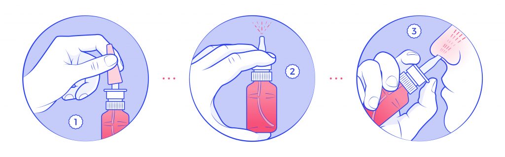
Another aspect to help with readability, is making the leaflets easier to decipher. In general, medicine leaflets are difficult to understand for the average Joe/Jane. If the average Joe/Jane is also on the older spectrum, the difficulty increases. This is why, using images in leaflets can help translate some of the complex terms into relatable instructions to follow, making it more accesible to a wider audience.

Creating clear, easy to understand, and attractive-looking images/illustrations that support the application instructions of medicines can suppose a significant improvement for the end-user. On the packaging design sign, adding illustrations to leaflets represents an extra layer in the packaging design; however, these illustrations do not need to be changed frequently, they can be outsourced or purchased to a third party specialized in creating these sort of materials (hint: we can offer you these services, but of course, feel free to do extended research).

Images of instructions to use a nasal spray
Image by Twona

Personalized packaging

Personalization is a growing marketing trend in multiple industries, as a way to distinguish yourself from competitors. In Pharma, this personalization may come with an added value of tailoring the packaging to the individual patient needs, through the use of technology. Think of including personal medication dosages, intake instructions, or reminders to take medication.

When thinking of personalized packaging, these are some of the forms it can take:

Pre-packaged Medication

The main use of pre-packaged medication is to dispense medication into individual packages, which contain information such as the patient’s name, administration instructions and dosage in a personalized label. The main objective of these labels is to ensure patients are taking the correct (amount of) medication, so the risk of medication errors is reduced.

Electronic Medication Dispensers

In addition to pre-packaged medication, technology can also make sure that medicines are dispensed automatically to the patient at specific times, reminding patients to take medication, and providing alerts if a dose is missed. Electronic medication dispensers can be programmed to this purpose.

Smart Packaging solutions

Another idea to make packaging of medicines more accesible is to introduce the so-called Smart Packaging solutions. These innovative solution utilizes technology to provide drug users with individualized information about their medication. These can be interactive features such as audio or visual instructions such as dosage instructions and potential side effects, that are specific to the patient’s personal needs. For older people who may not be able to read small print or forget complex medication regimens, Smart packaging can give users the confidence that they are taking the correct medication at the right time, reducing the risk of medication errors.

What types of Smart packaging can be used?

  • Interactive Packaging: videos, animations… in the form of augmented reality (AR) and accessed through a smartphone or tablet that can educate patients about their medication.
  • Near Field Communication (NFC) Packaging: allows patients to receive information on their mobile device about dosage, potential side effects, and other important information.
  • QR Code Packaging: Patients can scan the QR code, and access information about the medication, including dosage instructions and potential side effects.

Extending braille beyond the box

“The name in Braille does not have to be printed on the immediate packaging – such as blisters, ampoules and bottles, it only has to appear on the outer/secondary packaging, which is normally a carton”.

Guidance concerning the Braille requirements for labelling and the package leaflet

While not mandatory, extending braille beyond the traditional use of embossing it on the boxes, would make these more accesible to an older generation with – quite frequently – an impaired sight, giving the more independence to manage their medical needs in a safely manner . Here are some examples:

  • Blisters and caps: braille added on blisters holding individual pills or medication caps would allow individuals to identify medicines by touch.
  • Labels and leaflets: adding braille to the medication labels and leaflets would allow visually impaired individuals to access information such as dosage, expiry dates, warnings, contraindications, side effects…
  • Vials: the use of braille in vials could be limited to information such as name, expiry date, dosage

These are some of the ideas that come to mind in order to make pharmaceutical packaging design more accesible to the needs of the ageing population (although already without thinking about a user of age, the blind and visually impaired would benefit from these improvements on a daily basis!). Ideally, everything would be implemented in the future but I would be happy to see small steps towards that goal, and legislation coming into place to make more of these “nice to haves” mandatory moving forward. What is your take on this?

Artwork Management? On the Cloud, please

Photo by Massimo Botturi on Unsplash

If you follow the news, you will have heard of the cyber attacks that many pharmaceutical companies suffered in since a few years. The pandemic, and the sheer need to work from home and for employees to remotely access their valuable data, left companies that were not well prepared for this change in terms of security measures, highly unprotected for these schemes.

Besides the obvious consequences of data loss, and potential stolen intellectual property, there are other larger results like job losses and regulatory fines. However, companies’ reputation and brand can be also affected. According to this Forbes Insight report, 46% of organizations had suffered damage to their reputation as a result of a data breach.

One of our customers was the target of such cyber attacks in 2022. A lot of their data which was sitting in internal servers was compromised, affecting several areas within the company. Employees could not access data for days, and loss of information was experienced. Luckily, the Artwork and Regulatory teams were dealing with their packaging designs using our cloud-based Artwork Management System, so they could continue working normally and no data was lost for them.

Even though the Artwork Management Software Market Share is Expected to Grow at a CAGR of 9.0% 2022 to 2028, using Cloud technologies is not always a given for Life Sciences companies. Many of them do not consider a SaaS solution when looking at a change on their artwork management system, and insist on having it installed in their own servers. The main reason for this is that they consider they can have a better control on the application, and they believe it will be more secure.

Wrong.

More secured?

Cloud service providers offer heavy physical security measures to protect their data centers: advanced security systems, including biometric authentication, surveillance cameras, or 24/7 monitoring. They also have redundancy in place to ensure that data is not lost due to natural disasters or other events. Providers will also hire security professionals solely dedicated to ensuring that their infrastructure and services are secure; and since they have access to the latest security technologies, adapting to new threats is very quick.

More control?

When it comes to “having more control” over the solution, the reality shows that, often, organizations rely on manual processes to detect any unusual activity, which can be time-consuming, prone to errors, and too late when a serious problem occurs. Cloud service providers on the contrary, have continuous monitoring in place to detect any unauthorized access or unusual activity. They use advanced security technologies such as intrusion detection and prevention systems, firewalls, and access controls. And they have the time and resources to continuosly do security audits and vulnerability assessments to identify and address any weaknesses in their infrastructure.

Furthermore, on-premise solutions may not be updated regularly, leaving them vulnerable to new threats. When updates do occur, systems often need to be shut down for a period of time, and users are not allowed to log in until the changes have been implemented and tested on the production environments. Cloud solutions are constantly being improved, and most changes do not require a full stop of system usage, as often new releases can be done within a few minutes and are transparent for the common user. This, in consequence, means that updates on cloud solutions tend to happen on a more regular basis.

One other set back for on premise solutions is that organizations may not have the resources available to scale up in case of increased usage or large growth, as this requires investing in additional own hardware and infrastructure for which one may not have the money or the floor space for! In a cloud environment, one can quickly add or remove storage capacity based on requirements without needing any extra space, and at a fraction of the cost of own infrastructure.

Considering all the above, we believe – and hope that we have also given you enough reasons to believe the same – that Cloud solutions are a better, more flexible and economical solution for companies looking at updating their Artwork Management platforms.

Our solution, Twona, is a SaaS solution, and hosted in the cloud. We review the infrastructure underneath it regularly, to make sure it is upgraded to the latest at any given time, and constantly work on ways to improve our solutions performance based on these. And, if you still need some more reassurance, I would like to add as a final notes that at Twona, we have a recovery protocol whereby in a matter of hours, we are able to replicate our set up and get our clients functioning again.

Your Quality Assurance in Check

Our Studio works under a four-eyes principle when it comes to artwork production. In any workflow, either our own or one that the customer decides upon, we always introduce an internal QA step. None of our Artworks are sent to the clients before they go through the review of a different person within the department who was not involved in the initial design.

Why is that?

Instructional brochure image – generated with Midjourney

Very simple. When you have been working on a leaflet or an instructions brochure for an hour (sometimes even more!), you are no longer able to distinguish a small mistake. A separate person who was not involved in the original design is the perfect person to take a fresh look at the artwork and detect any potential issues.

It is also essential that this person knows what they need to review, aside of the obvious mistakes that one could have introduced.

  • The internal QA check needs to start from a clear check of the briefing /work order request that has been received. This is because sometimes there are requirements in these that deviate a bit from the customer guidelines.
  • These guidelines are the next step. Clients often have very clear instructions on there about their fonts, colors, and graphics. It is crutial to have them accesible but also include your own annotations on how the guideline is generally interpreted, as you will find that sometimes they can be a bit ambiguous.
  • Regulatory information must be kept updated. Because of regulations being constantly evolving, it is helpful to make sure that you keep any documents related to rules that apply to your packaging designs up to date for anyone doing a QA review, so they can fall back on to it when checking the artworks.
  • Check for consistency – does this package/label/blister have major differences with others produced earlier on? If so, what are the reasons for that? (new regulations, change in guidelines, specific customer request…).

One thing that our team uses frequently when undergoing the internal QA process is to refer to a checklist that they have developed. This checklist starts as a template (which you can download for your own use), with generic areas to review, although they often create one specific for each customer, to make sure that the client’s peculiarities are included and always visible to the review team.

Using such a checklist has many advantages for our Studio:

  • Error reduction – with a four eye principle in combination with a proper checklist, we are able to reduce the amount of oversights and not pass imperfect artworks to our clients – incorrect information, missing or incorrect formats, or design inconsistencies. We may have an extra internal version on occasion, but we make sure that the changes the client sends back are reduced to a minimum. This is one of the reasons why our average number of versions on artworks is so low.
  • Compliance – we obviously follow the guidelines and industry regulations when we create artworks but by using a checklist, we are able to reduce risk of not being compliant with these as the specific requirements are included in the checklist making them hard to miss.
  • Time and Cost Savings – by potentially catching errors or issues before they reach the client, we are able to save both time and money. Imagine that these errors lead to a recall packaging redesign, the effect that this would have on both our team and our clients’ would be massive.
  • Collaboration – for us, checklists are also a way for our team to remain a good working team. By sharing the checklists not only with designs but also other involved departments, we are able to give visibility to all the team members and make them part of the same shared objective. So it may be a soft advantage, but in the long run, a close team who works together would be a much stronger one.
  • Competitive advantage – not all studios provide these type of quality services. A lot of times there is a GiGo mentality, and imperfection is rewarded (e.g. when each single subversion of an artwork is charged for). For us, it is really mandatory that the product we deliver is as good as it can get. Therefore, this quality control step is a key one.

If you also find quality an essential step in your artwork process, and need some help getting started, you can download our checklist template from this link. Remember that adding your own items to the list is very important!!

The Jack / Jacqueline of all trades

Labeling and Artwork management is a critical aspect of product development and packaging. It involves the creation, organization, and distribution of all labeling and artwork used on a product, including packaging, promotional materials, and instruction manuals.

To guarantee that the packaging meets your brand’s requirements and is produced to a high standard of quality, companies hire Artwork Coordinators. This role, which is often undervalued, is critical to the success of product launch. Why is that?

Artwork coordination is a multi-faceted role. It involves a lot of juggling between activities that are interconnected, and working as liaison with diferent departments or stakeholders even external to your own team. It also involves some technical knowledge and a good eye for detail. All this makes an Artwork Coordinator a complex role with a lot of hidden skills needed to be successful.

Brief Creation

The artwork coordinator creates a brief/work order/request for the designer or agency responsible for producing the packaging artwork. The brief outlines the packaging requirements, including the brand guidelines, technical specifications, and any other relevant information. Being able to collate information from multiple sources, make it understandable and actionable, and distinguish between relevant and accesory information is a key still to have for this role.

The coordinator needs to ensure that the brief is clear and concise, allowing the designer or agency to create the packaging artwork that meets the brand’s requirements. If you want to know more about how this brief should look like for success, take a look at our earlier post on this matter.

Juggling of Multiple Projects and Deadlines

The role of an artwork coordinator also requires them to manage multiple projects simultaneously. It is not rare that an artwork coordinator would be dealing with tens of projects at the same time. Some of them would be more urgent than others, and some would have extra complexity or require extra time to produce (e.g. think of a label versus a leaflet, or a new product versus a change).

This is why good time management and being able to see the big picture are relevant criteria, so that the workload is effectively managed, and they can ensure that all projects are delivered within the specified timeline. The coordinator needs to be able to prioritize projects based on their importance, deliver and receive input on time, and not loose control of which status each project is at.

Coordination (of course!)

Artwork coordination requires effective communication skills to gather requirements and input with different teams involved in the packaging production process. The artwork coordinator needs to understand the needs of the brand, the regulatory teams, the translation agencies, the quality team, the printer, the suppliers… to ensure that the packaging artwork meets everyone’s requirements. They need to be able to manage the project timeline and update all the parties involved with any changes or progress made. The coordinator also ensures that the artwork is produced on time and meeting the quality, regulatory, and industry requirements.

Chaser

An artwork coordinator is also responsible for obtaining approvals from various stakeholders involved in the packaging production process. They need to follow up on the approvals, ensuring that the artwork is approved on time, and any feedback is incorporated into the artwork. The coordinator needs to be persistent in chasing approvals while maintaining good communication with all stakeholders, which at times could be a hard thing to do.

Final Reviewer

An Artwork coordinator is responsible for bringing a packaging product from start to end succesfully. Therefore, after they have all feedback incorporated into the design, they will then proceed to ultimately review and confirm the artwork meets all required quality standards. They check for any errors or inconsistencies in the artwork and make sure that the files are print-ready.

The coordinator also ensures that the artwork files are compatible with the printer’s specifications, minimizing any issues during the printing process. All this requires a certain level of technical knowledge about how printing works, which can be aquired with time, but always comes as a nice to have /must have criteria in job offers. So learning about color separation, bleeds, kerning, pantones, varnish or proofing is not a bad idea if you are considering a job like this!

We have put together a simple PDF explaining the multiple “hats” of an artwork coordinator.
Download it if you are interested in being an artwork coordinator or want to explain to your parents what it is that you do for work 🙂

Ingredient information on food packaging

Image generated with Midjourney

There are some basic elements that always must appear on a food product’s label/packaging:

  • Name of the product and manufacturer’s details
  • Ingredients
  • Weight, calorie count, servings & serving size
  • Nutritional information
  • Freshness – is it a fresh product, recently produced or harvested or how has it been preserved, and what is its best-before date
  • Whether it is organic or not and does it have any GMOs – generally modified organisms – present in the product?

When it comes to the ingredients, these are expected to appear listed from highest to lowest according to their amount, but there is not always a clear explanation on when the percentage of the ingredient needs to be shown on the label. This, however, is of high importance for consumers so they can make informed decisions about the products they purchase and consume.

This information is typically required by regulatory agencies such as the European Food Safety Authority (EFSA) in Europe or the Food and Drug Administration (FDA) in the United States, to ensure that consumers are provided with accurate and relevant information.

But why is this so important?

Having the ingredient percentage on food labels helps consumers understand the nutritional content of the product. For instance, knowing that a product contains a high percentage of sugar would be useful for those who are trying to limit their sugar intake.

More importantly, information about the percentage of whole grains or allergen substances such as peanuts or gluten can also be critical for individuals with dietary restrictions or allergies.

In addition to nutritional and allergen content, the percentage of ingredients used can also impact the overall quality and taste of the product. Take for instance a product that contains a high percentage of filler ingredients. Its flavour or texture may differ from that of one that contains a higher percentage of high-quality ingredients.

By providing information about the percentage of ingredients used, consumers can make more informed decisions about the products they buy and determine which products best meet their needs and preferences.

Furthermore, when a product’s packaging uses an image that depicts a certain ingredient, the label must clearly indicate the percentage of that ingredient used in the product. This is because images can be misleading and give consumers the impression that a product is something that it is not really. Imagine that you place a picture of juicy strawberries on a carton of strawberry yogurt, but it mostly originates from a concentrate juice that contains only a small percentage of fresh strawberry. By indicating the percentage of the ingredient used on the label, the consumer is given a more accurate representation of what they can expect of the product.

Products where, unless the percentage of an ingredient is mentioned, a user could fail to distinguish them from other foods, must certainly have it showing in their labels.

Another reason for the requirement of ingredient percentage information is to ensure that products are properly labeled and marketed. If the ingredient appears in the name of the product, very much so! For example, if a product claims to be “whole grain,” , “light” or “low-fat”, the label should indicate the percentage of whole grain ingredients used/ percentage of fat or calories that are reduced so consumers can be sure they are getting the product they expect.

As seen, there are various reasons – regulatory and not – why including information on the amount of each ingredient in your product is relevant. The fact that some of these are not mandatory, makes it a hard decision sometimes as your product label are in general already quite full, and the font sizes are already small so adding more information only makes it harder. However, the decision to include them can have a competitive advantage for you when customers are comparing seemingly similar products. Nowadays there are alternative to traditional labeling to help you, and your designers, be more creative about what comes where in the packaging – think of peel labels, or QR codes, which can take some of the load of the information.

Deciding what stays visible and what is “hidden” behind those techniques is a different matter… how would you make that decision??

Relevant links

Post that inspired this article

European Food labeling rules

Two Factor or not two factor … that is the question

Image created with Midjourney

Did you know that there are almost 1,000 attempts to hack account passwords every single second?

That is 1,000 now

… and 1,000 now,

… and 1,000 now.

In today’s world where cyber threats are on the rise, companies must prioritize the protection of their data and systems. Implementing a Two-Factor Authentication model is a sensible way to make sure that your tools, data and information are secure.

So, what is Two-Factor Authentication?

Two-Factor Authentication (2FA) is a security process that requires users to provide two forms of identification to access their accounts. You can see it as an extra layer of security that makes it harder for hackers to gain access to sensitive information such as username and passwords, as well as critical company data.

Why should you use a 2FA process?

Here are a few reasons why it may be important for your company to consider this option:

  1. Enhanced security

    2FA adds an extra level of security to the login process. With it, in order to access an account, a hacker would need to have both the password and the second factor (a one-time code sent by email, phone, or generated by an authentication app). This makes it much harder for a hacker to gain unauthorized access.
  2. Prevents account takeovers

    Account takeovers occur when a hacker gains access to a user’s account and can cause significant damage to the company’s systems, data, and/or its reputation and brand image. With 2FA, even if a hacker obtains a user’s password, they will not be able to access the account without the second factor.
  3. Meets industry standards/ requirements

    This may be one of the reasons why many companies are implementing a 2FA protocol. For industries with very strict requirements (or even regulations) regarding data security, companies may be required to use 2FA to be in compliance.

    By using 2FA, companies can demonstrate their commitment to data security and avoid potential fines and penalties for non-compliance.
  4. Easy to implement

    2FA can be easily implemented for most systems and tools, and many already have built-in 2FA options. In many cases, users simply need to enable 2FA in their account settings, and they’re good to go!
  5. Improves user trust

    By using 2FA, companies can show their customers, users, and partners that they are committed to protecting their sensitive information. This can build trust and improve customer satisfaction, as users will feel more confident that their information is secure.

Are you in charge of making these decisions, or at least, of bringing the discussion around it in your organization? A word of warning for you then: It is possible that some users would be a bit against the implementation of 2FA, as it requires an extra step. Imagine that because some users decide that taking 2 extra seconds to verify a code on their email is too long, and this protocol is not implemented, and this user’s computer gets hacked and access to your data is obtained. Was it worth it? I bet it would not be. As the saying goes… it is always better to be safe, than sorry.

Challenging times for the cosmetics industry

Image generated with Midjourney

The European beauty, personal care, and cosmetics industry is being challenged at the moment, with multiple regulations and changes to earlier ones taking effect during this and coming years.

One major change happened in April 2022, with the amendment to the cosmetics regulation that affected product labelling. This change was made to ensure the safety and well-being of consumers, improve market surveillance and create a level playing field for cosmetics companies within the EU. The new regulation has set several deadlines that companies must meet by 2023.

Ingredients list

The cosmetics regulation requires companies to provide detailed information on the ingredients used in their products. Companies must list the ingredients on the product label in descending order of concentration, and provide a full list of ingredients on their websites or through a consumer hotline. This information must be available by July 2023, and will help consumers make informed decisions about the products they purchase, including any potential allergens or harmful ingredients.

In relation to this, the list of allergenic chemicals that need to appear in the label if found in fragrances or essential oils at levels greater than 0.001% for leave-on products or 0.01% for rinse-off products, was increased to 81.

Warnings

Another major change to the cosmetics regulation is the requirement for companies to provide warning and precautionary statements on their product labels. This includes information on the safe use of the product, such as the recommended usage, and any potential risks associated with the use of the product. Companies were required to provide this information by January already, and it will help consumers make informed decisions about the use of cosmetic products and reduce the risk of adverse reactions.

Non-compliance measures

In addition to the new labelling requirements, the EU has increased its resources for market surveillance to ensure that companies are complying with the new regulations. This includes unannounced inspections, random sampling, and regular monitoring of companies. The EU is expected to take enforcement action against companies that fail to comply.

There is no doubt that the recent amendment to the cosmetics regulation is a significant step forward in ensuring the safety, transparency and sustainability of the cosmetics industry in the EU. However, the changes come hand in hand with other regulations that even if not specifically crafted for it, also affect this sector. Examples of such are the European restriction on microplastics, or the EU Packaging and Packaging Waste directive – which we may address at a later time.

The amount of changes and the need to adhere to new regulations is making it essential for people in the industry to closely monitor all information around these topics and connect with key sources in order to avoid fines, and other penalties due to non compliance. In many cases, this is also leading to re-labelling/re-packaging of certain lines of products for cosmetics manufacturers.

How are you keeping up to date with all these regulations?

Are you struggling to meet deadlines when it comes to re-packaging /relabelling your products?

Do you find it difficult to confirm if your products are compliant?

If that is the case, these links may be interesting for you: