La organización de la información es fundamental en cualquier proyecto, especialmente en un rebranding de packaging. Una buena gestión de la información asegurará un proceso eficiente, sin errores y con un resultado de calidad. La creación de documentos de apoyo fundamentales para tener éxito en un rebranding son:
- Procedimiento/s de diseño
- Template/s
- Documento/s de calidad
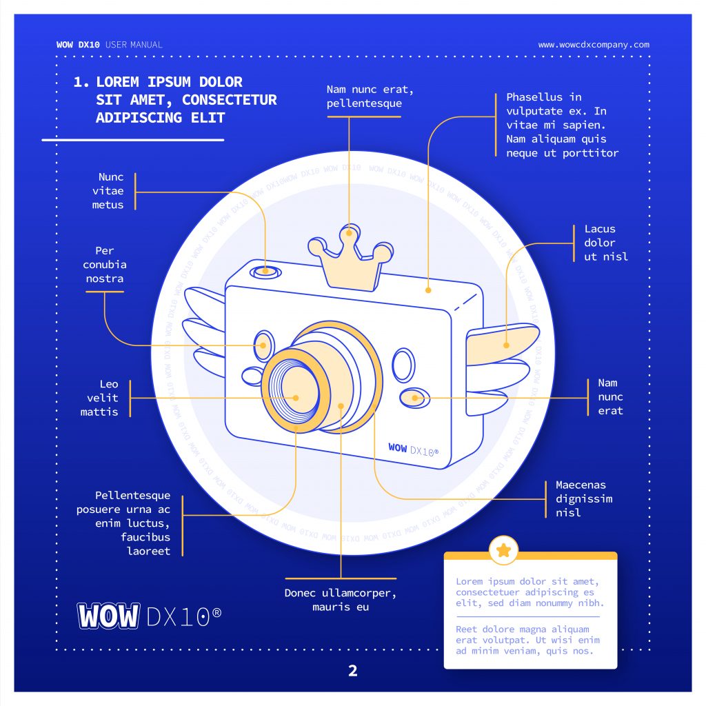
Un template es una herramienta que permite a los diseñadores tener recursos claros y precisos sobre las especificaciones de diseño para una categoría de producto. Este documento deberá incluir detalles como el tamaño, la posición de los elementos y los colores corporativos. Debemos crear tantos templates como tipo de producto vaya afectar al rebranding, si habláramos de la industria farmacéutica serían uno de envase, otro de prospecto y otro para los aluminios por ejemplo.
Un procedimiento detallado es otro documento importante que debe ser creado en la fase inicial del proyecto. Este documento explicará cómo se deben realizar las tareas y los pasos necesarios para lograr un resultado final exitoso. Además, el procedimiento también ayudará a evitar errores y a asegurar que todas las tareas se realicen de manera consistente. De nuevo el orden de dicho documento nos facilitará su uso, no debe ser una descripción del proceso, sino una síntesis de la información fundamental ordenada en capítulos para resolver el “puzzle” o diseño. De nuevo debe hacer tantos procedimientos como tipología de productos.
El documento de calidad es un registro de todas las especificaciones y requisitos necesarios para garantizar un resultado de alta calidad. Este documento debe incluir todos los detalles fundamentales para la aprobación del diseño y será más eficiente en la medida de que seamos capaces de condensar la información en capítulos para centrarnos en una zona o sección del diseño. Un ejemplo reducido de un algunos detalles a considerar en un envase de un medicamento podrían ser:
- Tipo de archivo (Ai, PDF?)
- Colores (Pantone +, máximo número de colores)
- Márgenes
- Detalles corporativos y logos
- Braille
- Revisión de Textos
- Códigos (EAN, laetus, datamatrix, ….)
Todos estos documentos de apoyo deben generarse en una primera fase, donde se diseñan una muestra de los productos a modificar. Estos modelos servirán de base para el resto de los productos, y garantizarán una continuidad, consistencia u homogeneización en el diseño.
En resumen, la creación de documentos de apoyo es fundamental en un proyecto de rebranding de packaging. Estos documentos asegurarán un proceso eficiente, sin errores y con un resultado de calidad por lo que se debe invertir el tiempo y atención necesaria en su creación además de las pertinentes pruebas de uso para detectar repeticiones innecesarias así como detalles omitidos.