How user friendly is your packaging?

Consumers value convenience when deciding what products to use. Or more importantly,
“Consumers might not always be aware of the importance of convenience in their behavior until it is absent. “

Importance of Convenience in Consumer Behavior (analyticssteps.com)

I don’t know about you, but I recently left a beautiful and perfect size lunch-box on the shelf because I struggled to open it when I tried to see the inside. And I hate it when opening a product outer packaging becomes a fight between me and the cardboard or plastic around it, but love the easiness of a little pull-me tab to tear the top so my purchase magically appears.

What are some elements that make product packaging user-friendly for me?

Easy-to-Open Designs

As mentioned, being able to open the packaging without it becoming a fight or having to read thru confusing instrutions, makes the whole world when you first are presented with a product. That creates a positive first impression and contributes to overall customer satisfaction.

Unboxing videos would not be so popular would you be seeing someone tear down cardboard and dangling with scissors to break into the purchased goods. Packaging that guarantees a quick access, an organized product structure, and is not too fragile to damage by mistake is crucial for customer retention and brand loyalty.

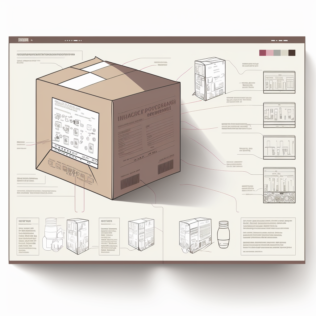
This is not always simple, specially when it comes to fragile goods that could damage during transportation, as even if the immediate product packaging may be friendly, the outer package could be a total nightmare. Therefore, manufacturers must consider the strength and integrity of the packaging to prevent accidental opening during transportation and storage while ensuring that end-users can open it effortlessly, which proves to be difficult to achieve sometimes.

Image: Thujey Ngetup , Unsplash

Some elements that you may consider to make your packaging easy to open are:

  • Tear strips and perforations
  • Pull tabs or finger lifts
  • Textured or embossed easy-grip features
  • Easy-to-peel seals, such as peel-off stickers or tape
  • Push-button releases

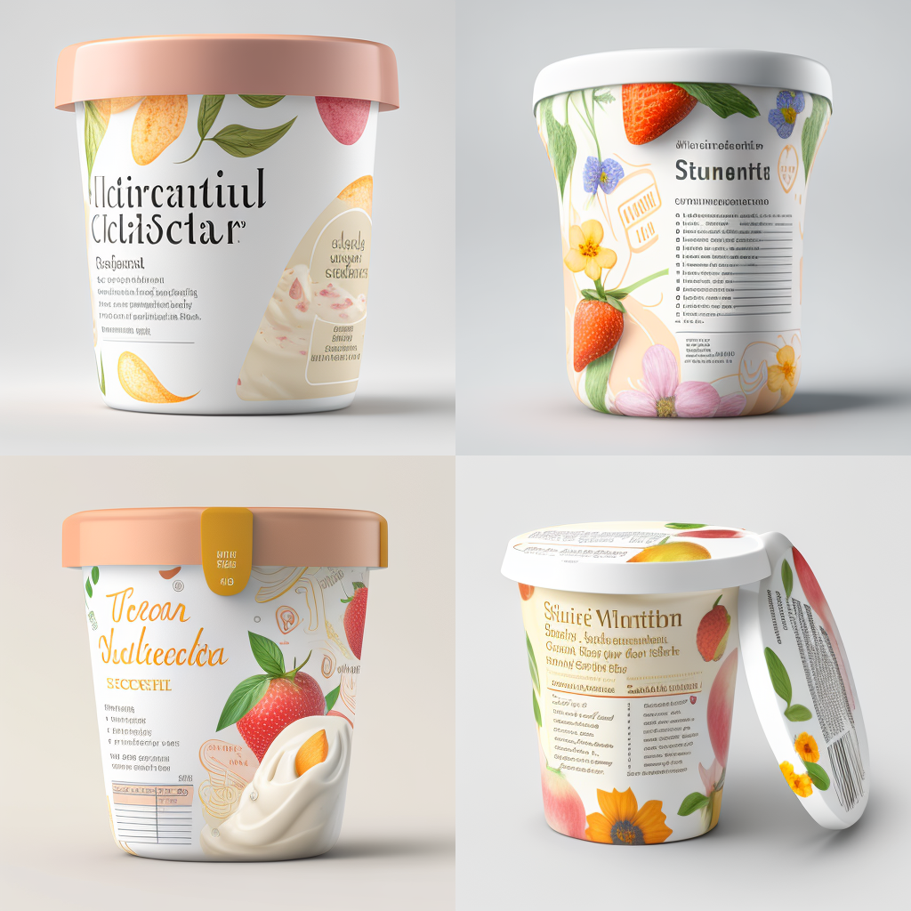
Resealable packaging

Packaging that cannot be resealed often means that consumers need to use other materials to reseal your product, or need to use a different container for it once opened, which defeats all your branding efforts.

Some products require to be re-sealed after each use, to preserve freshness or to prevent spills like personal care items, pet supplies, and household cleaners. Following in the convenience clause, your clients would appreciate being able to reseal the package without having to transfer the contents into additional containers.

Incorporate resealable closures, such as zippers, snaps, adhesive or magnetic strips; This allows users to open and close the packaging multiple times without compromising its integrity!

But this is easier said than done, as effective resealable packaging requires careful material selection and design considerations to maintain the integrity of the seal and prevent leakage, which also goes hand in hand with regulations about product safety or that increase the risk of tampering.

dirty re-seal adhesive

Additionally, manufacturers must conduct rigorous testing to ensure the resealing mechanism functions as intended throughout the product’s lifespan – this is not always the case when the re-seal gets in contact with “the elements” around it.

This often means that good resealing options come with a cost, and this is why they are not used YET on so many of the daily need products, but we start to see these in luxury or non-essential products. The trend is there, and as long as research continues and there is investigation into new ways of resealing products, and maybe some regulations come in to place, we will see these spread to essential products in due time.

Ergonomics

Ergonomics play a crucial role in user-friendly packaging, especially for products that consumers handle regularly or for extended periods. For example, in personal care products or household tools, ergonomic packaging reduces strain on users’ hands and provides a comfortable grip, enhancing the overall user experience. This is why ergonomic packaging will not only enhances the user experience but also demonstrates a brand’s commitment to customer satisfaction and well-being, making it a reason for staying loyal to a brand or product.

Manufacturers must carefully assess the target audience’s needs and preferences when designing ergonomic packaging. Conducting user testing and incorporating feedback during the design process can lead to packaging that aligns with consumers’ physical requirements and enhances usability.

Some ideas of ergonomic packaging that you can incorporate into your packaging

  • Soft-touch surfaces or materials, that enhance the tactile experience, and making the product comfortable to handle.
  • Curved edges and corners that make the packaging safer to handle.
  • Grip indentations that help handle the packaging securely and comfortably
  • Packaging that can be opened, closed, or dispensed with just one hand
  • Include handles into your packaging for easier handling and weight distribution

What are some innovations that you are carrying into your packaging design to make sure that it ticks all the boxes for convenience for your target group? How are you incorporating feedback from them into your design efforts? And finally, how are you making sure that the packaging meets all the regulations and brand requirements when it comes to these user-friendly elements?

Zuriñe García
Marketing

Transparency in packaging

If you are following packaging trends this year, one that stood out to me was the use of transparent packaging. With all the information that normally comes together on a product packaging, I feel that using a transparent one can be a big challenge for brands. However, I can see how using it also has a few advantages, which may outgrow the difficulties when it comes to sales and brand adherence.

Why would you should consider using transparent packaging, you ask? I bring you a few ideas on why this may be important for your product:

design award pasta https://competition.adesignaward.com/design.php?ID=52197
  • Having a clear packaging allows customers to “peek” into the product before purchasing, so they are able to better identify product ingredients, colors, texture, format… which can help verify that it meets their expectations and guide their buying decision. What you see is then what you get, there is no room for interpretation.
  • A transparent packaging transforms the product itself in a visual element of the packaging design. For the beauty and cosmetics markets, where the product is often visually appealing, creating an idea of luxury, having transparent packaging can help drive more attention on to the shelves. But other industries have jumped to this wagon lately and food brands have for instance. also been more creative in how they were showing their product inside the packaging, making it stand out in a fun way. See example of Pasta Nikita.
  • Transparency can create a sense of honesty and openness between the brand and the customer, building up trust in the brand. It gives an idea to the buyer that there is nothing to hide and that your brand believes so much in their product they are showing it to you “naked” from other elements that will distract you from the product itself.
  • If you are looking at making your product look and feel premium or high-end, transparent packaging is a way to go, as it often gives products a sleek and modern appearance. This can communicate quality and sophistication, which can translate into your ideal customer base and your product price tag.

As mentioned, brands will still need to make sure that they fit all required information into their (transparent) packaging. Here are some ideas on how to make this work:

  1. Use labels in a strategic way, place them where they don’t obstruct the view of the product such as the side or bottom of your packaging, or use smaller labels (using expansible ones).
  2. Print onto the packaging: using screen printing or an inkjet printer that can print directly onto plastic or other materials you can include the information directly into the packaging with color contrast.
  3. What about clear stickers or holograms? These can be attached over the packaging to provide the necessary regulatory details without obstructing the view of the product. This approach can be effective for adding required information, such as product expiration dates or manufacturing details that may be necessary to add at the end point of the printing process, and do not need to have a beautiful design, but be practical.
  4. Use QR Codes to bring customers to less relevant information. Using QR Codes is one of the Smart packaging initiatives that many companies have started using. With limited space, and lots to tell, technology can be your friend and a simple click can bring you to a wealth of information about the product. Think of adding details about the ingredients, giving ideas on recipes to combine with the product, or including information on a contest. Rather than cramping your package with all this, you can easily refer to it on a QR code and direct people to your website.
  5. Use packaging inserts: if online seems a little bit too fancy or your target audience is not that tech savvy, there is always the option for old fashioned paper inserts. Usage instructions, warnings, ingredients, an upcoming event, or a contest… all can be advertised through an insert included inside of the packaging or attached to the outer side of the packaging, as long as it does not obstruct the actual product view.
  6. Use textured packaging: with embossing or debossing on your packaging you will be able to add a texture to it, making it a product customers will want to touch and hold. It is unusual, and it brings an extra sense into the product experience, touch.

There are probably more ideas on how to make a transparent packaging work and still make sure you follow the regulations and include all mandatory information, without losing quality and attractiveness on your product. If you are using something else than the suggestions above, will you let me know? I am really interested in learning more on how to make a product stand out without cluttering the packaging and making your brand show transparency and trustworthiness through it. You can also share examples of transparent packaging that are working out for you/other brands you admire, or that simply made you laugh.

If you are interested in the topic and want to read more about “How seeing products on, or through, the packaging influences consumer perceptions and purchase behavior” take a look at the Oxford published paper here. Enjoy!

Claves del éxito al afrontar el diseño del packaging de un nuevo cliente

En el mundo del diseño, la creación de plantillas de diseño o templates a partir de ahora, es esencial para el éxito de cualquier proyecto. Un template es un documento o archivo que se utiliza como base para la creación de nuevos diseños o materiales. Pueden ser simples, como una página en blanco con un borde, o pueden ser más complejas, con una estructura detallada que incluye una variedad de elementos y características.

Call-E image

Necesito encontrar todo o casi todo lo que necesito en un mismo lugar, si no pierdo demasiado tiempo en buscar recursos y no en el propio diseño.

Cualquier diseñador

La importancia de crear templates adecuadas para futuros proyectos radica en la eficiencia que proporciona al proceso de diseño. Un template bien diseñado asegura que los diseños sean coherentes y que se mantengan dentro de la marca o la identidad visual de la empresa. Además, permiten que los diseñadores trabajen de manera más rápida y eficiente, reduciendo el tiempo de creación de un diseño y, por lo tanto, maximizar nuestros recursos.

Al crear los templates, es fundamental asegurarse de que su contenido sea apropiado para el proyecto en cuestión. Si no está diseñada específicamente para el proyecto puede generar problemas de coherencia, o peor aún, puede llevar a errores costosos. Por ejemplo, si una empresa tiene un template para un folleto que se utiliza para anunciar un producto específico, pero luego se utiliza para anunciar un producto diferente, el resultado puede ser una confusión entre los clientes potenciales y una pérdida de credibilidad de la marca.

Los documentos de apoyo son la base para un proceso de trabajo eficiente, se debe tener en cuenta que el template no solo debe ser funcional, sino que también debe ser fácil de usar. Los diseñadores que trabajan en el proyecto deben poder entender y utilizarlo de manera efectiva para que puedan trabajar con rapidez y eficiencia. Por lo tanto, es importante que sea claro, intuitivo y fácil de navegar.

Un ejemplo real para producir el packaging de un nuevo cliente por ejemplo en el sector farmacéutico sería de la siguiente manera:

  • 1. Proyecto piloto: es importante que haya un proceso inicial de aprendizaje donde trabajamos con una muestra que debe abarcar gran parte de los tipos de productos y siempre es importante que contenga ejemplos difíciles. No nos interesa aprender implementaciones sencillos para sufrir inevitablemente cuando lleguen productos complejos obviando que no podemos cubrir todas las opciones.
  • 2. Documentación de apoyo: una vez hayamos trabajando y aprendido los productos en la fase inicial es hora de generar los documentos de apoyo necesarios como templates, procedimientos y los checklists pertinentes. Siguiendo con el ejemplo debería haber tantas triadas (procedimiento, template y checklist) como categorías de productos: Envases, prospectos, aluminios, etiquetas, sobres, etc.
  • 3. Formación, uso y mejora constante: es necesario apuntar que dichos documentos deben ser de uso común y dado que son documentos vivos deben estar en continua revisión partiendo de su uso continuo mejorando y simplificando dichos archivos periódicamente. Es muy común que el contenido inicial de dichos documentos sea más extensiva que concentrada por motivos de seguridad y calidad.
Dall-E image

Resumiendo, el diseño del packaging tiene muchos detalles que hay que conjugar alineando también agentes externos con detalles técnicos de los fabricantes y excepciones que no encontrarás en ningún documento. La clave esta en tener una fase inicial que nos ayude (piloto), para nutrirnos de archivos de apoyo que nos faciliten el proceso (templates, procedimiento, checklists) para acelerar el diseño del 90% de los productos y así tener tiempo para las excepciones y seguir creciendo.

Asking vs SOPing.

In today’s fast-paced business world, every second counts, and no one wants to waste time on repetitive tasks. One area where this is especially true is in the supply chain of packaging design processes where not only time matters but reducing risk is a key factor of the process. Frequently, supply chain teams are asked to supply information that is mostly static and unchanging, yet the requests for this information continue to pour in. For every artwork material surely comes an email requesting the same information. In these cases, identifying repetitive tasks and documenting the necessary information can help save time across the supply chain while reducing unnecessary risks related to information processing.

Let’s consider the following example: An artwork coordinator requests information from the supply chain team regarding the technical specifications of serialisation printing. The details provided by the supply chain always relate to the market where the product is going to be released (different market, different rules) and change only every one or two years when the regulatory bodies change the laws. The request for information is done for every product, and therefore the response from the supply chain is almost always the same. Furthermore, supply chain is the only team up to date on when the regulations change.

In this situation, creating a set of technical specifications in the form of a Standard Operating Procedure (SOP) can help streamline the process. The SOP would describe the serialization requirements per market (what information can be printed where and under which technical specifications), and the supply chain team would become the owners of these documents. By creating and documenting these technical specifications, the supply chain team can prevent the information from being requested for every product, thereby saving a tremendous amount of time while reducing the risk of misinformation.

The benefits of creating SOPs and technical documents go beyond time-saving. By documenting and standardizing information, it becomes easier to communicate and collaborate with team members and stakeholders. This standardization can also reduce errors and improve the quality of the work.

Furthermore, the benefits of documenting information go beyond the immediate supply chain team. If the information is needed by other teams, such as quality assurange or regulatory affairs, having a documented SOP can ensure that everyone is on the same page and using the correct information. This can help prevent delays and ensure that all aspects of the product development process are aligned.

In conclusion, identifying repetitive tasks and documenting necessary information can help save time across the entire supply chain of packaging design. The example of creating an SOP for serialization requirements illustrates how this process can be applied in practice on any company that markets products across different countries. By creating and maintaining such documents, teams can save time, reduce the risk of misinformation, and improve the overall quality of their work.

Do you email or do you SOP?

Interested in hearing more?

Click the button below to receive a call, or send us information on what you are looking for to improve Artwork Management. We will be happy to help you!

Get in touch

The Jack / Jacqueline of all trades

Labeling and Artwork management is a critical aspect of product development and packaging. It involves the creation, organization, and distribution of all labeling and artwork used on a product, including packaging, promotional materials, and instruction manuals.

To guarantee that the packaging meets your brand’s requirements and is produced to a high standard of quality, companies hire Artwork Coordinators. This role, which is often undervalued, is critical to the success of product launch. Why is that?

Artwork coordination is a multi-faceted role. It involves a lot of juggling between activities that are interconnected, and working as liaison with diferent departments or stakeholders even external to your own team. It also involves some technical knowledge and a good eye for detail. All this makes an Artwork Coordinator a complex role with a lot of hidden skills needed to be successful.

Brief Creation

The artwork coordinator creates a brief/work order/request for the designer or agency responsible for producing the packaging artwork. The brief outlines the packaging requirements, including the brand guidelines, technical specifications, and any other relevant information. Being able to collate information from multiple sources, make it understandable and actionable, and distinguish between relevant and accesory information is a key still to have for this role.

The coordinator needs to ensure that the brief is clear and concise, allowing the designer or agency to create the packaging artwork that meets the brand’s requirements. If you want to know more about how this brief should look like for success, take a look at our earlier post on this matter.

Juggling of Multiple Projects and Deadlines

The role of an artwork coordinator also requires them to manage multiple projects simultaneously. It is not rare that an artwork coordinator would be dealing with tens of projects at the same time. Some of them would be more urgent than others, and some would have extra complexity or require extra time to produce (e.g. think of a label versus a leaflet, or a new product versus a change).

This is why good time management and being able to see the big picture are relevant criteria, so that the workload is effectively managed, and they can ensure that all projects are delivered within the specified timeline. The coordinator needs to be able to prioritize projects based on their importance, deliver and receive input on time, and not loose control of which status each project is at.

Coordination (of course!)

Artwork coordination requires effective communication skills to gather requirements and input with different teams involved in the packaging production process. The artwork coordinator needs to understand the needs of the brand, the regulatory teams, the translation agencies, the quality team, the printer, the suppliers… to ensure that the packaging artwork meets everyone’s requirements. They need to be able to manage the project timeline and update all the parties involved with any changes or progress made. The coordinator also ensures that the artwork is produced on time and meeting the quality, regulatory, and industry requirements.

Chaser

An artwork coordinator is also responsible for obtaining approvals from various stakeholders involved in the packaging production process. They need to follow up on the approvals, ensuring that the artwork is approved on time, and any feedback is incorporated into the artwork. The coordinator needs to be persistent in chasing approvals while maintaining good communication with all stakeholders, which at times could be a hard thing to do.

Final Reviewer

An Artwork coordinator is responsible for bringing a packaging product from start to end succesfully. Therefore, after they have all feedback incorporated into the design, they will then proceed to ultimately review and confirm the artwork meets all required quality standards. They check for any errors or inconsistencies in the artwork and make sure that the files are print-ready.

The coordinator also ensures that the artwork files are compatible with the printer’s specifications, minimizing any issues during the printing process. All this requires a certain level of technical knowledge about how printing works, which can be aquired with time, but always comes as a nice to have /must have criteria in job offers. So learning about color separation, bleeds, kerning, pantones, varnish or proofing is not a bad idea if you are considering a job like this!

We have put together a simple PDF explaining the multiple “hats” of an artwork coordinator.
Download it if you are interested in being an artwork coordinator or want to explain to your parents what it is that you do for work 🙂

Accountability and Authority, The Saga

Image with Midjourney

Once upon a time, in a packaging company not so far away, there was a team of designers tasked with the creation and management of product packaging for their Ancestors . The designers were excited to start working on the project and put their creative and technical skills to the test. They had been trained by the master Designers and could summon the Gods of Regulatory.

The Gods of Regulatory were responsible for ensuring that the package met all necessary regulations and guidelines, Lord praise the FDA, the EMA and the local regulatory bodies. They were accountable for the content that was placed on the packaging design. And they were good at it. They had to appease the recall demons, for one mistake could cost them dearly.

After many times together in the battle field however, the Designes and the Gods of Regulatory realized that while they were accountable for the packaging, and would suffer the consequences of an attack on their impeccable recall record, they lacked the authority to make any meaningful changes on their battle process. There were simply too many stakeholders, too many hidden decision makers and way too many KPIs to fulfil.

One day, the designers submitted a proposal for an improved workflow model that they were particularly proud of. They had worked hand in hand with the regulatory team tirelessly on it for weeks and were excited to finally present it to the higher court, the Decision Makers. However, they were swiftly denied their wishes. The Decision Makers had rejected the proposal outright, without providing any concrete reasons for their decision. They simply said: It shall not be done.

The designers were frustrated, the regulatory experts were angry. They all felt like they were being held accountable for something they had no control over. If something went wrong, their heads would roll, but without the means to change course, they felt abandoned and desperate. They began to lose their faith, their motivation and engagement in the project. To make matters worse, they soon discovered that the same thing was happening to other teams in the company.

The problem wasn’t just with their process; the company’s organizational structure and old fashioned culture made it difficult for anyone to have the necessary authority to make meaningful changes. Everything had to be escalated to the high court, where decisions were made without hands-on knowledge of the actual work that had to be done.

As a result, the frustrated designers and regulatory experts decided to take matters into their own hands. They started taking actions outside of their workflow to expedite the pressing deadlines and reach their tight objectives. They were operating under the blanket of cover and darkness, very much aware of the lack of compliance and added risks. But they had no choice, it was the only way to complete the assigned tasks.

The moral of the story is that accountability without authority can be a frustrating and demotivating experience. Furthermore, when the processes in place do not match the actual job requirements, the non-authoritative stakeholders are usually forced to take action, stepping outside of the agreed models to accomplish their tasks. When key stakeholders lack the necessary authority to make changes, it can lead to a lack of engagement and creativity, and in most cases non-compliance with SOPs. In the case of packaging companies, designers and regulatory experts must work together to ensure that the design process is collaborative and efficient, but they need to have authority to make changes to the process when it no longer works.

Do you feel accountable but lack authority?

La sinergia como esencia en el diseño de tu packaging

Midjourney image

Llevo más de 15 años diseñando packaging y si hablo de proyectos como serialización, puede ser que tengas claro a que industria destino mayoritariamente mi tiempo de trabajo, pero no es importante el sector en este caso, ya que trabajar para y con tu cliente no es nuevo para ti.

Ir juntos es un comienzo; mantenerse juntos es progreso; trabajar juntos es el éxito.

Henry Ford

Cuándo y por qué

No, Henry Ford que tanto ha aportado, no fue el primero en hablar de sinergía, ¿o si?, el término se acuño en el siglo XIX aunque hasta finales del siglo XX no se puso de moda en el mundo laboral. En cualquier caso, cuando menciona que el trabajo juntos o en equipo es el éxito, no hay duda de que tenía claro que remar todos en el mismo sentido es mejor.

En este sentido, la creación de sinergias con el cliente es crucial para garantizar el éxito del proyecto. Ambas partes deben estar alineadas a la hora de hacer un proyecto común compartiendo y mejorando la información disponible constantemente, dado que las reglas y/o normativas, las terceras partes como impresores o las necesidades pueden cambiar a lo largo del tiempo.

La comunicación entre el diseñador y el cliente debe ser constante a lo largo del proceso de diseño. Es importante compartir ideas, discutir los detalles y recibir comentarios para poder mejorar el proyecto.

¿Has tenido la sensación de que a veces se acumulan los cambios o notas en un procedimiento a seguir durante demasiado tiempo? ¿Cada cuánto se debe hablar con el cliente para alinear detalles?

No creo que haya una fórmula que aplique a todos los casos, pero estaremos de acuerdo en que tener una reunión una vez al año es insuficiente. Insuficiente porque en el mundo de hoy todo va rápido y todo cambia y si no crees que sea así puede ser que haya que pararse a pensar y estudiar con detenimiento los detalles porque todo proceso, siempre, es susceptible de mejora.

En resumen, el diseñador, como experto en el diseño de packaging, debe actuar como un facilitador que coordina y une a todas estas partes para lograr un proyecto exitoso y para ello que eso ocurra, en relación con nuestro cliente, son vitales ciertos aspectos:

  • Comunicación fluida
  • Recursos compartidos y comunes
  • Trabajar en soluciones en lugar de perseguir “razones”
  • Revisión y mejora continua en los procesos

Además, la creación de sinergias con el cliente también implica estar abiertos a cambios y a adaptarse a las nuevas circunstancias que puedan surgir durante el proyecto. Por ejemplo, pueden aparecer nuevas regulaciones o restricciones que afecten al diseño del packaging.

¿Puede ser el futuro y cercano cambio respecto a los plásticos en la UE una buena excusa para reunirte con tu cliente?

https://www.linkedin.com/posts/twona_recycled-plastic-foods-activity-6993122601833226240-vT5z?utm_source=share&utm_medium=member_desktop

Por qué exigir documentos técnicos correctos para el diseño de tu packaging

Midjourney image

A la hora de diseñar un packaging hay tres pilares fundamentales:

Guideline donde se describen las reglas corporativas respecto, colores, proporciones, posición de elementos y logos, en definitiva la esencia de nuestra organización.

Los textos a implementar, generalmente un documento word idílicamente revisado por el departamentos de asuntos regulatorios o marketing según el tipo de producto.

El documento técnico aportado por el fabricante o impresor donde se definen las medidas, tipo de material, grosor y reglas en códigos visuales.

Photo by Sigmund on Unsplash

Centrándonos en el documento técnico, en primera instancia no debería ser un problema dado que el impresor, debería aportar un documento con sus reglas para que el diseñador implemente los textos necesarios con la esencia del cliente.

Cuando me preguntan que hago en mi trabajo me gusta decir que hago puzzles, y para ello las piezas deben encajar, ¿verdad?.

Cómo debe ser un documento técnico

Los detalles en estos documentos son esenciales para garantizar que el diseño y la producción del envase se realicen de manera eficiente y efectiva. Después de más de 20 años produciendo packaging con miles de modelos el proceso se puede hacer tan complicado como poco claro sean sus reglas además de las muy comunes omisiones de información por lo que básicamente debe incluir solamente cinco detalles bien definidos, sólo cinco:

1.- Escala 1:1, es decir, una escala correcta sin proporciones incoherentes. Del mismo modo ya se ven poco, pero no hace mucho podías encontrar planos hechos con el famoso Autocad con diseños mal escalados e inservibles para su uso y edición en herramientas básicas de diseño como Illustrator o Indesign.

2.- Especificaciones respecto al material, incluyendo gramaje, grosor, si es un material reciclado y siendo exquisito una ayuda visual para sabes si es un papel continuo en rollo o si es tipo cliché entre.

3.- Límites y máximos, donde debe especificarse detalles como los márgenes, zonas de impresión o por el contrario zonas libres de texto donde no debemos incluir información dado que dicha zona tiene una reserva para incluir los datos variables o es una zona de plegado, por ejemplo. Otros detalles serían la posición del braille, localización de las etiquetas para garantizar la inviolabilidad, los datos variables como loteado o fecha de caducidad y posición de los datos de la famosa serialización.

4.- Reglas respecto a los códigos visuales, en éste apartado hay mucha variedad como laetus, códigos 128, datamatrix, collating marks (perdón, no conozco la acepción en español). En cualquier caso todos estarán bien definidos si se define: posición, orientación, dimensión y color.

5.- Colores, definiendo aspectos como el máximo de colores posibles, especificar si debe tener un color específico como negro muy común en un prospecto. La excelencia en éste apartado sería tener una nomenclatura de los colores técnicos, es decir, lo contrario a recibir un documento en cuatricomía (CMYK). ¿Es mucho pedir un documento con colores bien estructurados?. Si recibes de tu impresor un documento técnico con colores con una nomenclatura como la siguiente: dimensions, cutting, creasing, guides, perforating, Text Area, Text Free, Ink Free, solo me queda aconsejarte que felicites a tu impresor y que sigas trabajando con él todo lo que puedas.

Para terminar, exige a tu impresor que cumpla con éstas cinco pautas, la excelencia esta en la búsqueda de la mejora continua, de ésta manera te vas a ahorrar mucha frustración cuando te llegan una y otra vez rechazos de tus materiales incurriendo en versiones innecesarias y los nunca deseados retrasos sin mencionar la gran importancia si hablamos de nuevos lanzamientos.

Ingredient information on food packaging

Image generated with Midjourney

There are some basic elements that always must appear on a food product’s label/packaging:

  • Name of the product and manufacturer’s details
  • Ingredients
  • Weight, calorie count, servings & serving size
  • Nutritional information
  • Freshness – is it a fresh product, recently produced or harvested or how has it been preserved, and what is its best-before date
  • Whether it is organic or not and does it have any GMOs – generally modified organisms – present in the product?

When it comes to the ingredients, these are expected to appear listed from highest to lowest according to their amount, but there is not always a clear explanation on when the percentage of the ingredient needs to be shown on the label. This, however, is of high importance for consumers so they can make informed decisions about the products they purchase and consume.

This information is typically required by regulatory agencies such as the European Food Safety Authority (EFSA) in Europe or the Food and Drug Administration (FDA) in the United States, to ensure that consumers are provided with accurate and relevant information.

But why is this so important?

Having the ingredient percentage on food labels helps consumers understand the nutritional content of the product. For instance, knowing that a product contains a high percentage of sugar would be useful for those who are trying to limit their sugar intake.

More importantly, information about the percentage of whole grains or allergen substances such as peanuts or gluten can also be critical for individuals with dietary restrictions or allergies.

In addition to nutritional and allergen content, the percentage of ingredients used can also impact the overall quality and taste of the product. Take for instance a product that contains a high percentage of filler ingredients. Its flavour or texture may differ from that of one that contains a higher percentage of high-quality ingredients.

By providing information about the percentage of ingredients used, consumers can make more informed decisions about the products they buy and determine which products best meet their needs and preferences.

Furthermore, when a product’s packaging uses an image that depicts a certain ingredient, the label must clearly indicate the percentage of that ingredient used in the product. This is because images can be misleading and give consumers the impression that a product is something that it is not really. Imagine that you place a picture of juicy strawberries on a carton of strawberry yogurt, but it mostly originates from a concentrate juice that contains only a small percentage of fresh strawberry. By indicating the percentage of the ingredient used on the label, the consumer is given a more accurate representation of what they can expect of the product.

Products where, unless the percentage of an ingredient is mentioned, a user could fail to distinguish them from other foods, must certainly have it showing in their labels.

Another reason for the requirement of ingredient percentage information is to ensure that products are properly labeled and marketed. If the ingredient appears in the name of the product, very much so! For example, if a product claims to be “whole grain,” , “light” or “low-fat”, the label should indicate the percentage of whole grain ingredients used/ percentage of fat or calories that are reduced so consumers can be sure they are getting the product they expect.

As seen, there are various reasons – regulatory and not – why including information on the amount of each ingredient in your product is relevant. The fact that some of these are not mandatory, makes it a hard decision sometimes as your product label are in general already quite full, and the font sizes are already small so adding more information only makes it harder. However, the decision to include them can have a competitive advantage for you when customers are comparing seemingly similar products. Nowadays there are alternative to traditional labeling to help you, and your designers, be more creative about what comes where in the packaging – think of peel labels, or QR codes, which can take some of the load of the information.

Deciding what stays visible and what is “hidden” behind those techniques is a different matter… how would you make that decision??

Relevant links

Post that inspired this article

European Food labeling rules

Packaging perspective correction (with your phone)

Perspective Correction Algorithm for Cell Phone Photography

Image with Midjourney

Cell phone photography has become increasingly popular in industrial and business applications in recent years, with the increase in resolution, accuracy and connectivity. One of the biggest challenges with cell phone photography when applied to Quality Control is correcting the perspective of an image. This is especially important when comparing a master design file with a printed a packaging material. A perspective correction algorithm can be used to address this issue.

The perspective correction algorithm is a software-based solution that adjusts the perspective of an image to make it look as though it was taken from a straight-on angle (thus, correcting the perspective distortion). This is achieved by identifying key points in the image, such as the corners or the edges of a packaging material, and adjusting the image to align these points. The process follows a set of determined steps:

  • Extract key points on both the design and the photo
  • Match those points to identify corredpondance
  • Calculate the required transformation
  • Modify the photography according to the calculated parameters to obtain a corrected image

The use of a perspective correction algorithm is especially important when overlaying a cell phone photo on a packaging design. This can be particularly useful when comparing a master design file (the artwork) with a photography taken with a cellphone of the printed material before it goes into full production. Being able to identify wether the approved master artwork corresponds exactly with the printed material helps reduce (or even eliminate) the risk of printing a packaging material from an un-approved or modified version. This sometimes happens when a stakeholder takes the liberty to modify an artwork for technical reasons and by mistake, something else goes amiss.

Content-based quality checks on printed packaging are crucial to avoid product recalls.

Every Quality Person in the world

There are industrial applications that involve in-line high resolution cameras to compare printed materials with master files. However, they are usually applied for Quality Control on already approved files. Therefore, being able to check before giving the green light for production on a print proof file has tremendous value, specially for highly regulated environments.

If you want to know more about how the perspective correction algorithm works, don’t hesitate to get in touch and we will be happy to chat with you. In the meantime, just to prove this is possible and valuable, you can see how the algorithm works with a really difficult case.