Por qué exigir documentos técnicos correctos para el diseño de tu packaging

Midjourney image

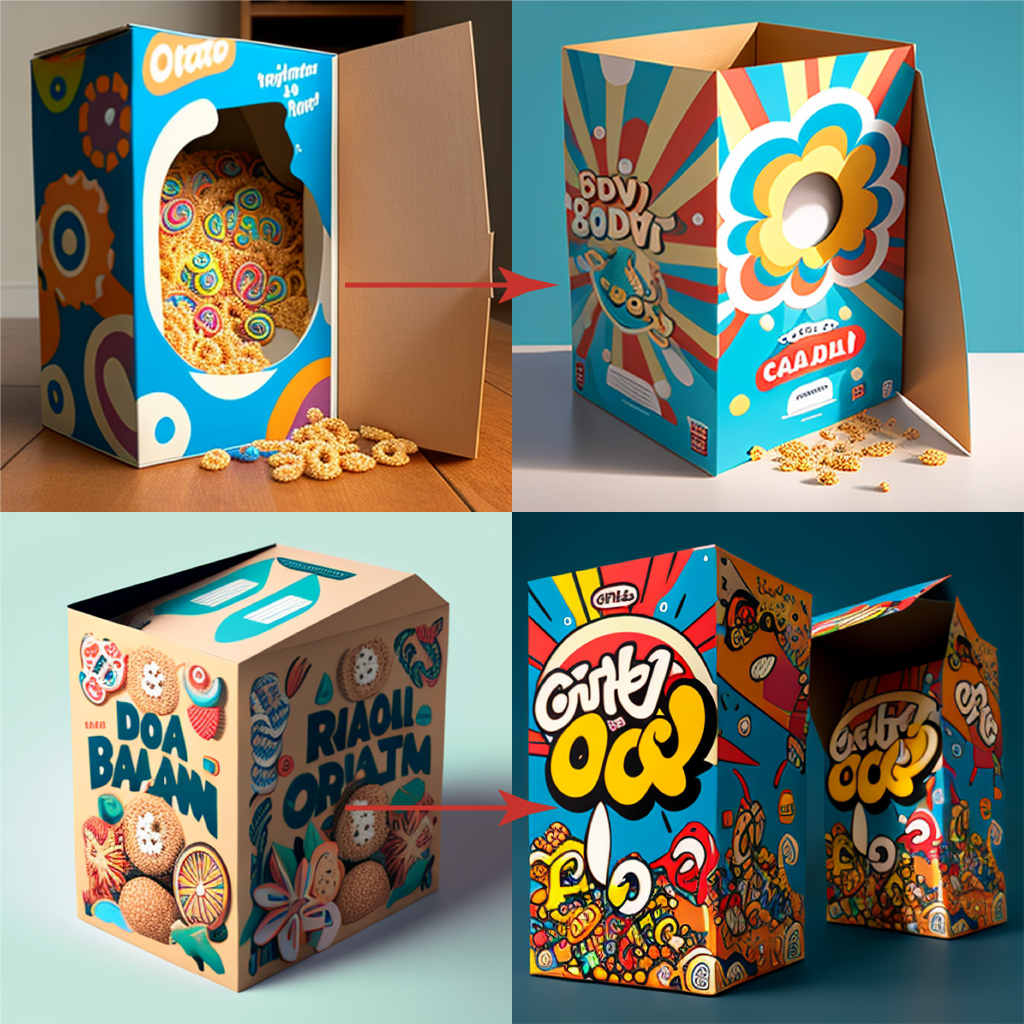
A la hora de diseñar un packaging hay tres pilares fundamentales:

Guideline donde se describen las reglas corporativas respecto, colores, proporciones, posición de elementos y logos, en definitiva la esencia de nuestra organización.

Los textos a implementar, generalmente un documento word idílicamente revisado por el departamentos de asuntos regulatorios o marketing según el tipo de producto.

El documento técnico aportado por el fabricante o impresor donde se definen las medidas, tipo de material, grosor y reglas en códigos visuales.

Photo by Sigmund on Unsplash

Centrándonos en el documento técnico, en primera instancia no debería ser un problema dado que el impresor, debería aportar un documento con sus reglas para que el diseñador implemente los textos necesarios con la esencia del cliente.

Cuando me preguntan que hago en mi trabajo me gusta decir que hago puzzles, y para ello las piezas deben encajar, ¿verdad?.

Cómo debe ser un documento técnico

Los detalles en estos documentos son esenciales para garantizar que el diseño y la producción del envase se realicen de manera eficiente y efectiva. Después de más de 20 años produciendo packaging con miles de modelos el proceso se puede hacer tan complicado como poco claro sean sus reglas además de las muy comunes omisiones de información por lo que básicamente debe incluir solamente cinco detalles bien definidos, sólo cinco:

1.- Escala 1:1, es decir, una escala correcta sin proporciones incoherentes. Del mismo modo ya se ven poco, pero no hace mucho podías encontrar planos hechos con el famoso Autocad con diseños mal escalados e inservibles para su uso y edición en herramientas básicas de diseño como Illustrator o Indesign.

2.- Especificaciones respecto al material, incluyendo gramaje, grosor, si es un material reciclado y siendo exquisito una ayuda visual para sabes si es un papel continuo en rollo o si es tipo cliché entre.

3.- Límites y máximos, donde debe especificarse detalles como los márgenes, zonas de impresión o por el contrario zonas libres de texto donde no debemos incluir información dado que dicha zona tiene una reserva para incluir los datos variables o es una zona de plegado, por ejemplo. Otros detalles serían la posición del braille, localización de las etiquetas para garantizar la inviolabilidad, los datos variables como loteado o fecha de caducidad y posición de los datos de la famosa serialización.

4.- Reglas respecto a los códigos visuales, en éste apartado hay mucha variedad como laetus, códigos 128, datamatrix, collating marks (perdón, no conozco la acepción en español). En cualquier caso todos estarán bien definidos si se define: posición, orientación, dimensión y color.

5.- Colores, definiendo aspectos como el máximo de colores posibles, especificar si debe tener un color específico como negro muy común en un prospecto. La excelencia en éste apartado sería tener una nomenclatura de los colores técnicos, es decir, lo contrario a recibir un documento en cuatricomía (CMYK). ¿Es mucho pedir un documento con colores bien estructurados?. Si recibes de tu impresor un documento técnico con colores con una nomenclatura como la siguiente: dimensions, cutting, creasing, guides, perforating, Text Area, Text Free, Ink Free, solo me queda aconsejarte que felicites a tu impresor y que sigas trabajando con él todo lo que puedas.

Para terminar, exige a tu impresor que cumpla con éstas cinco pautas, la excelencia esta en la búsqueda de la mejora continua, de ésta manera te vas a ahorrar mucha frustración cuando te llegan una y otra vez rechazos de tus materiales incurriendo en versiones innecesarias y los nunca deseados retrasos sin mencionar la gran importancia si hablamos de nuevos lanzamientos.

3 claves para el Rebranding de tu marca

Midjourney image

La organización de la información es fundamental en cualquier proyecto, especialmente en un rebranding de packaging. Una buena gestión de la información asegurará un proceso eficiente, sin errores y con un resultado de calidad. La creación de documentos de apoyo fundamentales para tener éxito en un rebranding son:

  • Procedimiento/s de diseño
  • Template/s
  • Documento/s de calidad

Un template es una herramienta que permite a los diseñadores tener recursos claros y precisos sobre las especificaciones de diseño para una categoría de producto. Este documento deberá incluir detalles como el tamaño, la posición de los elementos y los colores corporativos. Debemos crear tantos templates como tipo de producto vaya afectar al rebranding, si habláramos de la industria farmacéutica serían uno de envase, otro de prospecto y otro para los aluminios por ejemplo.

Un procedimiento detallado es otro documento importante que debe ser creado en la fase inicial del proyecto. Este documento explicará cómo se deben realizar las tareas y los pasos necesarios para lograr un resultado final exitoso. Además, el procedimiento también ayudará a evitar errores y a asegurar que todas las tareas se realicen de manera consistente. De nuevo el orden de dicho documento nos facilitará su uso, no debe ser una descripción del proceso, sino una síntesis de la información fundamental ordenada en capítulos para resolver el “puzzle” o diseño. De nuevo debe hacer tantos procedimientos como tipología de productos.

El documento de calidad es un registro de todas las especificaciones y requisitos necesarios para garantizar un resultado de alta calidad. Este documento debe incluir todos los detalles fundamentales para la aprobación del diseño y será más eficiente en la medida de que seamos capaces de condensar la información en capítulos para centrarnos en una zona o sección del diseño. Un ejemplo reducido de un algunos detalles a considerar en un envase de un medicamento podrían ser:

  • Tipo de archivo (Ai, PDF?)
  • Colores (Pantone +, máximo número de colores)
  • Márgenes
  • Detalles corporativos y logos
  • Braille
  • Revisión de Textos
  • Códigos (EAN, laetus, datamatrix, ….)

Todos estos documentos de apoyo deben generarse en una primera fase, donde se diseñan una muestra de los productos a modificar. Estos modelos servirán de base para el resto de los productos, y garantizarán una continuidad, consistencia u homogeneización en el diseño.

En resumen, la creación de documentos de apoyo es fundamental en un proyecto de rebranding de packaging. Estos documentos asegurarán un proceso eficiente, sin errores y con un resultado de calidad por lo que se debe invertir el tiempo y atención necesaria en su creación además de las pertinentes pruebas de uso para detectar repeticiones innecesarias así como detalles omitidos.

Puntos clave para tu Guía de Estilo en la industria farmacéutica

Photo by Aron Visuals on Unsplash

El packaging es un aspecto fundamental en el sector farmacéutico, ya que es el elemento de comunicación más directo y visual con el consumidor. Por eso, es importante tener una guía de estilo bien definida para el diseño de los envases de los productos farmacéuticos.

La importancia de tener una guía de estilo específica para un país concreto

La guía de estilo debe ser creada por diseñadores que conozcan el sector y sus normativas, para garantizar que el packaging cumpla con todos las regulaciones en materia de seguridad y salud respecto a un país concreto. Es cierto que muchas veces la guía de estilo es un documento que aplica a nivel europeo y esto puede ser un problema por varias razones. Comparto algunos ejemplos de incoherencias que he encontrado en los 20 años que llevo diseñando packaging farmacéutico, en particular productos genéricos:

  • Documento en inglés con normas difíciles de aplicar cuando tu texto en lugar de “pills” se debe implementar: comprimidos recubiertos con película EFG.
  • Disposición de elementos en contra de la normativa del país, por ejemplo posición del código nacional en una posición que la normativa prohibe explícitamente.
  • Normas de diseño no posibles por normativa cómo diferentes atributos en la fuente del nombre cuando se exige que el nombre debe ser una unidad respecto a tamaño de fuente y formato.
  • Disposición de logos y aspectos visuales corporativos en detrimento de información respecto a contenido u otros elementos más importantes.
  • Disposición de elementos visuales solamente posibles en otros paises o ignorando pautas obligatorias respecto a la normativa vigente.

Si te has enfrentado a una guía de estilo generalmente bastante amplia, creada por marketing o una agencia con experiencia en otros sectores, te habrás encontrado con la frustración que supone intentar seguir una guía que no cumple normativa o que no da alternativas. Una solución es un anexo a dicha guía de diseño con las particularidades de un país en concreto.

El orden es fundamental

Photo by Clayton Robbins on Unsplash

Una buena guía de estilo es una herramienta valiosa que ayuda a los diseñadores y departamento de calidad a crear y revisar respectivamente los materiales para que sean coherentes, eficaces y cumplan con las regulaciones y requisitos necesarios. Además, una guía de estilo bien organizada asegura que el proceso de diseño y revisión sea más eficiente y que los errores sean mínimos.

La organización por tipo de producto es fundamental en la guía de estilo, ya que cada envase requiere un tratamiento específico en cuanto a su diseño y presentación. Una buena guía de estilo debe tener secciones dedicadas a envases blister, envases verticales, aluminios, viales, entre otros. Por ejemplo, un envase tipo blister requiere una tipografía clara y legible, mientras que un envase para viales necesita un diseño más compacto y que aproveche al máximo el espacio disponible.

Es fundamental que la guía esté estructurada de manera clara y sencilla, de modo que sea fácil de seguir y consultar. De esta manera, los diseñadores y departamentos de revisión cómo marketing o calidad pueden acceder a la información relevante de manera ágil y eficiente. Esto evitará errores y re-diseños innecesarios, y permitirá acelerar el proceso.

Actualización con el mercado

Otro detalle a tener en cuenta es la falta de actualización a lo largo del tiempo dado que un documento tan extenso y que supedita tantos detalles no se actualiza anualmente obviamente, pero si debe tener en cuanta los cambios de normativa y ser suficientemente orgánico para poder generar un anexo útil. Un ejemplo relativamente cercano puede ser la serialización. ¿Hace cuánto fue ese proyecto? ¿Se ha actualizado tu guide line al respecto?. Es cierto que dicho proyecto no va afecta a todos los diseños, pero si la etiqueta que debes incluir en tu envase esta sobre un texto no duplicado sabes que tu diseño será rechazado.

Resumiendo, si quieres que el trabajo de tus diseñadores así como departamentos de revisión de materiales implicados sean eficientes tu guía de estilo debe cumplir los siguientes cuatro puntos:

  • Creada desde y para la industria farmacéutica.
  • Ajustarse a la normativa del país de aplicación o un anexo en su defecto.
  • Estar ordenada en secciones o capítulos por tipo de producto.
  • Ser un documento orgánico que sea actualizado con los cambios de dicha industria.

Packaging Reduction: Non Food items

Electrical goods often come with warranties and usage instructions in multiple languages. You know what I’m talking about, the multiple booklets of instructions in 10 different languages or the warranty document to complete and return by post! (remember postage stamps anyone?!), that often fall straight into the recycling bin.

But, there are valid and important reasons for having these. One, being the safety of the consumer and their new product, or information on how to put your new piece of furniture together; but also, one SKU with as many languages included as possible, means a reduction in the overall number of SKUs in production. The more languages you can include, the more countries you can sell that same product in.

So, how do you go about making these important and (sometimes) required pieces of information available while considering packaging reduction and carbon footprint for example? How to squeeze 10 languages on less paper? Do we really need to print out 5 different warranty cards?

  1. A picture is worth 1000 words: Pictures are a universal language and can help convey information without the need for words. This is particularly useful for showing how to use a product or for highlighting specific parts of the product. For example, IKEA provides assembly instructions for their furniture with clear and concise illustrations and no words.
  2. Words: Words are necessary for more detailed instructions and for legal information such as warranties and safety warnings. They also allow for specific language nuances and cultural references that may not be conveyed through pictures alone. Samsung provides detailed instructions in multiple languages for their products, including safety warnings, to ensure that customers fully understand the products they purchase.
  3. Pictures: Using pictures can make the information easier to understand and remember, especially for customers who are not fluent in the language in which the instructions are written. It also saves space, making it easier to include multiple languages in the single document. Apple Inc. uses pictures and diagrams to explain the functions of their products in multiple languages, making the same information accessible to a wide range of customers.
  4. Environmental Impact: Printing documents in multiple languages can have a significant environmental impact, particularly if they are rarely read and often thrown away. Consider providing instructions and warranties in electronic format (online) where possible, to reduce waste. This aligns with companies’ efforts to reduce their carbon footprint and meet overall packaging reduction targets. For instance, Tesla provides electronic versions of their warranties and usage instructions, reducing the amount of paper waste generated by their products.

In conclusion, handling multiple languages in FMCG warranties and usage instructions requires careful consideration of the most effective way to convey information. A combination of pictures and words can be an effective solution, while also reducing the environmental impact of printing (less paper required) or by providing electronic versions where possible. This supports companies’ efforts to reduce their carbon footprint and meet overall packaging reduction targets.

What are you doing to reduce the amount of packaging and unread booklets in your product?

The nightmare of technical specs

Image created with Midjourney

Working in the pharmaceutical industry, the creation of packaging designs can be a challenging and complex process, especially when dealing with multiple Contract Manufacturing Organizations (CMOs) and Printing companies. There are many factors that can impact the design, including regulatory requirements, branding, marketing, and of course, technical considerations. One of the biggest challenges that packaging designers face when working with multiple printing stakeholders (weather it is a CMO or a printer directly) is the varying technical requirements. Different companies have different machinery and different Standard Operating Procedures (SOPs) (sometimes they don’t even have SOPs).

Oh man…this is hard.

The first challenge related to working with multiple printers is the differences in print and packing capabilities. Each printer may have different printing processes and equipment that they use. For example, one printer may use a rotogravure printing process while another may use flexographic printing. This can result in differences in color accuracy, registration, and overall quality of the final print. Additionally, some printers may not be able to accommodate certain design elements, such as holographic foils or raised printing, which can impact the design and the overall look of the packaging. Additionally, and more specifically for the packaging industry, the printed materials are going to be the input of a packing machine which is going to fold, fill, glue and whatnot in an automated machine. This process is critical since failure can have a high cost impact. Most “reasonable” printing companies and CMOs provide technical specifications to their design agencies (or their clients) so the design materials can be created to specs.

The second challenge is the complex technical documentation that designers must understand in order to create compliant designs. Technical documentation often includes specifications on dielines, varnish free areas, margins, folding lines, visual marks used for automated packing and many more. Understanding these guidelines and ensuring that the design meets them can be a time-consuming and confusing process, particularly for designers who are not familiar with the specific requirements of each printer and considering some of these technical specification documents can be 40 page long. If you are dealing with 10 suppliers, times 40 is a 400 page documentation. That is not easy to manage. This can result in mistakes and miscommunications between the design team and the printer, which can ultimately impact the time to market.

What can we do to fix this?

There are ways to improve the process when technical specification documentation is complex and there are many different suppliers:

  1. Write and maintain proper design manuals specifically for each printer/CMO. This will help ensure that the design team has all of the information they need to create designs that are compatible with each printer’s technical requirements. This can also help avoid misunderstandings and miscommunications between the design team and the printer. Additionally, it will be required should you have to face a customer audit.
  2. Perform training of the design team on all technical requirements. This will help ensure that the design team is aware of the specific requirements of each printer and can create designs that are compatible with those requirements. Furthermore, it will help designers find and interpret information faster and accurately.
  3. Allow a direct line of communication with the printer instead of via the client. A direct line of communication can help avoid misunderstandings and miscommunications that may occur when the design team is communicating through the client. Let the technical people speak to technical people directly, otherwise you will face the broken phone syndrome.

The creation of packaging designs can be challenging, especially when working with multiple CMOs and printers. The varying technical requirements of each printer and the long and complex technical documentation can be a pain in the arse to deal with and a high risk factor. But don’t despair, by following these three tips – writing and maintaining proper design manuals, performing training on technical requirements, and allowing a direct line of communication with the printer – designers can improve the process and ensure that the final product meets all of the necessary requirements.

Send this to your (design) clients

Design briefs are essential for creative projects as they help set clear expectations and define the scope of work. However, working with a design brief that has missing (or useless) information such as low-quality images can be a significant challenge. Below you will find the key challenges faced when working with an incomplete design brief and obtain tips on how to create a clear and comprehensive brief.

You must read this if you are a customer

Every designer in the world

The classical challenges

One of the major challenges of working with a design brief that has missing information is the lack of clear guidelines. This often leads to confusion and misinterpretation, resulting in a final product that does not meet the client’s expectations. For example, if the brief does not include all the reference files or text documents, the designer may struggle to understand the client’s request and produce an artwork that is not in line with their requirements.

Another common mistake is the use of low-quality (or low-resolution) images. When the final design needs to be printed, such as packaging materials for like…..everything that is sold, the images provided to the design team need to have sufficient resolution for the required printing size and method (SPOT and Digital Printing can be different). This not only affects the quality of the final product but also the reputation of the designer and the company they work for. Although, in all likelihood, your designer will probably have to reject the job and ask for better images.

5 things you need to do as a customer

It is of the outmost importance to create a clear and comprehensive design brief that includes all relevant information. Here are five tips to help make the brief clear:

  1. Include clear brief information: The brief should include a clear and concise description of the project’s goals, technical specifications and in general the desired outcome. This will help the designer understand the client’s vision and ensure that they are on the same page. Do not make it more difficult that it needs to be….more is not always better.
  2. Add up-to-scale dielines: Dielines are essential for product design, as they provide a template for the designer to follow when creating the final product. This is particularly critical for packaging materials since it will most likely be the input of a packaging machine when mistakes can be very costly. By including up-to-scale, clean and usable dielines in the brief, the designer can ensure that the final product will meet the client’s technical specifications. If you think a blurry scan of a dieline is good enough…..think again.
  3. Include all text documents: The brief should include all text documents that are relevant to the project, such as product descriptions, marketing materials, regulatory texts, and any other content that will be used in the final product. The designers cannot read your mind, they cannot possibly know all the details of the regulatory bodies of the many countries where you are releasing and have no insight on your company’s strategies. Don’t make it difficult, make it nice. If a text needs to be included, please add a readable document that can be copy-pasted (designers do not type).
  4. Add clear and precise annotations: Sometimes the best way to convey an idea is by annotating an existing document indicating any specific requirements or requests that the client has. Be like water, be clear.
  5. Include all relevant references of essential information: The brief should include references to any essential information that the client feels is important, such as brand guidelines or examples of similar products. If it takes time to find those documents, better do it before hand.

Working with an incomplete design brief can be a significant challenge for designers, but with the right tools and tips, it can be overcome. Remember, too much information is just as bad as too little information, so be sure to strike the right balance and keep the brief concise, yet comprehensive. And always remember, a good design brief is like a GPS – it helps you reach your destination with ease!

Key concepts on barcodes for pharma

Illustration created with Midjourney

The use of barcodes has become ubiquitous in the pharmaceutical industry, providing a crucial means of identification and tracking for products in the supply chain. Accurate creation of barcodes is essential to ensure reliable digital reading and to prevent failures that can cause significant disruptions and potentially pose risks to patients, not to mention the costly and feared product recall. In this article, we will explore the importance of creating barcodes accurately and explain why the size of the barcode and the color used in the design are crucial factors to consider. We will also provide two tips to help ensure that barcodes are created correctly for packaging design.

The risks

Poorly printed or sized barcodes can cause digital readers to fail, leading to incorrect identification of products, misdirected deliveries, and even recalls. This does not only pose a danger for the patient but also a significant risk for the brand in terms of reputation and costs.

The size matters

One of the key factors to consider when creating barcodes is the size of the code. The size of the barcode needs to be large enough to be easily read by digital readers, but also small enough to fit on the limited space available on the packaging. The size of the barcode must also be consistent across all packaging to ensure reliable digital reading and to prevent confusion. However, the most important aspect of barcode sizing is following the regulated standards for the selected barcode. Some barcode types allow for more flexibility in terms for size and color while others (like the Pharmacode) are very strict in their technical specifications.

Pharmaceutical Binary Code – The Pharmacode

The pharmaceutical binary code, commonly known as the pharmacode, was first introduced in the 1970s as a means of providing a fast and efficient way to identify and track products in the supply chain. The barcode system was originally based on the Universal Product Code (UPC) developed by the grocery industry. The pharmaceutical barcode, also known as the GS1 barcode, was developed to meet the specific requirements of the pharmaceutical industry and is based on international standards established by the Global Standards One (GS1) organization. The technical specifications of the pharmaceutical barcode include a specific number of digits, with the first three digits identifying the company that manufactured the product, the next two digits identifying the product, and the last digit used as a check digit for error detection. The barcode is also required to meet certain size and printing quality standards to ensure reliable digital reading.

You should NEVER resize the width of a pharmacode.

Rafael Cruz, Studio Manager

Color also matters

Midjourney image

The color used to create the barcode is also an important factor to consider. Barcodes must be printed in high contrast colors to ensure that they are easily readable by digital readers. The color of the background and the barcode must be carefully chosen to ensure that the barcode is clearly visible and easily distinguishable from the background. The use of low contrast colors, such as light blue on white, can make barcodes difficult to read and can cause digital readers to fail.

2 Tips to help you out

To ensure that barcodes are created accurately, there are two important tips to keep in mind. Firstly, it is crucial to use high-quality printing materials and equipment to create the barcodes. This will ensure that the barcodes are clearly visible and easily readable, and will help prevent digital reading failures. Secondly, it is important to regularly test the barcodes to ensure that they are accurately readable by digital readers. This can be done by using a barcode scanner to test the barcodes and to confirm that they are being accurately read.

In summary, to ensure accurate barcode creation for pharmaceutical packaging design, it’s crucial to:

  1. Consider the size of the barcode to ensure it is easily readable by digital readers and fits the packaging space
  2. Choose high-contrast colors for printing to improve barcode visibility and readability
  3. Use high-quality printing materials and equipment
  4. Regularly test barcodes for accurate digital reading with a barcode scanner

Standardizing products in the pharmaceutical industry

patrick tomasso unsplash

Homogeneize/Standardize is the process to harmonize or confer homogeneity or unity to the elements of a set or an area. When it comes to our packaging, it has many other implications:

  • Identification & communication of attributes and visibility.
  • Item Distribution Strategy.
  • Increase in perceived value of the product.
  • Brand recognition.
  • Loyalty.

With the term defined and considering the high strategic importance of standardizing our packaging, we are going to focus on how to deal with the production of (standardize) materials.

What is the best way to guarantee that our team of designers produce homogeneous materials?

Without a doubt, it is the use of templates. These templates, which are expected to be a shared resource, must be unique and protected to avoid changes and therefore generate unwanted deviations.

It is important to develop as many templates as types of products are in our portfolio. These types or groups of products have similar content, form and distribution:

  • Blister box
  • Vertical box
  • Label
  • Leaflet
  • Blister

Using a Folding Box as an example, our template must contain: logos and corporate identity signs, road safety or photosensitivity icon, recycling symbol(s), dosage chart and a long etcetera depending on the complexity of our design.

In order to complete our template, we are currently still missing a fundamental element. It is of vital importance to have a mockup in our template so that designers can use the elements that compose it when building new products.

Back to our example of a Folding Box. In our mock-up there will be a set of elements in the front face such as the name of the product/component in the correct corporate font, size and formatting that would help the designer create the final material. Very important is to make sure that these elements are not to be specific and refer to a real product/component. These should contain a generic text, such to avoid human errors by not replacing the correct text from the Medicines Agency.

For example: Molecule Brand 00 xx xxxxxxx xxxxxx EFG – all these in the correct font and sizes/styling.

Austrian national library – unsplash

Besides reducing risk of mistakes, another benefit of using templates is to exponentially speed up the design process. The template is expected to already solve many questions when starting producing a material: What font should I use? Where are the logos and icons? What were these products like that I haven’t worked on lately?…

To finish with our recommendations to standardize your designs with the use of templates, it is important to highlight that a template is subject to real and common cases. What does this mean? The template should be simplified as much as possible so that its use is agile and efficient, therefore, they should not include exceptions or extreme cases when creating the template.

Our template must encompass the common elements of at least 90% of our materials, as well as our guide or procedure for a material that you can see in a previous article: Facing a Rebranding without stress.

Rafael Cruz Núñez
Artwork Manager

Stress-Free Packaging Rebranding

Photo by myriam-zilles-KltoLK6Mk-g-unsplash

Image of pills, different types, formats and colors.
Photo by myriam-zilles-KltoLK6Mk

As difficult as it may be to recognize it, we sometimes have a hard time adjusting to change. It is that adaptation process what seems like an uphill task.

For a pharmaceutical lab to be competitive, it needs to keep adjusting their processes; using new tools that make work more efficient, or renewing their brand image, for example. And that is the aspect we are going to focus on.

Rebranding and its feared companion: the new Guideline

A rebranding is a brand image change that affects a company’s products and packaging and which rules are collected in a document, named a guideline. Some of the changes that these entail are:

  • New corporate design.
  • New color ranges.
  • Fonts.
  • Icons, logos.

Finding the necessary information to adjust your designs in a document of 30, 60 or maybe even 150 pages, can be complex. Do you imagine working each day with such a lengthy document?

If you have never gone through a rebranding process, here is a shocker: no guideline, none at all, ever, has covered all possible cases. I mean exceptions, nearly impossible implementations, small formats like a label or adjusting those rules to a double molecule, with hidroclorotiazide, for instance.

How to handle a rebranding in an efficient manner?

When you first get introduced to a new guideline, a mix of feelings arise: it is both exciting and challenging at the same time. Before you start hyperventilating at the thought of how complicated it can become to check that or another details, make sure you do this: simplify the document into smaller sections, so you can solve each case separately, focusing on what is important.

The key is to divide the information in several areas, one way is for instance by type of product:

  • Folding Box
  • Leaflet
  • Labels

Whatever division you choose from, it should answer one question: “How do I design/ review a …” > For example, for a Folding box, as it is a very common product that has a rather high complexity.

The procedure to design a box from the guideline is then dissected into smaller pieces that compose it: front face/back face/secondary faces/closing sleeve…

Each section of the divided guidelines will obviously have to contain all its specific rules, and always have images/drawings of real examples. Make sure to also define margins, corporate elements, proportions, and colors, besides the actual content of that box face.

My recommendation is to leave exceptions or special cases to the end. Make sure that the section covers 90% of the cases and leave the 10% for the end of the section.

Similarly, from my experience, besides splitting up information into more agile documents, I would recommend creating templates for the most common cases. It is also very useful to generate checklists that contain the key elements that cannot be missed. Both of these will help you tremendously on the final review.

And you? What tricks do you use to make your rebranding projects simpler and less stressful?

If you are currently going through a rebranding process or it is in the planning, and you have any questions, do not hesitate to contact me. Good luck with that rebranding process!

Rafael Cruz Núñez
Artwork Manager

The Perfect Artwork Request / Briefing

Photo by afif-kusuma-RjqCk9MqhNg-unsplash

Depicts a dartboard with red darts on it
Photo by afif-kusuma-RjqCk9MqhNg

What is an Artwork Request/Briefing?

An Artwork Request is the start of the journey for a design agency. It contains the description of work that needs to be done on a design so that it meets all the necessary requirements to be ready to print and produce. This is applicable to both new designs and edits, and covers the process until it has gotten the sign off from all necessary departments and external parties.

Your design agency/studio needs a good request so that they can translate those requirements into a good artwork version.

Why is a perfect artwork request/briefing important?

  • It guarantees that you, as a client, get what you are expecting from your designs
  • It will reduce the number of back-and-forth iterations to complete the project
  • It assures that the chance of error is kept to a minimum
  • It makes turnaround times faster

Sounds simple. But in reality, it is not always so.

Why is that?

The reality is that many of the people making change requests do not create their information themselves, but they receive it from a third party (or sometimes even fourth). Frequently in a different language.

Furthermore, the level of understanding and knowledge about design/printing specifics of everybody involved in the artwork process varies a lot: across organisations, across different roles, across countries. It is literally impossible to expect that every single person involved knows the same, and that they are good at translating that information into an actionable instruction.

When that happens, and not enough/clear information is provided, it is very easy to fall into a trend that leads to extra time to ask questions and get answers, and to obtain and provide the right details (measurements, keylines, logos, images…).

What is then the perfect request?

The perfect request is one that describes the changes required in a way that makes the outcome anticipated clear and agreed on by both the requestor and the executor, but also other parties that may need to get involved later (e.g. manufacturer).

The perfect request should cover 5 main areas:

  1. Product guidelines – becoming familiar with the client’s guidelines is a pre. All designs must follow these, so they become a hidden requirement after the first iterations with a customer, but nonetheless, a very important item to request at the beginning or refer to.
  2. (Manufacturing) technical requirements – any printer/manufacturer requirements are important to understand so that the artworks are not sent back for adjustments at the last step of the process.
  3. Key data – including the text, changes to this, and graphics that the artwork needs to include and any earlier mockups or open artworks that may exist.
  4. Keylines – attach these always to a request, as using a wrong one will require big changes to your artwork versions.
  5. Format specifications – dimensions and other details about the artwork.

Obtaining this information may require interaction between different departments. It may be best to ask the experts on each area to pitch in to your request so that you get the right information in one go. Also important to have one system where to collate it all, rather than letting it fly through emails and attachments. But we can talk about that another time!

The important thing is to establish a great collaboration between your design agency and your quality and/or regulatory teams. They, together, need to manage the workflow process in a way that brings an artwork from request to execution with the least amount of changes and time to market.

And this collaboration starts with defining what is for your company a perfect starting point, using the above criteria, and what information needs to be provided and by whom at the start of the process.

Do you already know what YOUR perfect request looks like?

Share with us your perfect briefings via: marketing@twonas.com!

Zuriñe García
Marketing