Packaging Reduction: Non Food items

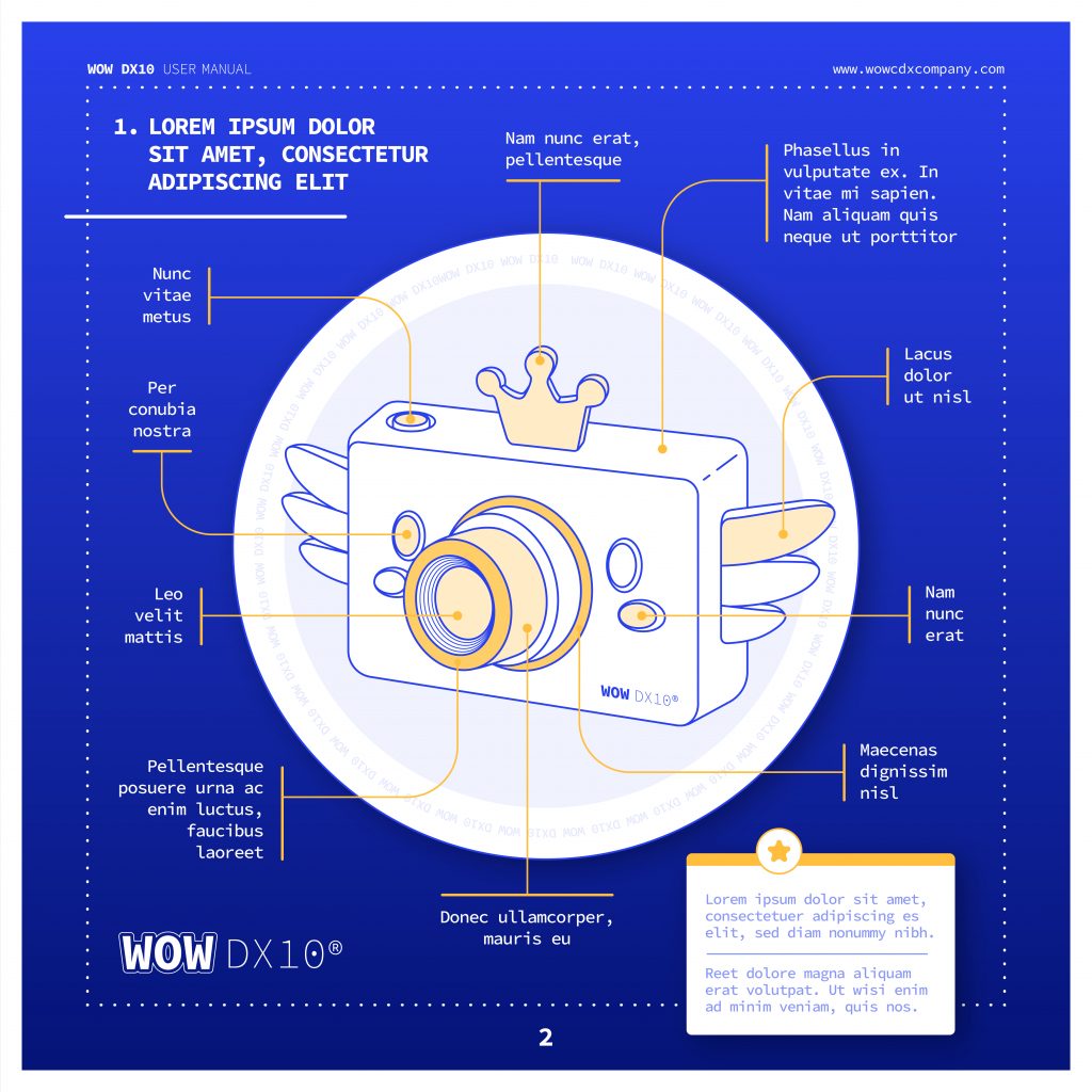
Electrical goods often come with warranties and usage instructions in multiple languages. You know what I’m talking about, the multiple booklets of instructions in 10 different languages or the warranty document to complete and return by post! (remember postage stamps anyone?!), that often fall straight into the recycling bin.

But, there are valid and important reasons for having these. One, being the safety of the consumer and their new product, or information on how to put your new piece of furniture together; but also, one SKU with as many languages included as possible, means a reduction in the overall number of SKUs in production. The more languages you can include, the more countries you can sell that same product in.

So, how do you go about making these important and (sometimes) required pieces of information available while considering packaging reduction and carbon footprint for example? How to squeeze 10 languages on less paper? Do we really need to print out 5 different warranty cards?

  1. A picture is worth 1000 words: Pictures are a universal language and can help convey information without the need for words. This is particularly useful for showing how to use a product or for highlighting specific parts of the product. For example, IKEA provides assembly instructions for their furniture with clear and concise illustrations and no words.
  2. Words: Words are necessary for more detailed instructions and for legal information such as warranties and safety warnings. They also allow for specific language nuances and cultural references that may not be conveyed through pictures alone. Samsung provides detailed instructions in multiple languages for their products, including safety warnings, to ensure that customers fully understand the products they purchase.
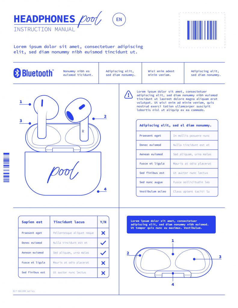
  3. Pictures: Using pictures can make the information easier to understand and remember, especially for customers who are not fluent in the language in which the instructions are written. It also saves space, making it easier to include multiple languages in the single document. Apple Inc. uses pictures and diagrams to explain the functions of their products in multiple languages, making the same information accessible to a wide range of customers.
  4. Environmental Impact: Printing documents in multiple languages can have a significant environmental impact, particularly if they are rarely read and often thrown away. Consider providing instructions and warranties in electronic format (online) where possible, to reduce waste. This aligns with companies’ efforts to reduce their carbon footprint and meet overall packaging reduction targets. For instance, Tesla provides electronic versions of their warranties and usage instructions, reducing the amount of paper waste generated by their products.

In conclusion, handling multiple languages in FMCG warranties and usage instructions requires careful consideration of the most effective way to convey information. A combination of pictures and words can be an effective solution, while also reducing the environmental impact of printing (less paper required) or by providing electronic versions where possible. This supports companies’ efforts to reduce their carbon footprint and meet overall packaging reduction targets.

What are you doing to reduce the amount of packaging and unread booklets in your product?

The nightmare of technical specs

Image created with Midjourney

Working in the pharmaceutical industry, the creation of packaging designs can be a challenging and complex process, especially when dealing with multiple Contract Manufacturing Organizations (CMOs) and Printing companies. There are many factors that can impact the design, including regulatory requirements, branding, marketing, and of course, technical considerations. One of the biggest challenges that packaging designers face when working with multiple printing stakeholders (weather it is a CMO or a printer directly) is the varying technical requirements. Different companies have different machinery and different Standard Operating Procedures (SOPs) (sometimes they don’t even have SOPs).

Oh man…this is hard.

The first challenge related to working with multiple printers is the differences in print and packing capabilities. Each printer may have different printing processes and equipment that they use. For example, one printer may use a rotogravure printing process while another may use flexographic printing. This can result in differences in color accuracy, registration, and overall quality of the final print. Additionally, some printers may not be able to accommodate certain design elements, such as holographic foils or raised printing, which can impact the design and the overall look of the packaging. Additionally, and more specifically for the packaging industry, the printed materials are going to be the input of a packing machine which is going to fold, fill, glue and whatnot in an automated machine. This process is critical since failure can have a high cost impact. Most “reasonable” printing companies and CMOs provide technical specifications to their design agencies (or their clients) so the design materials can be created to specs.

The second challenge is the complex technical documentation that designers must understand in order to create compliant designs. Technical documentation often includes specifications on dielines, varnish free areas, margins, folding lines, visual marks used for automated packing and many more. Understanding these guidelines and ensuring that the design meets them can be a time-consuming and confusing process, particularly for designers who are not familiar with the specific requirements of each printer and considering some of these technical specification documents can be 40 page long. If you are dealing with 10 suppliers, times 40 is a 400 page documentation. That is not easy to manage. This can result in mistakes and miscommunications between the design team and the printer, which can ultimately impact the time to market.

What can we do to fix this?

There are ways to improve the process when technical specification documentation is complex and there are many different suppliers:

  1. Write and maintain proper design manuals specifically for each printer/CMO. This will help ensure that the design team has all of the information they need to create designs that are compatible with each printer’s technical requirements. This can also help avoid misunderstandings and miscommunications between the design team and the printer. Additionally, it will be required should you have to face a customer audit.
  2. Perform training of the design team on all technical requirements. This will help ensure that the design team is aware of the specific requirements of each printer and can create designs that are compatible with those requirements. Furthermore, it will help designers find and interpret information faster and accurately.
  3. Allow a direct line of communication with the printer instead of via the client. A direct line of communication can help avoid misunderstandings and miscommunications that may occur when the design team is communicating through the client. Let the technical people speak to technical people directly, otherwise you will face the broken phone syndrome.

The creation of packaging designs can be challenging, especially when working with multiple CMOs and printers. The varying technical requirements of each printer and the long and complex technical documentation can be a pain in the arse to deal with and a high risk factor. But don’t despair, by following these three tips – writing and maintaining proper design manuals, performing training on technical requirements, and allowing a direct line of communication with the printer – designers can improve the process and ensure that the final product meets all of the necessary requirements.

Mistakes on medical leaflets

The packaging of pharmaceutical products is a crucial aspect of the industry. It serves not only as a protective barrier for the product, but also as a means of communication between the releaser and the consumer. The releaser, a pharmaceutical laboratory, must ensure the existence of an appropriate pharmacovigilance system that allows him to assume his responsibilities and obligations in relation to the pharmaceutical specialties he markets and ensure the adoption of appropriate measures when necessary.

Risks and consequences

One of the most important components of pharmaceutical packaging is the leaflet, also known as the patient information leaflet (PIL), which provides information about the product, including its intended use, side effects, and usage instructions.

To check the content of a leaflet thoroughly is critical, as even a small typo, missing text, or added text can have significant consequences for the patient and the releaser.

Why?

Midjourney image

It is important to avoid errors in the leaflet because they can result in medication errors. For example, if a typo results in the incorrect dosage instructions being printed on the leaflet, the patient may take too much or too little of the medication, which can have serious consequences for their health. Similarly, if important information about side effects is missing or incorrect, the patient may not be fully aware of the risks associated with taking the medication. Believe me, there are side effects which patient and relatives should be fully aware from small possible irritations to a tendency to gambling, side effect that is only revealed after clinical trials for obvious reasons.

Deviation in the leaflet can also result in recalls and legal issues for the releaser. A recall is a costly and time-consuming process, as it requires to retrieve all the affected products from the market and replace them with new, corrected versions. In some cases, the recall may result in significant financial losses, as well as a damaged reputation and loss of trust from consumers.

As a designer and knowing the sensitivity of this situation, the corresponding procedure, quality documents and relevant tools are essential. Just thinking about the lack of an appropriate software 15 years ago makes me dizzy.

How to avoid mistakes

Midjourney image

In order to avoid errors in the leaflet, it is important to have a robust quality control process in place. This may involve multiple rounds of review and testing by different employees within the company, we call it four eyes principle. The process should also include a thorough review of the final product before it is released to the market, in order to catch any last-minute changes or mistakes.

In conclusion, checking the content of a leaflet in the packaging of pharmaceutical products is a crucial step in ensuring patient safety and avoiding costly recalls and damage to brand image. By having a robust quality control process in place, releasers can avoid errors and ensure that the information provided in the leaflet is accurate and up-to-date. Patients can also play a role reporting any discrepancies to their healthcare provider. By working together, the industry and consumers can ensure that the information provided in the leaflet is accurate and that patients receive the best possible care.

Send this to your (design) clients

Design briefs are essential for creative projects as they help set clear expectations and define the scope of work. However, working with a design brief that has missing (or useless) information such as low-quality images can be a significant challenge. Below you will find the key challenges faced when working with an incomplete design brief and obtain tips on how to create a clear and comprehensive brief.

You must read this if you are a customer

Every designer in the world

The classical challenges

One of the major challenges of working with a design brief that has missing information is the lack of clear guidelines. This often leads to confusion and misinterpretation, resulting in a final product that does not meet the client’s expectations. For example, if the brief does not include all the reference files or text documents, the designer may struggle to understand the client’s request and produce an artwork that is not in line with their requirements.

Another common mistake is the use of low-quality (or low-resolution) images. When the final design needs to be printed, such as packaging materials for like…..everything that is sold, the images provided to the design team need to have sufficient resolution for the required printing size and method (SPOT and Digital Printing can be different). This not only affects the quality of the final product but also the reputation of the designer and the company they work for. Although, in all likelihood, your designer will probably have to reject the job and ask for better images.

5 things you need to do as a customer

It is of the outmost importance to create a clear and comprehensive design brief that includes all relevant information. Here are five tips to help make the brief clear:

  1. Include clear brief information: The brief should include a clear and concise description of the project’s goals, technical specifications and in general the desired outcome. This will help the designer understand the client’s vision and ensure that they are on the same page. Do not make it more difficult that it needs to be….more is not always better.
  2. Add up-to-scale dielines: Dielines are essential for product design, as they provide a template for the designer to follow when creating the final product. This is particularly critical for packaging materials since it will most likely be the input of a packaging machine when mistakes can be very costly. By including up-to-scale, clean and usable dielines in the brief, the designer can ensure that the final product will meet the client’s technical specifications. If you think a blurry scan of a dieline is good enough…..think again.
  3. Include all text documents: The brief should include all text documents that are relevant to the project, such as product descriptions, marketing materials, regulatory texts, and any other content that will be used in the final product. The designers cannot read your mind, they cannot possibly know all the details of the regulatory bodies of the many countries where you are releasing and have no insight on your company’s strategies. Don’t make it difficult, make it nice. If a text needs to be included, please add a readable document that can be copy-pasted (designers do not type).
  4. Add clear and precise annotations: Sometimes the best way to convey an idea is by annotating an existing document indicating any specific requirements or requests that the client has. Be like water, be clear.
  5. Include all relevant references of essential information: The brief should include references to any essential information that the client feels is important, such as brand guidelines or examples of similar products. If it takes time to find those documents, better do it before hand.

Working with an incomplete design brief can be a significant challenge for designers, but with the right tools and tips, it can be overcome. Remember, too much information is just as bad as too little information, so be sure to strike the right balance and keep the brief concise, yet comprehensive. And always remember, a good design brief is like a GPS – it helps you reach your destination with ease!

Key concepts on barcodes for pharma

Illustration created with Midjourney

The use of barcodes has become ubiquitous in the pharmaceutical industry, providing a crucial means of identification and tracking for products in the supply chain. Accurate creation of barcodes is essential to ensure reliable digital reading and to prevent failures that can cause significant disruptions and potentially pose risks to patients, not to mention the costly and feared product recall. In this article, we will explore the importance of creating barcodes accurately and explain why the size of the barcode and the color used in the design are crucial factors to consider. We will also provide two tips to help ensure that barcodes are created correctly for packaging design.

The risks

Poorly printed or sized barcodes can cause digital readers to fail, leading to incorrect identification of products, misdirected deliveries, and even recalls. This does not only pose a danger for the patient but also a significant risk for the brand in terms of reputation and costs.

The size matters

One of the key factors to consider when creating barcodes is the size of the code. The size of the barcode needs to be large enough to be easily read by digital readers, but also small enough to fit on the limited space available on the packaging. The size of the barcode must also be consistent across all packaging to ensure reliable digital reading and to prevent confusion. However, the most important aspect of barcode sizing is following the regulated standards for the selected barcode. Some barcode types allow for more flexibility in terms for size and color while others (like the Pharmacode) are very strict in their technical specifications.

Pharmaceutical Binary Code – The Pharmacode

The pharmaceutical binary code, commonly known as the pharmacode, was first introduced in the 1970s as a means of providing a fast and efficient way to identify and track products in the supply chain. The barcode system was originally based on the Universal Product Code (UPC) developed by the grocery industry. The pharmaceutical barcode, also known as the GS1 barcode, was developed to meet the specific requirements of the pharmaceutical industry and is based on international standards established by the Global Standards One (GS1) organization. The technical specifications of the pharmaceutical barcode include a specific number of digits, with the first three digits identifying the company that manufactured the product, the next two digits identifying the product, and the last digit used as a check digit for error detection. The barcode is also required to meet certain size and printing quality standards to ensure reliable digital reading.

You should NEVER resize the width of a pharmacode.

Rafael Cruz, Studio Manager

Color also matters

Midjourney image

The color used to create the barcode is also an important factor to consider. Barcodes must be printed in high contrast colors to ensure that they are easily readable by digital readers. The color of the background and the barcode must be carefully chosen to ensure that the barcode is clearly visible and easily distinguishable from the background. The use of low contrast colors, such as light blue on white, can make barcodes difficult to read and can cause digital readers to fail.

2 Tips to help you out

To ensure that barcodes are created accurately, there are two important tips to keep in mind. Firstly, it is crucial to use high-quality printing materials and equipment to create the barcodes. This will ensure that the barcodes are clearly visible and easily readable, and will help prevent digital reading failures. Secondly, it is important to regularly test the barcodes to ensure that they are accurately readable by digital readers. This can be done by using a barcode scanner to test the barcodes and to confirm that they are being accurately read.

In summary, to ensure accurate barcode creation for pharmaceutical packaging design, it’s crucial to:

  1. Consider the size of the barcode to ensure it is easily readable by digital readers and fits the packaging space
  2. Choose high-contrast colors for printing to improve barcode visibility and readability
  3. Use high-quality printing materials and equipment
  4. Regularly test barcodes for accurate digital reading with a barcode scanner

Artwork Coordination: an often undervalued, complex role

Photo by Matt Bero on Unsplash
Photo of a business person with headset on, a backpack, wearing a shirt, crossing a zebra pad juggling some balls
Photo by Matt Bero on Unsplash

The role of an artwork coordinator in industries such as food, pharmaceutical or retail is crucial for ensuring that the packaging design of products is consistent, accurate, and meets all legal and regulatory requirements. However, this position does not always get the appreciation it deserves.

Being an artwork coordinator for the packaging design of products comes with its own set of difficulties and challenges, which can range from managing a large volume of designs, to ensuring the accuracy of information and meeting tight deadlines, amongst others:

  1. Managing a large volume of designs: Artwork coordinators are responsible for simultaneously managing a large number of designs, both for large product launches and small packaging changes, which can be a time-consuming and complex process.
  2. Maintaining design consistency: Maintaining consistency in design across multiple products and packaging, as well as keeping up to date with customer input and market inspiration (not for Pharma products, where all is more regulated) is crucial for creating a strong brand identity.
  3. Accuracy of information: The accuracy of information on packaging is crucial for ensuring product safety and compliance with legal and regulatory requirements. This is specially critical in the FMCG and pharmaceutical industries, where errors can lead to severe consequences on the consumer side. Products that are sold across multiple countries, with multi-lingual labels, represent an extra complexity on this front, to make sure that all information is accurate and meets the local standards.
  4. Meeting tight deadlines: Coordinators often have to work with very tight deadlines to ensure that products are available for sale in a timely manner.
  5. Collaboration and communication: Effective collaboration and communication between different departments and stakeholders is essential for ensuring the success of a packaging design project.
  6. Approval management: this communication and collaboration amongst departments and external parties such as external clients, regulatory bodies, or printers, takes an extra step when it comes to managing the approvals on the artworks. Dealing with both internal and external feedback rounds adds an extra layer of risk in making sure that the correct files are used when it comes to creating the final product that goes in the shelves.
  7. Control of document versions and files in general: don’t you hate it when you receive a final version and then it turns out it is no the final one, amendments are made and you lose track of which file is the one that should be used? With so many projects ongoing and multiple approvals needed, it is one artwork’s coordinator nightmare to make sure the files are correctly stored and identified.

These challenges show how important and complex the role of artwork coordinator can be. Luckily, nowadays, there are tools that can assist an artwork coordinator in their daily tasks to make them more successful and efficient.

An artwork management system (AMS) can help automate and streamline the design process, through custom workflows that will take some of the repetitive tasks out of their plate, and giving visibility to other stakeholders when they need to provide input or approve. Such technology would also make sure that designs used are the correct ones, by providing a central repository for storing and sharing artworks, keeping version control on all files. Through an audit trail on changes, it becomes much more simple to track where a design is at any given time, and who may have performed a change, taking action from there.

Artwork Management System – Twona

Reaching deadlines becomes easier, as the approval process can be automated and they only need to make sure to check feedback when completed. Because the tool would provide real-time updates on the status of designs, they can focus on more valuable activities other than chasing and reminding people. As a central platform for sharing designs and communicating with stakeholders, and AMS would improve collaboration and communication, as everyone is involved and has visibility over the process. Furthermore, additional tools such as artwork comparison/proofing systems can help coordinators verify that the information on packaging is accurate and up-to-date, reducing the risk of errors and mistakes.

The role definition does not need to change. Its beauty is that it interlocks so many areas of the packaging design process. However, it can be more appreciated when the right technology is used to support their multiple tasks, as it will help professionalize and standardize the artwork coordinator function.

3 Key aspects of medical illustrations

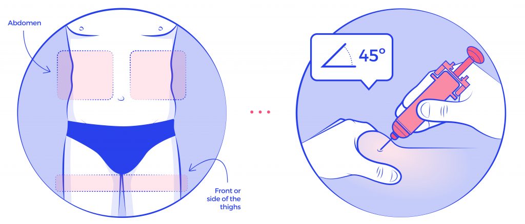
Illustration by Twona Studio (artist Belinda Ramos)

Illustrations are a fundamental tool for communicating information about medical devices to patients and healthcare professionals. In order for these illustrations to be effective, they must be relevant, accurate, and well-thought-out.

Relevance

The illustrations should be directly related to the device in question and should provide information that is useful and relevant to the intended audience. For example, an illustration of a medical device used for a specific condition should be included in the documentation for that condition.

Accuracy

Accuracy is another crucial aspect of illustrations depicting medical devices. Inaccurate illustrations can lead to confusion and even errors in use, which can be dangerous for patients. Therefore, it is essential that illustrations are based on accurate, up-to-date information and are reviewed and approved by experts in the field. Additionally, the illustrations need to be easy to understand by the appropriate audience. A healthcare professional might have received appropriate training, but in many occasions the intended user might not have received any training at all.

Design

The third important aspect of relevant, accurate and well thought through illustrations is that they should be well-designed to effectively communicate the intended message. The illustrations should be clear, concise, and easy to understand. They should also be visually appealing, as this can help to engage the reader and make the information more memorable. The illustrations should be placed in a logical and meaningful way in the leaflet or other medical documentation to make it easy for the reader to follow and understand.

Illustration by Twona Studio (artist Belinda Ramos)

Medical illustrations are essential when it comes to communicating information about medical devices to patients and healthcare professionals. They can greatly enhance the effectiveness of instructional materials by making complex information easy to understand, and by ensuring correct application and treatment.

If you need to improve your medical devices illustrations, reach out to our Studio and we will be happy to chat with you.

Listen to your users

Photo by Jon Tyson on Unsplash

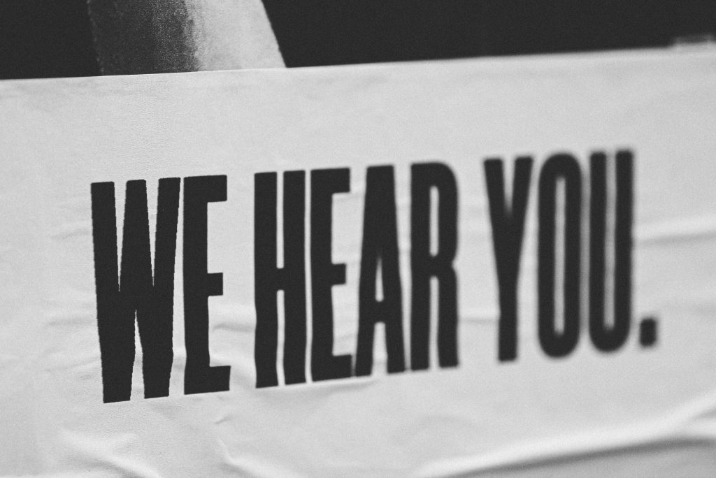
Black and white image showing the text in capital letters: "WE HEAR YOU".
Photo by Jon Tyson on Unsplash

User feedback is crucial when designing and programming a SaaS solution for large and complex corporate companies to manage their packaging design process. Without user feedback, the solution may not meet the specific needs and demands of the users, leading to dissatisfaction and a lack of adoption.

By gathering feedback from users throughout the design and development process, the solution can be tailored to their specific needs. This ensures that the software is user-friendly and easy to navigate, making the packaging design process more efficient and streamlined. User feedback also helps identify any potential issues or bugs that may have been missed during testing.

Incorporating user feedback into the design and development process also demonstrates that the company values the input of its users and is committed to providing a high-quality solution. This can lead to increased customer satisfaction and loyalty.

Additionally, user feedback can provide valuable insights into the industry and market trends, allowing the company to stay competitive and continuously improve the solution.

There is of course a fine line between listening to your users and building a custom application for each of them.

How to prevent this from happening? These are some ideas to make it work for everyone:

  • Making sure that any feedback you receive is properly tracked and reported – this way you can link similar ideas/requests and map them to your own product development timelines
  • Translating the feedback into clear requirements (SOPs) – without clear requirements, nothing can be built. Users need to be very specific when talking about their needs so that there is no possibility to get something lost in translation.
  • It is imperative that the need applies to a majority of your user base – if what a customer wants is not what another one needs, there is little room for an implementation that will affect all your users. While some features may not be used/needed by all, building something that will only apply to a handful of users defeats the purpose of increasing the quality of your software and will deteriorate your client satisfaction.

When all these three conditions apply, customer feedback can become a great tool to make sure you are designing and programming a SaaS solution that is built to last and that users identify and are comfortable working with.

At Twona we often incorporate feedback from our users into upcoming releases. It may take some time for things to appear in your screen – we work with an agile methodology, but until proper requirements are drafted and confirmation that the solution will be beneficial to most users, we may not proceed to put it in the planning; or after going thru the 3 steps above, realize that the request was not meeting but a customer needs and could not move forward; but in any case, we do take their input seriously and report each feedback input into our tracking system for discussion with the Product owner and engineer teams.

So if you are one of our clients, do not hesitate to let your Success Manager know about your ideas!

Standardizing products in the pharmaceutical industry

patrick tomasso unsplash

Homogeneize/Standardize is the process to harmonize or confer homogeneity or unity to the elements of a set or an area. When it comes to our packaging, it has many other implications:

  • Identification & communication of attributes and visibility.
  • Item Distribution Strategy.
  • Increase in perceived value of the product.
  • Brand recognition.
  • Loyalty.

With the term defined and considering the high strategic importance of standardizing our packaging, we are going to focus on how to deal with the production of (standardize) materials.

What is the best way to guarantee that our team of designers produce homogeneous materials?

Without a doubt, it is the use of templates. These templates, which are expected to be a shared resource, must be unique and protected to avoid changes and therefore generate unwanted deviations.

It is important to develop as many templates as types of products are in our portfolio. These types or groups of products have similar content, form and distribution:

  • Blister box
  • Vertical box
  • Label
  • Leaflet
  • Blister

Using a Folding Box as an example, our template must contain: logos and corporate identity signs, road safety or photosensitivity icon, recycling symbol(s), dosage chart and a long etcetera depending on the complexity of our design.

In order to complete our template, we are currently still missing a fundamental element. It is of vital importance to have a mockup in our template so that designers can use the elements that compose it when building new products.

Back to our example of a Folding Box. In our mock-up there will be a set of elements in the front face such as the name of the product/component in the correct corporate font, size and formatting that would help the designer create the final material. Very important is to make sure that these elements are not to be specific and refer to a real product/component. These should contain a generic text, such to avoid human errors by not replacing the correct text from the Medicines Agency.

For example: Molecule Brand 00 xx xxxxxxx xxxxxx EFG – all these in the correct font and sizes/styling.

Austrian national library – unsplash

Besides reducing risk of mistakes, another benefit of using templates is to exponentially speed up the design process. The template is expected to already solve many questions when starting producing a material: What font should I use? Where are the logos and icons? What were these products like that I haven’t worked on lately?…

To finish with our recommendations to standardize your designs with the use of templates, it is important to highlight that a template is subject to real and common cases. What does this mean? The template should be simplified as much as possible so that its use is agile and efficient, therefore, they should not include exceptions or extreme cases when creating the template.

Our template must encompass the common elements of at least 90% of our materials, as well as our guide or procedure for a material that you can see in a previous article: Facing a Rebranding without stress.

Rafael Cruz Núñez
Artwork Manager

Stress-Free Packaging Rebranding

Photo by myriam-zilles-KltoLK6Mk-g-unsplash

Image of pills, different types, formats and colors.
Photo by myriam-zilles-KltoLK6Mk

As difficult as it may be to recognize it, we sometimes have a hard time adjusting to change. It is that adaptation process what seems like an uphill task.

For a pharmaceutical lab to be competitive, it needs to keep adjusting their processes; using new tools that make work more efficient, or renewing their brand image, for example. And that is the aspect we are going to focus on.

Rebranding and its feared companion: the new Guideline

A rebranding is a brand image change that affects a company’s products and packaging and which rules are collected in a document, named a guideline. Some of the changes that these entail are:

  • New corporate design.
  • New color ranges.
  • Fonts.
  • Icons, logos.

Finding the necessary information to adjust your designs in a document of 30, 60 or maybe even 150 pages, can be complex. Do you imagine working each day with such a lengthy document?

If you have never gone through a rebranding process, here is a shocker: no guideline, none at all, ever, has covered all possible cases. I mean exceptions, nearly impossible implementations, small formats like a label or adjusting those rules to a double molecule, with hidroclorotiazide, for instance.

How to handle a rebranding in an efficient manner?

When you first get introduced to a new guideline, a mix of feelings arise: it is both exciting and challenging at the same time. Before you start hyperventilating at the thought of how complicated it can become to check that or another details, make sure you do this: simplify the document into smaller sections, so you can solve each case separately, focusing on what is important.

The key is to divide the information in several areas, one way is for instance by type of product:

  • Folding Box
  • Leaflet
  • Labels

Whatever division you choose from, it should answer one question: “How do I design/ review a …” > For example, for a Folding box, as it is a very common product that has a rather high complexity.

The procedure to design a box from the guideline is then dissected into smaller pieces that compose it: front face/back face/secondary faces/closing sleeve…

Each section of the divided guidelines will obviously have to contain all its specific rules, and always have images/drawings of real examples. Make sure to also define margins, corporate elements, proportions, and colors, besides the actual content of that box face.

My recommendation is to leave exceptions or special cases to the end. Make sure that the section covers 90% of the cases and leave the 10% for the end of the section.

Similarly, from my experience, besides splitting up information into more agile documents, I would recommend creating templates for the most common cases. It is also very useful to generate checklists that contain the key elements that cannot be missed. Both of these will help you tremendously on the final review.

And you? What tricks do you use to make your rebranding projects simpler and less stressful?

If you are currently going through a rebranding process or it is in the planning, and you have any questions, do not hesitate to contact me. Good luck with that rebranding process!

Rafael Cruz Núñez
Artwork Manager