Mistakes on medical leaflets

The packaging of pharmaceutical products is a crucial aspect of the industry. It serves not only as a protective barrier for the product, but also as a means of communication between the releaser and the consumer. The releaser, a pharmaceutical laboratory, must ensure the existence of an appropriate pharmacovigilance system that allows him to assume his responsibilities and obligations in relation to the pharmaceutical specialties he markets and ensure the adoption of appropriate measures when necessary.

Risks and consequences

One of the most important components of pharmaceutical packaging is the leaflet, also known as the patient information leaflet (PIL), which provides information about the product, including its intended use, side effects, and usage instructions.

To check the content of a leaflet thoroughly is critical, as even a small typo, missing text, or added text can have significant consequences for the patient and the releaser.

Why?
Midjourney image

It is important to avoid errors in the leaflet because they can result in medication errors. For example, if a typo results in the incorrect dosage instructions being printed on the leaflet, the patient may take too much or too little of the medication, which can have serious consequences for their health. Similarly, if important information about side effects is missing or incorrect, the patient may not be fully aware of the risks associated with taking the medication. Believe me, there are side effects which patient and relatives should be fully aware from small possible irritations to a tendency to gambling, side effect that is only revealed after clinical trials for obvious reasons.

Deviation in the leaflet can also result in recalls and legal issues for the releaser. A recall is a costly and time-consuming process, as it requires to retrieve all the affected products from the market and replace them with new, corrected versions. In some cases, the recall may result in significant financial losses, as well as a damaged reputation and loss of trust from consumers.

As a designer and knowing the sensitivity of this situation, the corresponding procedure, quality documents and relevant tools are essential. Just thinking about the lack of an appropriate software 15 years ago makes me dizzy.

How to avoid mistakes

Midjourney image

In order to avoid errors in the leaflet, it is important to have a robust quality control process in place. This may involve multiple rounds of review and testing by different employees within the company, we call it four eyes principle. The process should also include a thorough review of the final product before it is released to the market, in order to catch any last-minute changes or mistakes.

In conclusion, checking the content of a leaflet in the packaging of pharmaceutical products is a crucial step in ensuring patient safety and avoiding costly recalls and damage to brand image. By having a robust quality control process in place, releasers can avoid errors and ensure that the information provided in the leaflet is accurate and up-to-date. Patients can also play a role reporting any discrepancies to their healthcare provider. By working together, the industry and consumers can ensure that the information provided in the leaflet is accurate and that patients receive the best possible care.

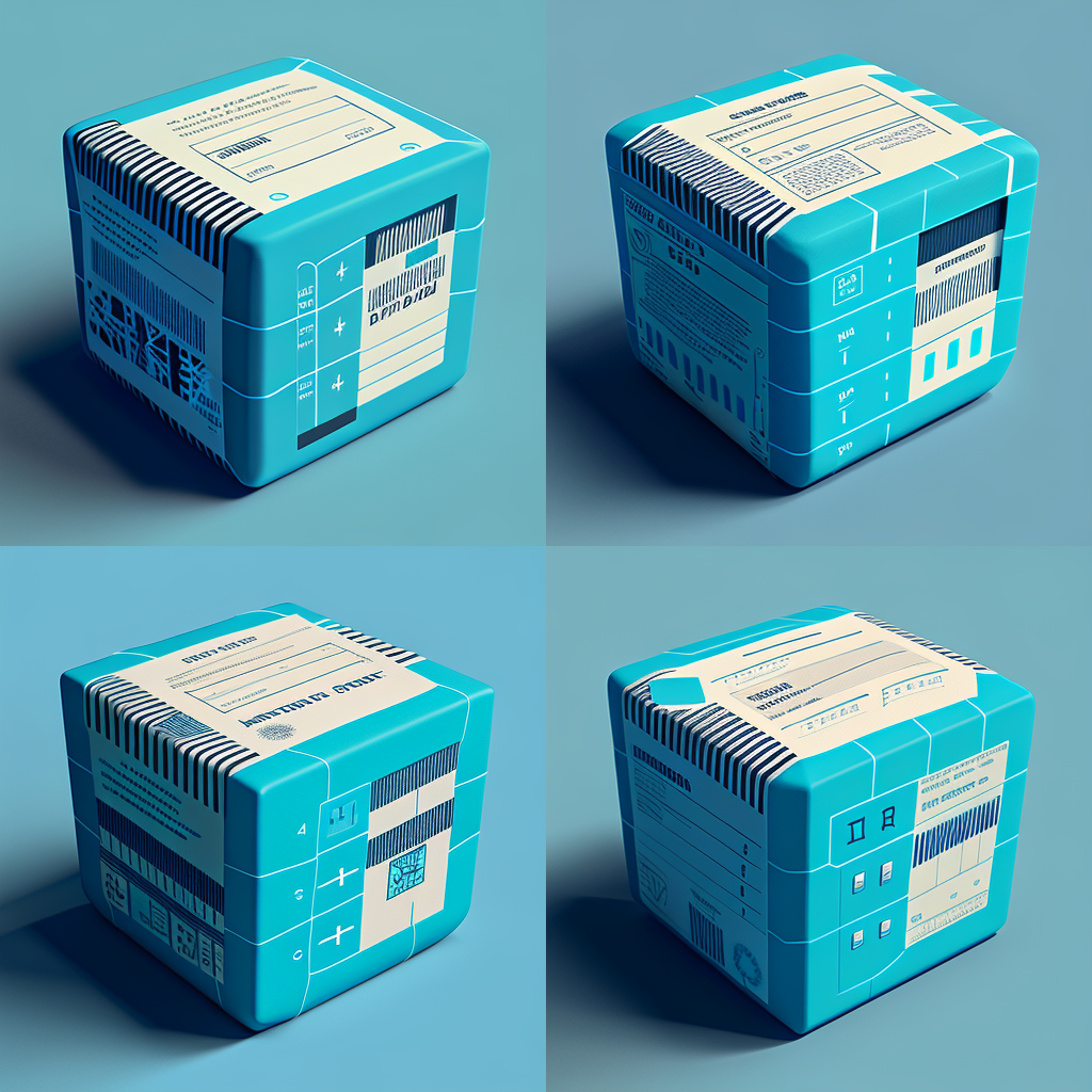
Key concepts on barcodes for pharma

Illustration created with Midjourney

The use of barcodes has become ubiquitous in the pharmaceutical industry, providing a crucial means of identification and tracking for products in the supply chain. Accurate creation of barcodes is essential to ensure reliable digital reading and to prevent failures that can cause significant disruptions and potentially pose risks to patients, not to mention the costly and feared product recall. In this article, we will explore the importance of creating barcodes accurately and explain why the size of the barcode and the color used in the design are crucial factors to consider. We will also provide two tips to help ensure that barcodes are created correctly for packaging design.

The risks

Poorly printed or sized barcodes can cause digital readers to fail, leading to incorrect identification of products, misdirected deliveries, and even recalls. This does not only pose a danger for the patient but also a significant risk for the brand in terms of reputation and costs.

The size matters

One of the key factors to consider when creating barcodes is the size of the code. The size of the barcode needs to be large enough to be easily read by digital readers, but also small enough to fit on the limited space available on the packaging. The size of the barcode must also be consistent across all packaging to ensure reliable digital reading and to prevent confusion. However, the most important aspect of barcode sizing is following the regulated standards for the selected barcode. Some barcode types allow for more flexibility in terms for size and color while others (like the Pharmacode) are very strict in their technical specifications.

Pharmaceutical Binary Code – The Pharmacode

The pharmaceutical binary code, commonly known as the pharmacode, was first introduced in the 1970s as a means of providing a fast and efficient way to identify and track products in the supply chain. The barcode system was originally based on the Universal Product Code (UPC) developed by the grocery industry. The pharmaceutical barcode, also known as the GS1 barcode, was developed to meet the specific requirements of the pharmaceutical industry and is based on international standards established by the Global Standards One (GS1) organization. The technical specifications of the pharmaceutical barcode include a specific number of digits, with the first three digits identifying the company that manufactured the product, the next two digits identifying the product, and the last digit used as a check digit for error detection. The barcode is also required to meet certain size and printing quality standards to ensure reliable digital reading.

You should NEVER resize the width of a pharmacode.

Rafael Cruz, Studio Manager

Color also matters

Midjourney image

The color used to create the barcode is also an important factor to consider. Barcodes must be printed in high contrast colors to ensure that they are easily readable by digital readers. The color of the background and the barcode must be carefully chosen to ensure that the barcode is clearly visible and easily distinguishable from the background. The use of low contrast colors, such as light blue on white, can make barcodes difficult to read and can cause digital readers to fail.

2 Tips to help you out

To ensure that barcodes are created accurately, there are two important tips to keep in mind. Firstly, it is crucial to use high-quality printing materials and equipment to create the barcodes. This will ensure that the barcodes are clearly visible and easily readable, and will help prevent digital reading failures. Secondly, it is important to regularly test the barcodes to ensure that they are accurately readable by digital readers. This can be done by using a barcode scanner to test the barcodes and to confirm that they are being accurately read.

In summary, to ensure accurate barcode creation for pharmaceutical packaging design, it’s crucial to:

  1. Consider the size of the barcode to ensure it is easily readable by digital readers and fits the packaging space
  2. Choose high-contrast colors for printing to improve barcode visibility and readability
  3. Use high-quality printing materials and equipment
  4. Regularly test barcodes for accurate digital reading with a barcode scanner

3 Key aspects of medical illustrations

Illustration by Twona Studio (artist Belinda Ramos)

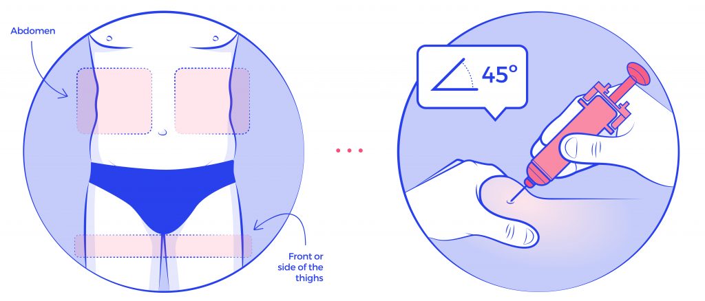
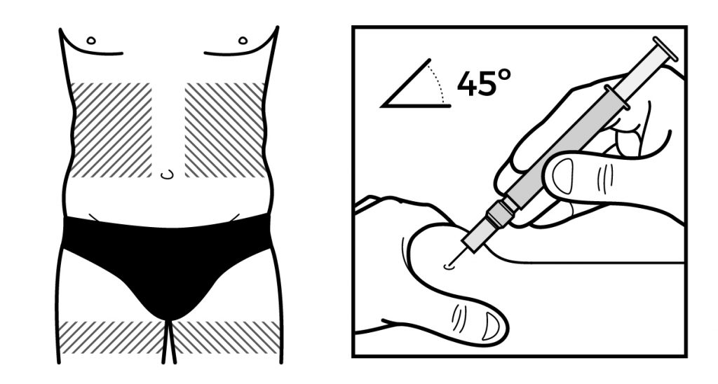
Illustrations are a fundamental tool for communicating information about medical devices to patients and healthcare professionals. In order for these illustrations to be effective, they must be relevant, accurate, and well-thought-out.

Relevance

The illustrations should be directly related to the device in question and should provide information that is useful and relevant to the intended audience. For example, an illustration of a medical device used for a specific condition should be included in the documentation for that condition.

Accuracy

Accuracy is another crucial aspect of illustrations depicting medical devices. Inaccurate illustrations can lead to confusion and even errors in use, which can be dangerous for patients. Therefore, it is essential that illustrations are based on accurate, up-to-date information and are reviewed and approved by experts in the field. Additionally, the illustrations need to be easy to understand by the appropriate audience. A healthcare professional might have received appropriate training, but in many occasions the intended user might not have received any training at all.

Design

The third important aspect of relevant, accurate and well thought through illustrations is that they should be well-designed to effectively communicate the intended message. The illustrations should be clear, concise, and easy to understand. They should also be visually appealing, as this can help to engage the reader and make the information more memorable. The illustrations should be placed in a logical and meaningful way in the leaflet or other medical documentation to make it easy for the reader to follow and understand.

Illustration by Twona Studio (artist Belinda Ramos)

Medical illustrations are essential when it comes to communicating information about medical devices to patients and healthcare professionals. They can greatly enhance the effectiveness of instructional materials by making complex information easy to understand, and by ensuring correct application and treatment.

If you need to improve your medical devices illustrations, reach out to our Studio and we will be happy to chat with you.