Our Studio works under a four-eyes principle when it comes to artwork production. In any workflow, either our own or one that the customer decides upon, we always introduce an internal QA step. None of our Artworks are sent to the clients before they go through the review of a different person within the department who was not involved in the initial design.
Why is that?
Very simple. When you have been working on a leaflet or an instructions brochure for an hour (sometimes even more!), you are no longer able to distinguish a small mistake. A separate person who was not involved in the original design is the perfect person to take a fresh look at the artwork and detect any potential issues.
It is also essential that this person knows what they need to review, aside of the obvious mistakes that one could have introduced.
- The internal QA check needs to start from a clear check of the briefing /work order request that has been received. This is because sometimes there are requirements in these that deviate a bit from the customer guidelines.
- These guidelines are the next step. Clients often have very clear instructions on there about their fonts, colors, and graphics. It is crutial to have them accesible but also include your own annotations on how the guideline is generally interpreted, as you will find that sometimes they can be a bit ambiguous.
- Regulatory information must be kept updated. Because of regulations being constantly evolving, it is helpful to make sure that you keep any documents related to rules that apply to your packaging designs up to date for anyone doing a QA review, so they can fall back on to it when checking the artworks.
- Check for consistency – does this package/label/blister have major differences with others produced earlier on? If so, what are the reasons for that? (new regulations, change in guidelines, specific customer request…).
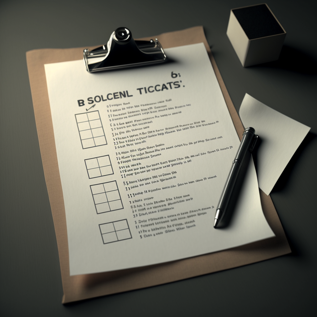
One thing that our team uses frequently when undergoing the internal QA process is to refer to a checklist that they have developed. This checklist starts as a template (which you can download for your own use), with generic areas to review, although they often create one specific for each customer, to make sure that the client’s peculiarities are included and always visible to the review team.
Using such a checklist has many advantages for our Studio:
- Error reduction – with a four eye principle in combination with a proper checklist, we are able to reduce the amount of oversights and not pass imperfect artworks to our clients – incorrect information, missing or incorrect formats, or design inconsistencies. We may have an extra internal version on occasion, but we make sure that the changes the client sends back are reduced to a minimum. This is one of the reasons why our average number of versions on artworks is so low.
- Compliance – we obviously follow the guidelines and industry regulations when we create artworks but by using a checklist, we are able to reduce risk of not being compliant with these as the specific requirements are included in the checklist making them hard to miss.
- Time and Cost Savings – by potentially catching errors or issues before they reach the client, we are able to save both time and money. Imagine that these errors lead to a recall packaging redesign, the effect that this would have on both our team and our clients’ would be massive.
- Collaboration – for us, checklists are also a way for our team to remain a good working team. By sharing the checklists not only with designs but also other involved departments, we are able to give visibility to all the team members and make them part of the same shared objective. So it may be a soft advantage, but in the long run, a close team who works together would be a much stronger one.
- Competitive advantage – not all studios provide these type of quality services. A lot of times there is a GiGo mentality, and imperfection is rewarded (e.g. when each single subversion of an artwork is charged for). For us, it is really mandatory that the product we deliver is as good as it can get. Therefore, this quality control step is a key one.
If you also find quality an essential step in your artwork process, and need some help getting started, you can download our checklist template from this link. Remember that adding your own items to the list is very important!!