Having a consistent brand experience is one important element for your product success in the market. Achieving this is not always easy, specially when companies have a multitude of products in different categories, or products that are targeted at different customer groups, when they use many different designers/agencies, and specially, when deadlines are tight. As an artwork coordinator, you have to bridge those gaps and make sure that your brand stands out, and is recognizable throughout all your different product lines, without incoherences and mistakes.
These 5 best practices can help you get there!
1. Define brand guidelines
We have talked about brand guidelines before. A complete brand book will contain the rules and directions on how to use design elements like typography, colors, imagery and logos, as well as define the brand tone of voice and messaging, so that the brand values and image are easily recognizable by the product users. Artwork coordinators need to have a deep knowledge of the guidelines, how to implement them, and when exceptions can be made. It is your job to make sure that the brand guidelines are complete, and cover all possible packaging scenarios, so that when new products are introduced, their packaging design is easily replicated with its specific differences and nuances.
2. Use consistent templates
Once you have your brand guidelines in place, you should make sure to develop templates that make your work easier when creating new artworks; that way, you can be sure that all your product line will have a similar look and feel. The templates can have locked out elements like the placement of logos, product name, or key visual elements, so that you can be sure that those align perfectly.
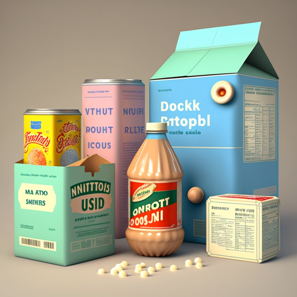
Not sure how you feel about it, but I hate when I purchase a bag of chick-pea crisps and a bag of lentil crisps from the same company, and the packaging is “slightly off”, with small detail things like: a logo is bigger in one bag than in the other, or moved to the side, or the key selling point of the product appears on a particular font or color, and these do not match. Clients notice these small things, and they are annoyed by them. At least, clients like me :D!
3. Work closely with designers
If you are not acting as a designer as well (which let’s be honest, happens quite often to artwork coordinators), you will certainly be working with them very closely, to create the packaging artworks.
It is of absolute importance that the guidelines are understood by the design team, so you should make it a priority to teach them about the guidelines, not just show them where the brandbook document is stored (*yes, I know you have done this before, it is ok, that is why I am here to let you know that you need to stop doing that and provide proper training on your brand guidelines).
Additionally, you also should make sure that they have all in their possession all key brand elements: logos in the right size and formats, fonts that they will need to use, color codes for RGB/CMYK, image bank/library access, design tool licenses… so that the quality of what they produce can be up to standards.
4. Conduct regular reviews
Once the packaging design is completed and in use, it is not crazy to plan periodical reviews. One clear scenario for this is when you are working with different designers/studios, or when you recently changed providers, so that you can compare their adherence to the guidelines and verify that brand consistency remains intact. It is also possible that over time, your guidelines evolve as your brand does, and this is also a moment when reviewing your packaging design would be needed, so that any changes implemented in the guidelines can also be put in place in your packaging moving forward.
These changes can also be driven by new regulations that require new icons/information on your packaging, and without a proper review, some of your artworks could be deviating from the way you want them to be created, just due to lack of communication about the changes, country-specific regulations, or others. It is your job as an artwork coordinator to have this under control, and ensure that the packaging effectively communicates the product’s value proposition at any given time.
5. Ensure consistent production
In the end, what the client will see is what they can get their hands on, so the final product on the shelves. For multiple reasons, the production of different products of your portfolio may not take place in the same printer, or production facility , which means that the printing or quality standards may vary. Because products end up sitting next to each other on the shelves, it is possible that two variations of a product / different line of a product, end up showing small (hopefully) differences in the final sold product.
Consistency of the final product with the approved artwork is key to a positive brand image. This is why it is often important to be able to compare the final product (e.g from a photo of a box, wrapping, bottle, can…) with the final approved artwork. This is something that you can for instance do with Twona X-RAY, a complete Artwork and Graphic Design Comparison Platform that helps you effortlessly review your text, graphics, and final packaging.
Packaging consistency is therefore a matter of aligning multiple stakeholders and making sure they all adhere to the brand standard, templates and guidelines defined by your company. It involves activities such as information sharing, training, and reviews (multiple rounds) that often fall on the task list of an artwork coordinator, while juggling other many tasks and deadlines. The job of the artwork coordinator is a complex one, as we explained before!
Following these 5 best practices, we are sure that you will achieve more consistency in your packaging design and new product launch. Do you have any other tips to share with fellow artwork coordinators?